Activity Pattern Heat Maps – Free Excel Template
This Excel template can be used to visualize activity patterns. Some of the scenarios where you could use this would be visualizing call arrival patterns in call centers, support request arrival patterns in contact/support/service centers, website traffic and order placements. By understanding the arrival patterns, you could make decisions around staffing (in contact/call center example) and website maintenance timing (website traffic example). This template uses simple formulas and some conditional formatting.
FREE DOWNLOAD
Activity Pattern Heat Maps Excel Template
VIDEO DEMO
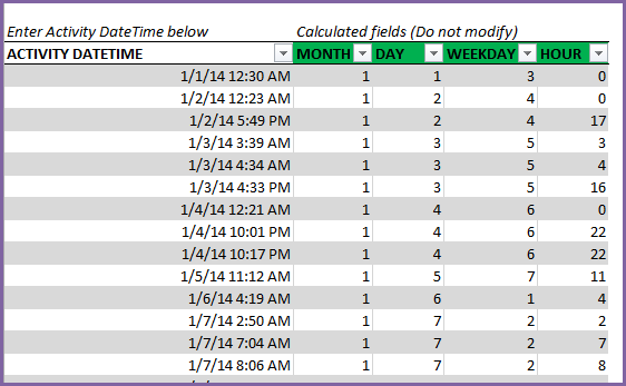
DATA INPUT
Just enter your activity date-time data in column A in the table. The columns with green labels are calculated using formulas. Please do not modify them.

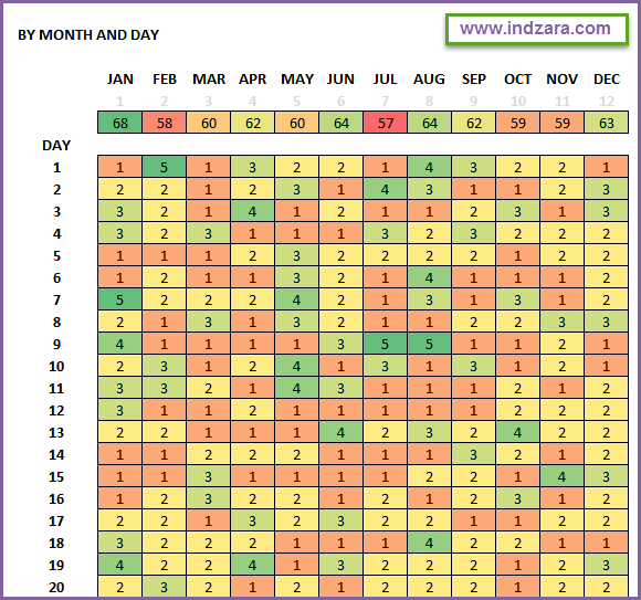
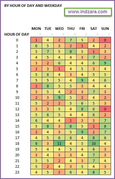
The visualizations on the right will update. It is just a count of activities in each cell. For example, Jan month and day of 5th will represent the number of activities on 5th of January (from the data you entered). The Grader Color Scale is used where dark red indicates the lowest value and dark green represents the highest. You can edit the conditional formatting rules if you would like a different color scheme.
BY MONTH AND DAY

BY HOUR OF DAY AND WEEKDAY
Google Analytics provides a similar visualization as well.

Do you find this template useful? This is a very simple and basic attempt at visualizing activity patterns. I look forward to your feedback to expand on this template to accommodate other common use cases. Please share your thoughts in the comments below.
Some of our related products…


Leave a Reply