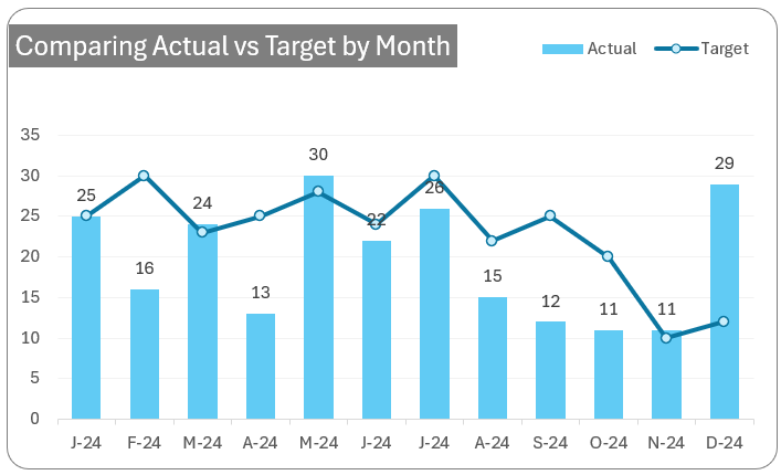
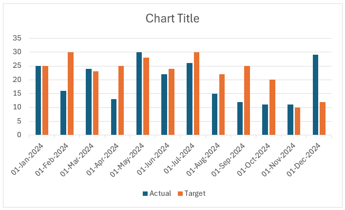
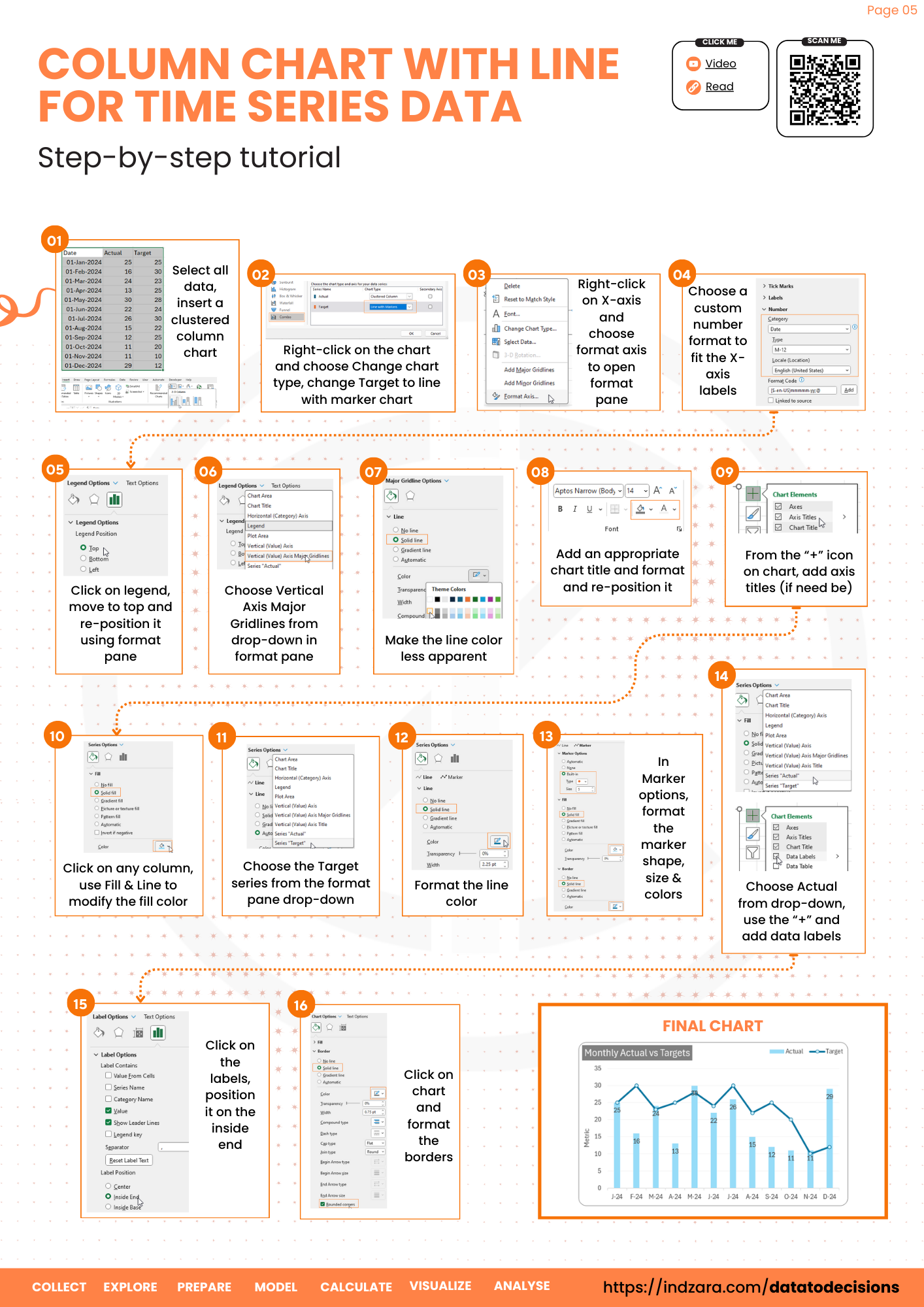
This blog walks you through the simple steps in creating a simple actual v. target chart for time series data (as shown).
When to use these charts?
This is ideal when comparing actual vs target values across periods. A simple example would be sales data by month, compared to monthly targets. Note that we use the line chart for target only when the X-axis is a time dimension (that is Month/Quarter/Year/etc.)
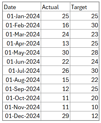
To build this chart, let’s use sample data of a metric’s actual and target for every month as shown below:
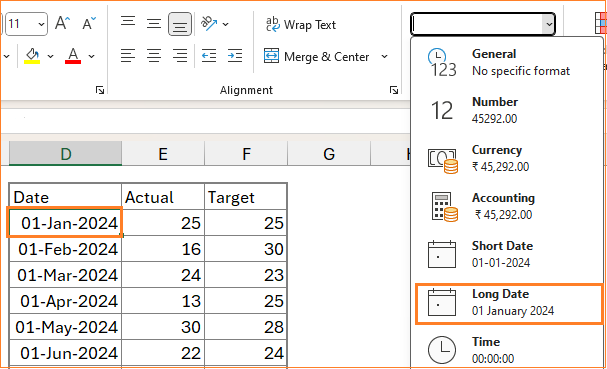
Note: The date column should have actual date values, to check this, click on any cell with a date and go to the cell format. Here, if the value is an actual date, the Long Date format shows the same accordingly. This is a very quick and easy way to identify whether your input is date or not.
With this sample data, let’s build our chart.
Ready to save time on your next presentation? Explore our Data Visualization Toolkit featuring multiple pre-designed charts, ready to use in Excel. Buy now, create charts instantly, and save time! Click here to visit the product page.
Do check our dedicated video on YouTube explaining these steps in detail.
The following are the steps we’d follow in creating this chart:
- Insert a clustered column chart
- Change the target series chart type
- Format the X-axis
- Format the chart
Step 01: Insert a clustered column chart
Select all the data, from the Insert ribbon, and insert a Clustered Column chart.
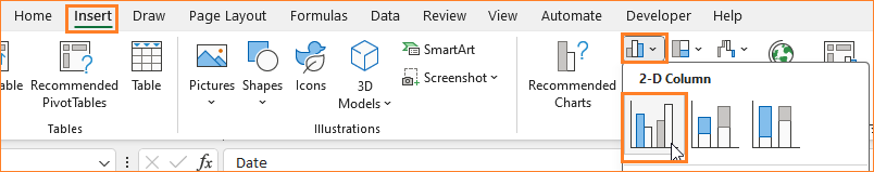
This inserts a default clustered column chart based on our data (note that the colors of the chart may vary based on the Excel theme)
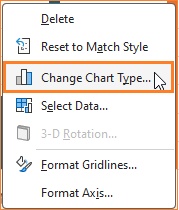
Step 02: Change the target series chart type
To modify this chart as an actual v. target chart, we will make some modifications.
Right-click on the chart and select Change Chart Type which opens a dialog box.
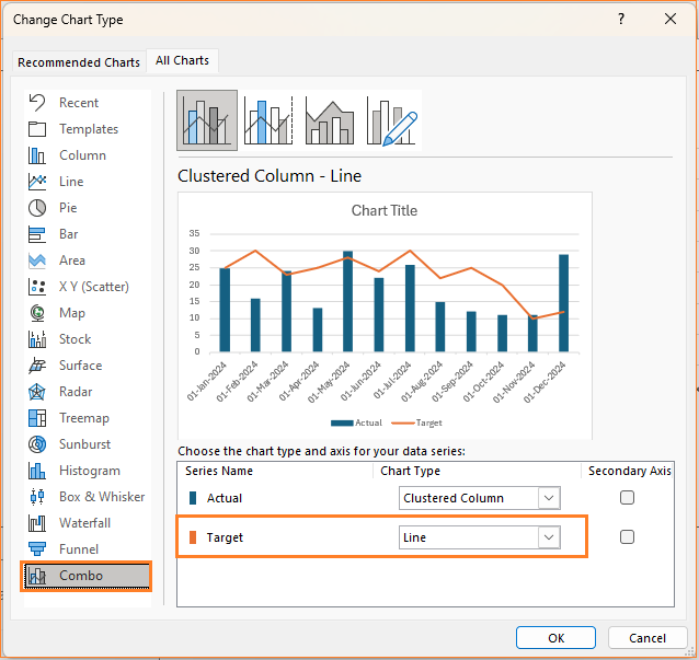
Here, in the Combo chart type, change the target series to Line Chart as shown:
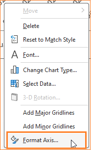
Step 03: Format the X-axis
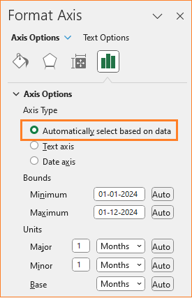
Since the X-axis has the date as given in the sample data, let us see the formatting options available in Excel for the date axis. Right-click on the axis and go to Format Axis option which opens a format pane to the right.
In this pane, we can see that Excel has identified this data in the X-axis as Date, and correspondingly the Bounds and Units are date-related.
To format the axis, in the Number section of the formatting pane, choose the category as “Date”.
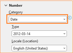
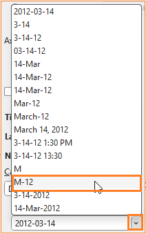
This gives several formatting options as shown, choose one that suits the purpose of your chart. Here, to accommodate the size of the chart, we’ll use a M-YY format as shown:
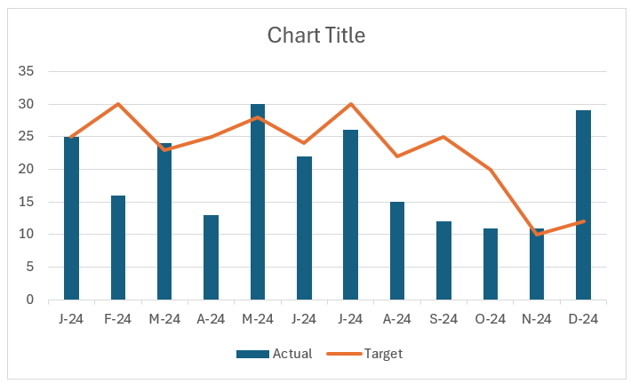
These options can be chosen purely based on the space available for the axis or the chart size. With this, the chart is:
In some cases, say where you have two years of data or when the horizontal axis labels have more data points, we can adjust the labels in the Units section of the formatting pane to have skips.
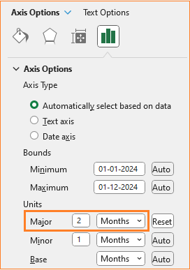
This skips a month and displays the X-axis, here we can format the X-axis as shown:
These are options available to display the X-axis labels, choose what suits your audience and the story you want your chart to display.
Step 04: Format the chart
In this step, let us continue the formatting to get a more visually pleasing chart.
i. Move the legend to the top to get more chart area. Click on the legend and in the formatting pane, move the same to the top.
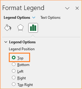
Drag and reposition the same as needed.
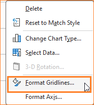
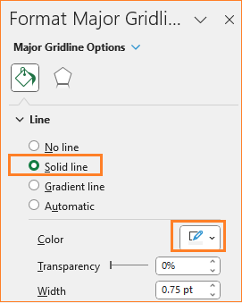
ii. Now the gridlines, ensure to have them but not so evidently overpowering chart by modifying the line color.
iii. Give a suitable title to the chart, say “Monthly Actual vs Targets” and format the same in the Home ribbon.
iv. Click anywhere on the chart and click on the “+” symbol that appears on the right corner. Here, we’ll choose to include axis titles.
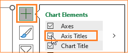
Since the X-axis is very clear as a date axis, click on the axis title and delete the same. With the Y-axis, to show the user what is being displayed, we’ll include an axis title as “Metric”
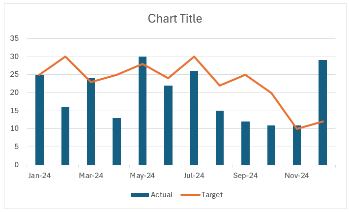
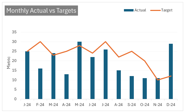
At this point, this is our Actual vs Target Chart for Time Series Data looks something like this:
Finding it difficult to follow the steps in a blog? Check our easy, 1-minute tutorial on creating this chart here:
Now, let’s format the column and line.
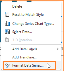
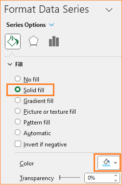
i. Right-click on any of the columns and go to Format Data Series.
This opens the formatting pane, in the Fill & Line, choose a solid fill and a color of your choice.
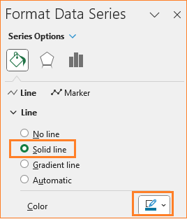
ii. Similarly, right-click on the line series, and in the format pane, choose a line color as well.
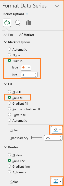
Here, to format the marker, go to the Marker options and choose a built-in marker type, a fill, and a border color as shown:
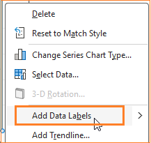
iii. Right-click on the columns and add data labels:
Now, click on the labels, and from the format pane, choose to place these labels on the inside end as shown:
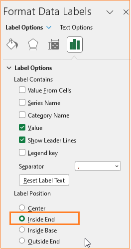
Depending on the context of the chart and the data, you can choose to include the data labels for the target lie as well.
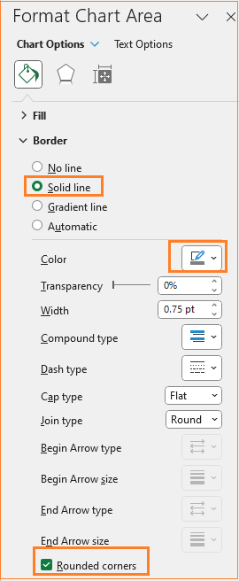
As a last step in our formatting, click anywhere on the chart and format the chart border as shown:
That’s it! In four simple steps, our actual v. target chart for a time series data is ready!
Check our 1-page, downloadable illustrative guide explaining all the steps for a quick reference.
Check our blog on visualizing actual v. target with multiple target values using a column chart.
If you have any feedback or suggestions for a blog, please post them in the comments section below.


