In one of our posts, we created a column chart that displays a single target as a line. What if there are multiple target values instead of one?
This post addresses such cases.
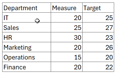
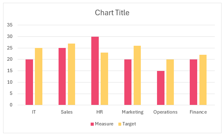
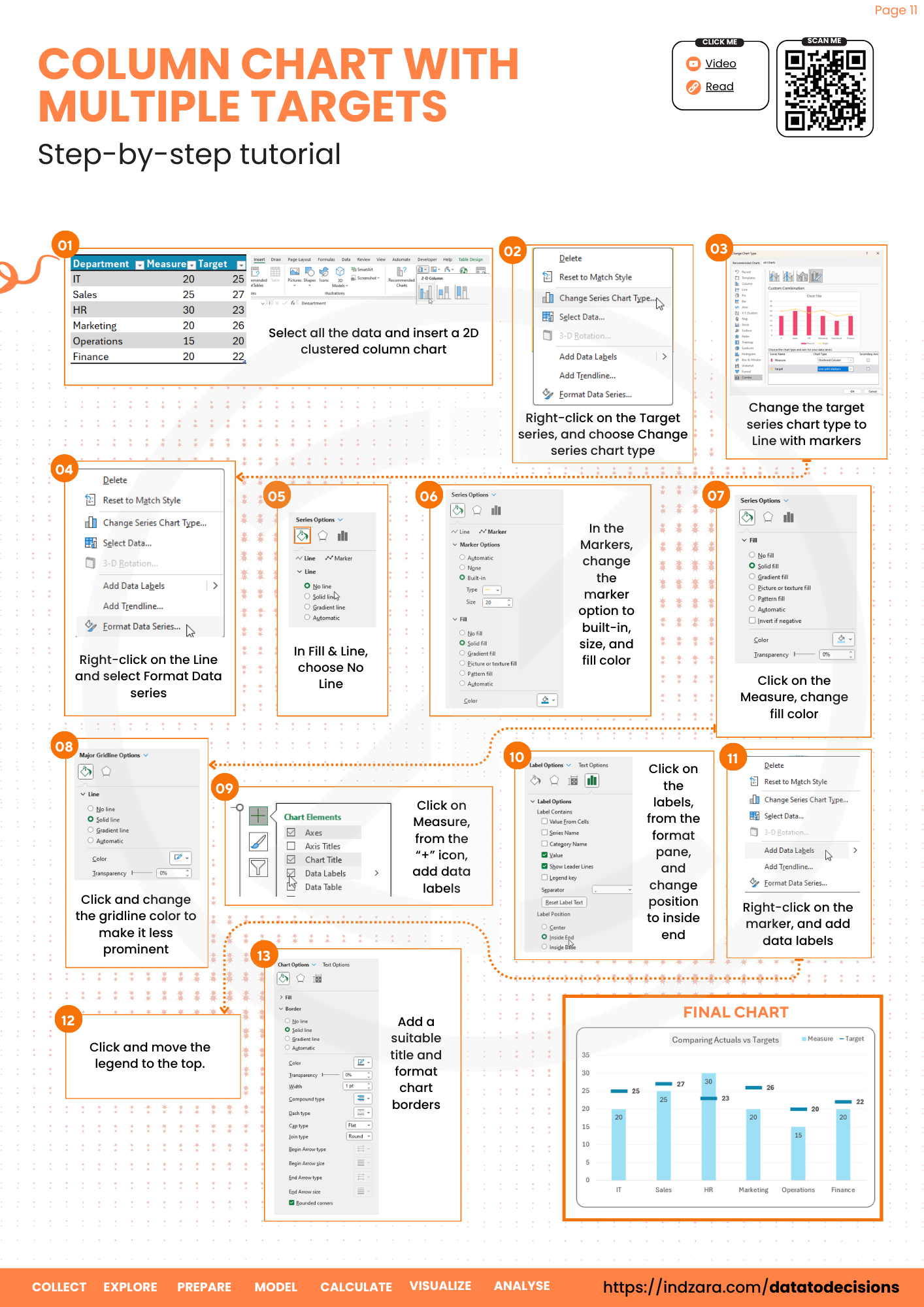
Consider a sample data of departments and a measure with their respective target values:
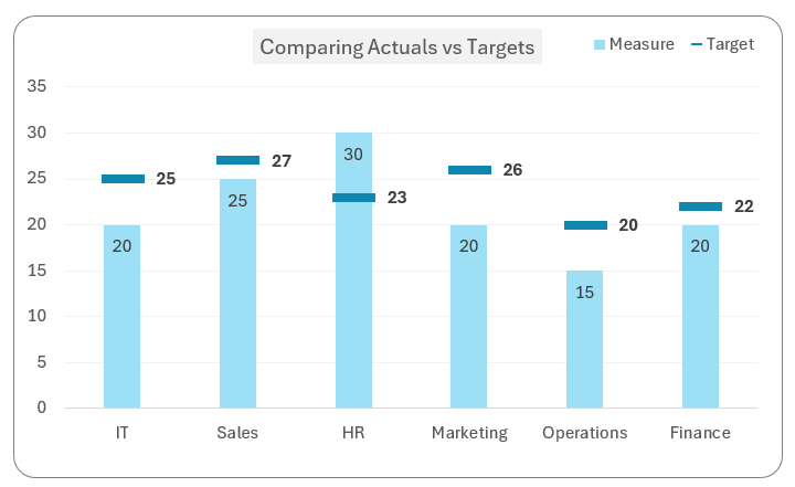
Our goal is to create a column chart that has a target lines for each of these values:
Let’s get started.
Ready to save time on your next presentation? Explore our Data Visualization Toolkit featuring multiple pre-designed charts, ready to use in Excel. Buy now, create charts instantly, and save time! Click here to visit the product page.
Do check our YouTube video on the same topic:
The following are the steps we’d follow in creating this chart:
- Convert the data to a table
- Insert a clustered column chart
- Modify chart type
- Format the chart
Step 01: Convert the data to a table
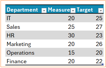
Let’s create a table for this data by selecting all the data and CTRL + T.
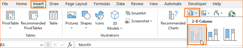
Step 02: Insert a clustered column chart
Select all the data and create a 2D column chart.
This creates a default column chart with two series:
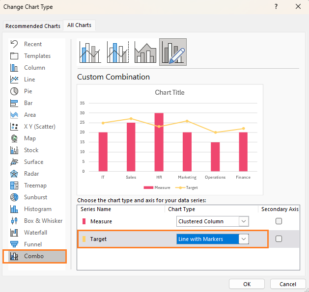
Step 03: Modify chart type
Right-click on the Target series, and select “Change Series Chart Type” to a Line with Markers as shown:
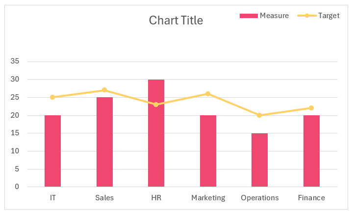
This creates a chart that is a combination of a column and a line with markers:
Step 04: Format the chart
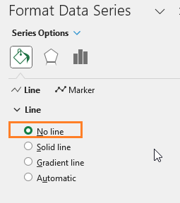
To modify the line to a bar, right-click and Format Data series and make the following modifications:
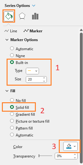
i. Edit the Line option to no line:
ii. Then in the Marker Option, choose a built-in option of a line and increase size accordingly, assign a color in the fill section as shown.
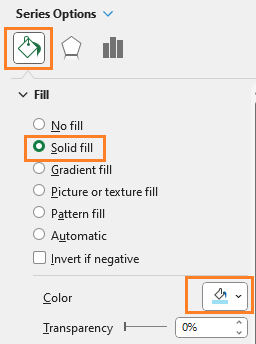
iii. As seen in the previous articles, Right-click on the columns to modify the Fill color according to your needs.
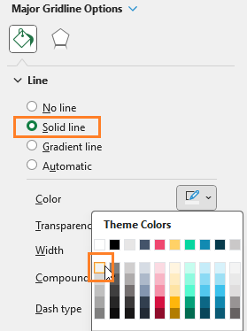
iv. Modify the gridline color to make it less apparent by (1) right-click (2) format gridlines and change the color:
v. Add Data labels to the measure columns (1) click anywhere inside the column, a + icon appears to the top right:
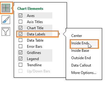
vi. Similarly, add data labels for the targets as well, and perform any additional chart formatting to make the visual more appealing.
With this, the final column chart with multiple targets is ready!

Check our 1-page, downloadable illustrative guide explaining all the steps for a quick reference.
If you have any feedback or suggestions, please post them in the comments below.


