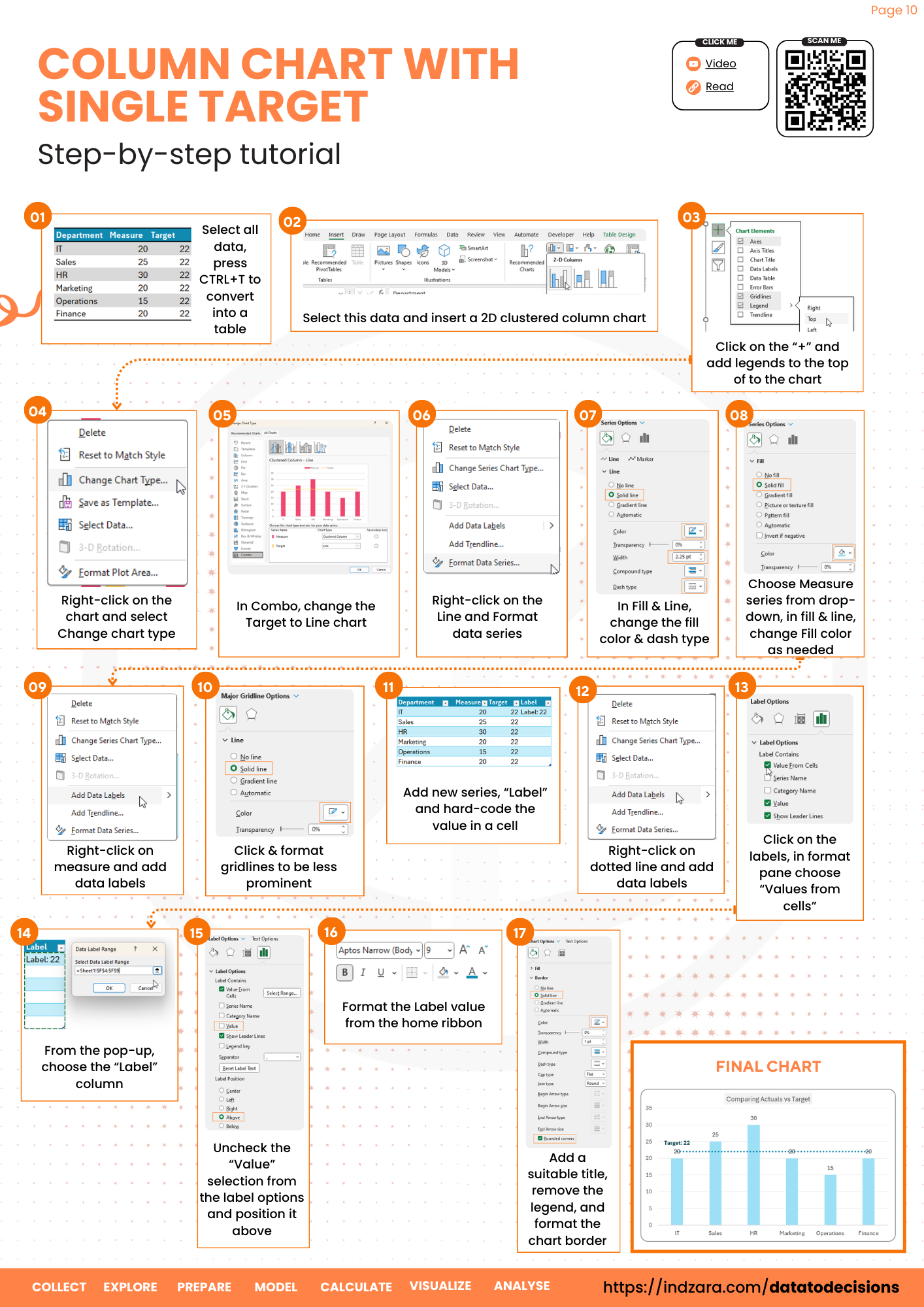
Let’s create a column chart with a single target line that can be used to compare the measure value in the chart.
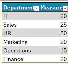
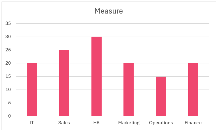
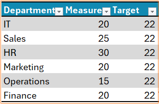
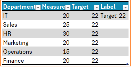
Assume a sample data of a measure for different departments as shown:
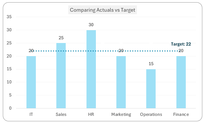
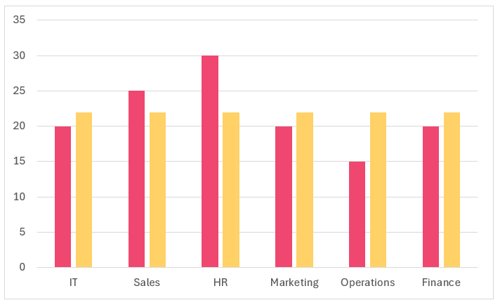
The chart we aim to create is:
Let’s get started!
Ready to save time on your next presentation? Explore our Data Visualization Toolkit featuring multiple pre-designed charts, ready to use in Excel. Buy now, create charts instantly, and save time! Click here to visit the product page.
Do check our YouTube video for the step-by-step instructions:
The following are the steps we’d follow in creating this chart:
- Prepare data & insert a clustered column chart
- Add Target column to the data
- Modify the chart
- Format the chart
- Add the Label column
Step 01: Prepare data & insert clustered column chart
Firstly, convert the data into a table by selecting all the data and CTRL + T. This ensures that the chart gets updated when the data get’s updated.
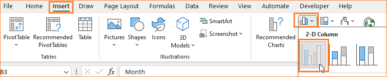
Insert a 2D column chart:
This creates a chart as shown (the colors may vary based on the theme of your Excel spreadsheet):
Step 02: Add Target column to the data
To get a target line, let’s include another column in our table as “Target” and we’ll use a formula as shown:
=ROUND(AVERAGE([Measure]),0) i.e. the average of my measure value rounded to 0 decimals.
Since this is a part of the original table, Excel includes this as a series on the original chart as shown:
Step 03: Modify the chart
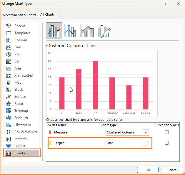
We do not need an additional line, we’ll only need a line. To modify this, right-click on the chart, and choose Change Chart type:
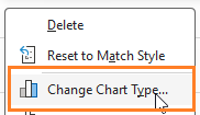
This opens a pop-up where (1) go to Combo (2) change the Target chart type to a Line
Step 04: Format the chart
Let’s apply some formatting techniques to this chart:
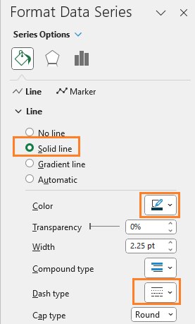
i. Right-click on the line and choose format data series,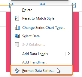
Now, modify the line to your need in the format pane to the right:
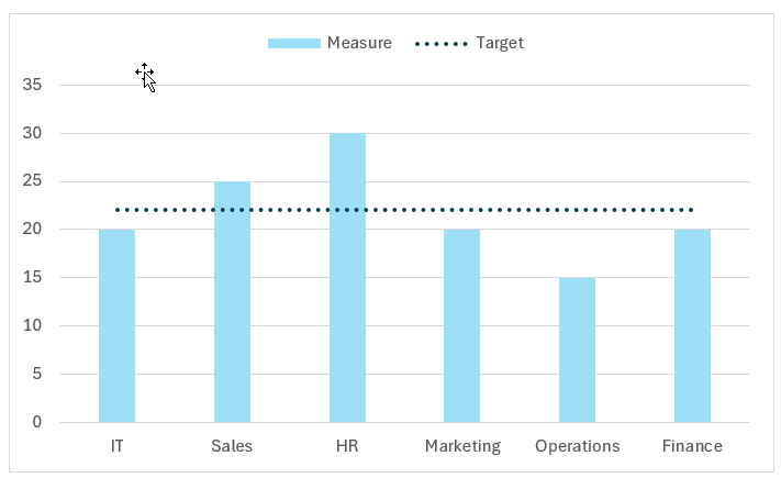
ii. Modify the measure column fill as well, and now the chart looks like this:
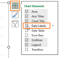
iv. Include Data Labels for the measure, click on the chart, a + icon appears for formatting
Step 05: Add the Label column
To add a label to the target line, add a new series to the data and name it “Label”. Hard-code the label as needed:
Here, why did we add another series to the data? If not for this, similar to adding data labels to the columns, if we add labels to the line, the chart would look something like this:
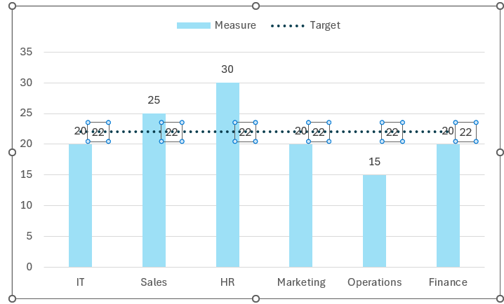
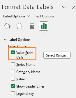
Now, since this is not a desired visual representation, hence by adding another column, we can add a different label as needed. Let’s quickly see how: Right-click on the labels, and go to Format Data Labels option, in the format pane, choose Values from cell and uncheck others:
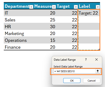
This produces the desired label, which we can format as needed. Moving the target wherever you want, controls the position of the label.
Check our 1-page, downloadable illustrative guide explaining all the steps for a quick reference.
Check our article on creating a column chart with multiple targets.
If you have any feedback or suggestions, please post them in the comments below.