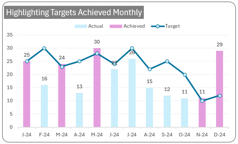
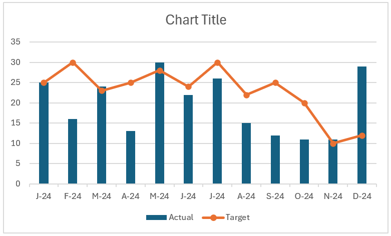
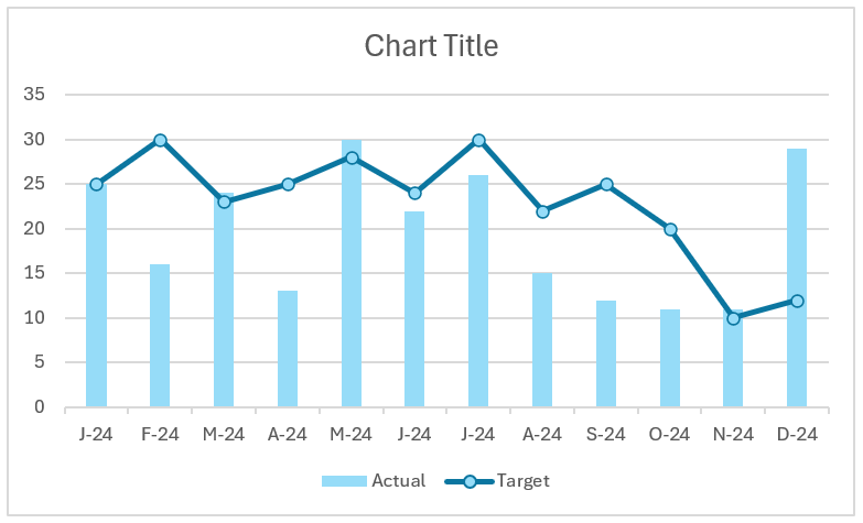
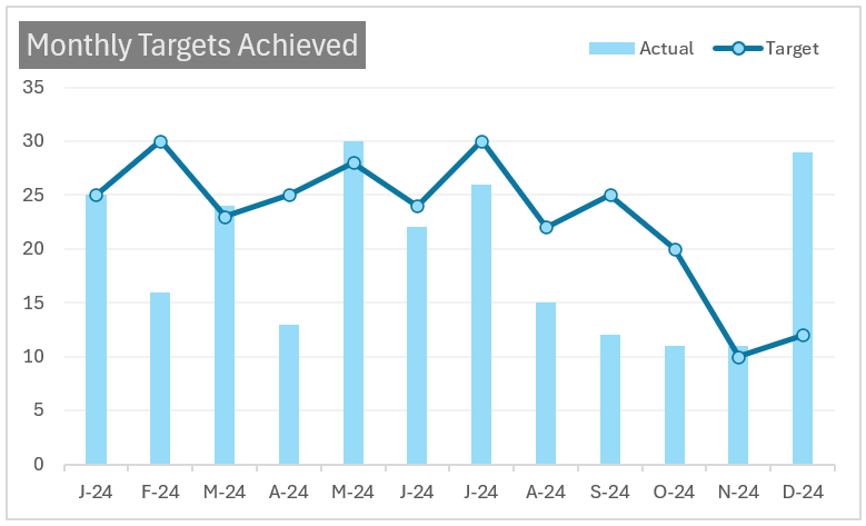
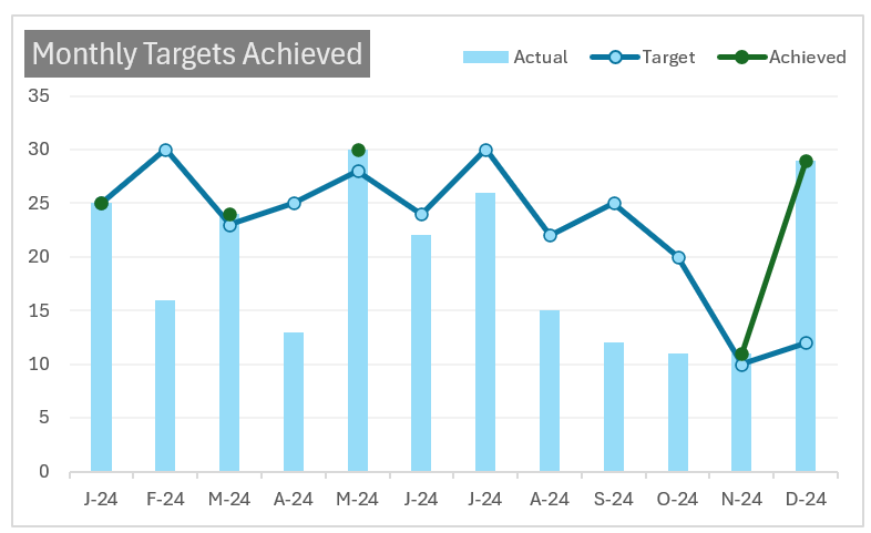
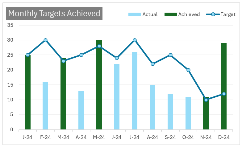
Learn to create a combination of column and line charts to display actual vs. target for time series data through this post. Here you’ll learn how to highlight months where the target value is achieved to get a great visual for your reports or presentations. A sample chart is shown below:
Let’s build this chart in Excel!
Ready to save time on your next presentation? Explore our Data Visualization Toolkit featuring multiple pre-designed charts, ready to use in Excel. Buy now, create charts instantly, and save time! Click here to visit the product page.
Please check our previous article where we’ve described in detail, the steps to create a column chart that highlights columns above a target value.
Do check our dedicated video on YouTube explaining these steps in detail.
The following are the steps we’d follow in creating this chart:
- Insert a clustered column chart
- Modify the target series to line
- Format the X-axis
- Format the line and column
- Format the chart
- Add an “Achieved” column to the data
- Add the Achieved series to the chart
- Format the achieved series
Step 01: Insert a clustered column chart
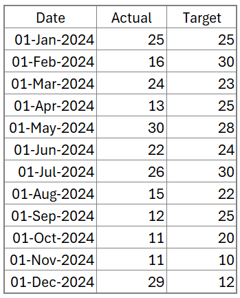
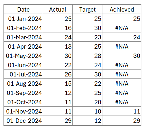
Consider sample data of a metric’s actual vs. target values across months as shown:
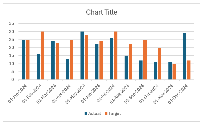
Select all the data and insert a clustered column chart as shown:
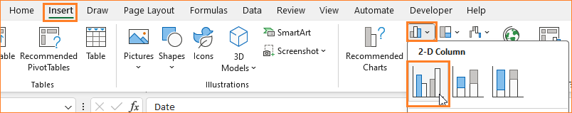
This inserts a default clustered column chart based on our data (note that the colors of the chart may vary based on the Excel theme)
Step 02: Modify the target series to line
To modify this chart as an actual v. target chart, we will make some modifications.
Right-click on the chart and select Change Chart Type which opens a dialog box.
Here, in the Combo chart type, change the target series to Line with Markers Chart as shown:
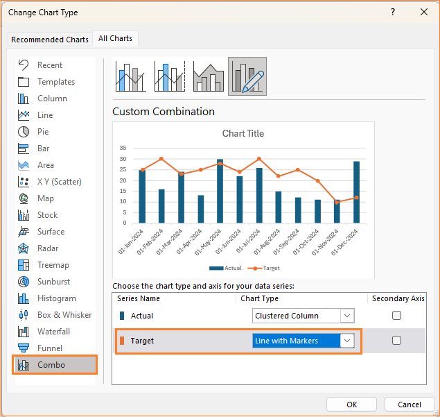
With this step, this is our chart:

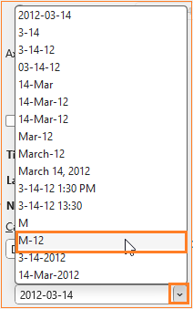
Step 03: Format the X-axis
In the chart created at the end of step 02, the X-axis takes up considerable space. To format the same, right-click on the axis and go to Format Axis option which opens a format pane to the right.
In the Number section of the formatting pane, choose the category as “Date”.
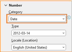
In the Type, choose one that suits the purpose of your chart. Here, to accommodate the size of the chart, we’ll use a M-YY format as shown:
After applying these changes, our chart looks something like this:
Step 04: Format the line and column
Now, let’s format the columns and the line series,
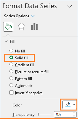
i. Click on any of the columns, and in the format pane, in the Fill & Line, choose a solid fill and a color of your choice.
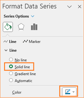
ii. Similarly, click on the line series, and in the format pane, choose a line color as well.
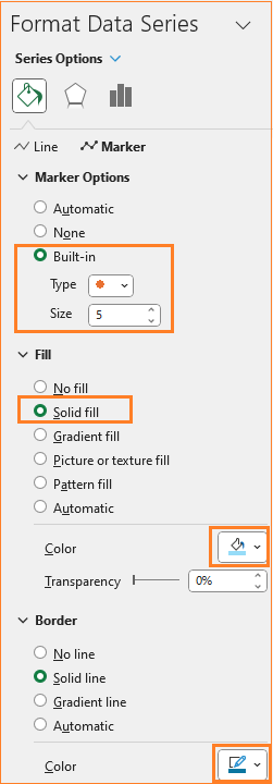
Here, to format the marker, go to the Marker options and choose a built-in marker type, a fill, and a border color as shown:
At this stage, this is our chart:
Step 05: Format the chart
Let’s apply further formatting to our chart.
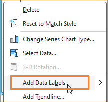
i. Right-click on the columns and add data labels:
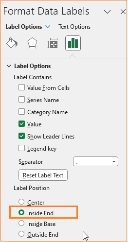
Now, click on the labels, and from the format pane, choose to place these labels on the inside end as shown:
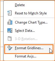
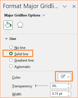
ii. Now the gridlines, ensure to have them but not so evidently overpowering chart by modifying the line color.
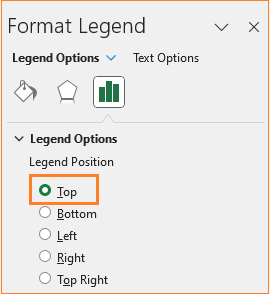
iii. Move the legend to the top to get more chart area. Click on the legend and in the formatting pane, move the same to the top.
Drag and reposition the same as needed.
iv. Give a suitable title to the chart, say “Monthly Targets Achieved” and format the same in the Home ribbon.
At the end of this step, this is our chart:
Step 06: Add an “Achieved” column to the data
The purpose of this article is to modify the chart in such a way that the columns (i.e. months) where the set target is achieved, are highlighted.
To get this, we need to add additional series to the data.
Let’s call this column “Achieved” and this will have the following formula
=IF(C4>=D4,C4,NA())In the above formula, Column C has the actual and D has the target data respectively
This formula returns values only when the actual is greater than or equal to the target set else we get a #N/A as shown here:
Step 07: Add the Achieved series to the chart
There are multiple ways to add this new data to the chart, one of the easier ways is to copy all the data from the new series (CTRL +C), click on the chart, and do a simple paste (CTRL + V).
This adds the new series but not in the desired format, as shown here:
With Excel, formatting this to get the desired output is a breeze!
Step 08: Format the achieved series
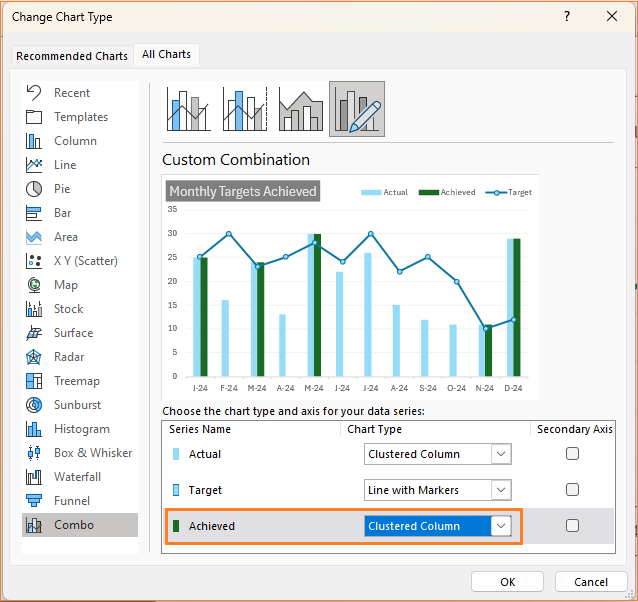
Right-click on the chart and go to Change Chart Type to open a dialog box:
Here, change the Achieved to a Clustered column:
This creates an additional column by the side of the actuals column. We need these two columns to overlap each other completely.
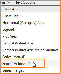
For this, select the Achieved column from the Format pane (this is called the Achieved series as the column header in our sample data is of that name)
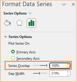
Now, in the Series Option modify the overlap to a 100% as shown here:
With this, the actual vs target chart that highlights the achieved is taking shape:
A key point to note here is that this overlap of the achieved was correct since all the series are present in needed order. To check this, right click on the chart and go to Select Data and this is how the order has to be:
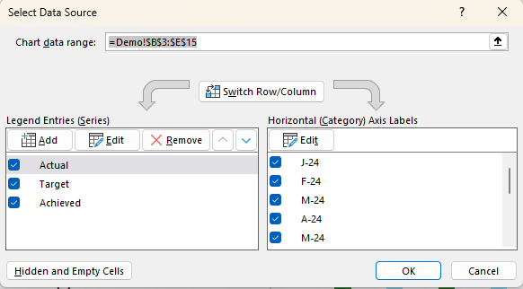
Note that the Achieved series is below the Actual series.
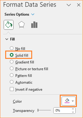
Format the achieved column with a different color in the format pane:
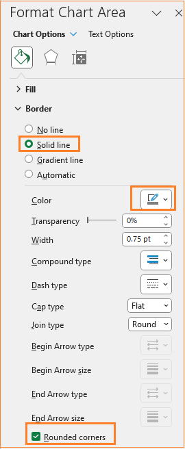
As a final step of formatting, change the chart border by clicking on the chart and modifying the following in the format pane:
With this our final dynamic actual vs target chart that highlights achieved is ready.
Check our 1-page, downloadable illustrative guide explaining all the steps for a quick reference.

Try modifying the sample data to see the dynamic nature of this chart. This is a sample scenario explained to create a chart with dynamic highlights. This can be extended to other cases where only a few series need to be highlighted from the rest like a threshold value being reached where all that’s needed is to modify the additional series data accordingly.
Do check our blog on using a column chart to highlight achieved target values.
If you have any feedback or suggestions, please post them in the comments below.


