This blog is to create customization in Column charts in Excel: highlight columns based on a set goal or target value.
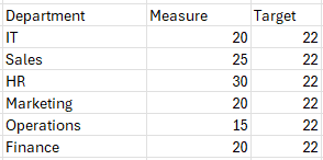
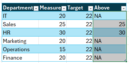
Consider a sample data of multiple departments with measure and target values as shown.
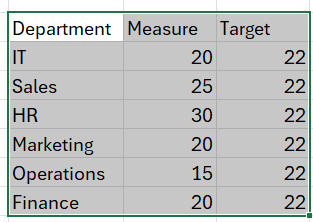
Let’s create a table for this data by selecting all the data and CTRL + T.
With this data, let’s create a column chart that highlights columns based on targets.
Ready to save time on your next presentation? Explore our Data Visualization Toolkit featuring multiple pre-designed charts, ready to use in Excel. Buy now, create charts instantly, and save time! Click here to visit the product page.
Check our detailed video on this here:
The following are the steps we’d follow in creating this chart:
- Insert a clustered column chart
- Add Above Column
- Add Above column to chart and format it
- Update legends
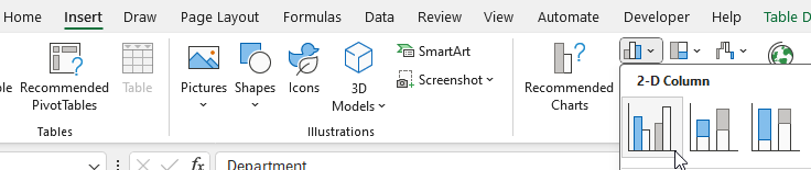
Step 01: Insert a clustered column chart
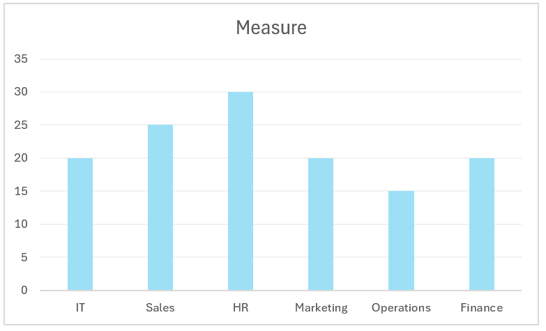
Select only the Department and Measure columns and create a 2D column chart.
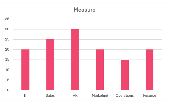
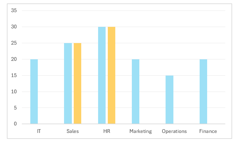
This generates a simple column chart,
Let’s quickly format this chart before proceeding further:
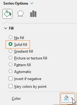
Format this based on your need (by right-clicking on columns, Format Data Series), I have changed the fill.
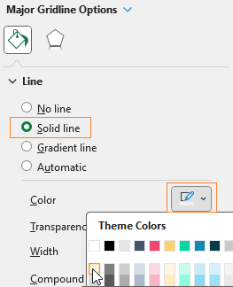
Let’s also modify the gridlines to make them lightly visible:
You can apply more formatting like adding a chart title, axis titles etc. At this stage the chart is:
Step 02: Add Above Column
Our focus is on the target value and how the chart can be highlighted based on this value. To achieve this, we’ll add another column to our data and call it “Above” (name as per our need).
This column will have a formula to display only those values that meet the target, we’ll use IF function for the same as shown:
=IF([@Measure]>=[@Target],[@Measure],"NA")With this, our data will be:
Step 03: Add Above column to chart and format it
Let’s incorporate this new series “Above” into the chart.
(1) Right-click on the chart, Select Data
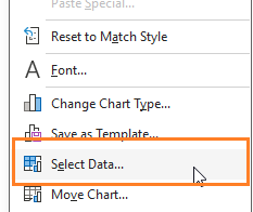
This opens up a dialog box to add series and horizontal axis as shown:
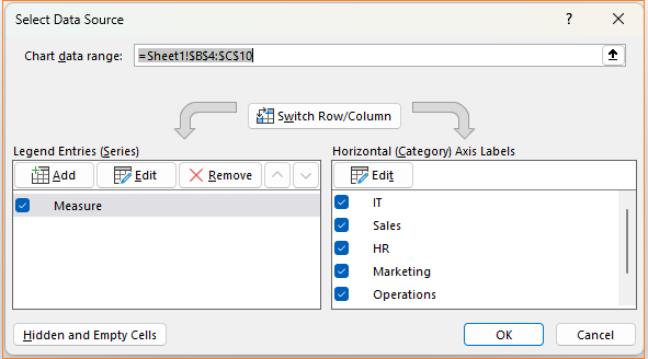
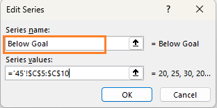
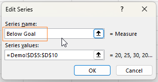
(2) Add a new series and call it “Above Goal”
With this Excel adds the new series as additional columns:
We DO NOT need an additional column series, to modify that, head to the format panel.
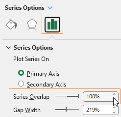
Here, change the series overlap to 100%
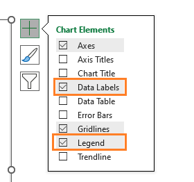
With this the columns get a 100 % overlap and after adding data labels and legends to the measure columns,
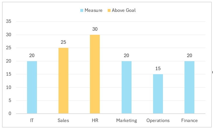
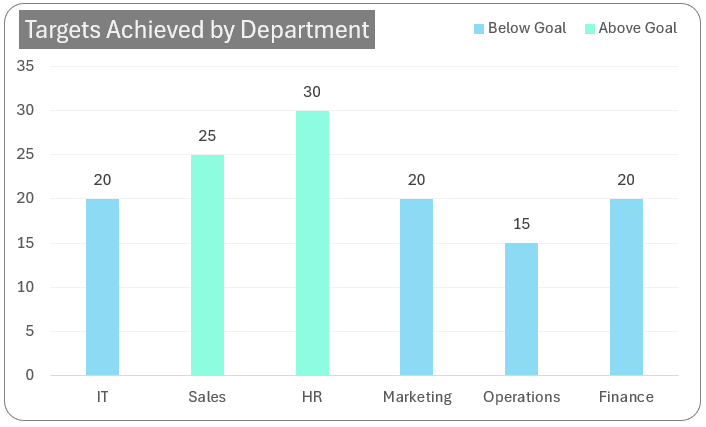
our chart looks like this:
Step 04: Update legends
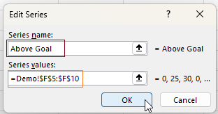
Notice here, that the legend Measure is not very sensible, to modify this, (1) Right click and (2) Select Data and (3) modify the series name to Below Goal
The names can be according to the analysis you are building. With this our chart that highlights the columns above a given target is ready!
Try the dynamic nature of this chart by modifying the data and the target to see the chart getting updated accordingly.
Check our 1-page, downloadable illustrative guide explaining all the steps for a quick reference.

If you have any feedback or suggestions, please post them in the comments below.


