In today’s post, in continuation with the dynamic chart creations, let us look at creating a chart that can highlight the maximum and minimum value columns in Excel.
Before we begin, we highly recommend reading our previous blog on dynamic chart creation, before you get into today’s post.
A column chart is very effective in analyzing categories based on a measure. An example would be identifying the department with the min/max number of employees.
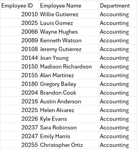
We’ll use raw data with a list of employees’ ID, their Names, and Departments.
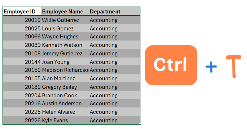
As a preparatory step, always convert your data into an Excel Table (we’ll call this Data), this increases formula readability and scalability when the data expands.
Now we have our base data ready, let’s dive right in!
Please read our blog on how to create a dynamic column chart to help get started with this blog post.
Step 01:
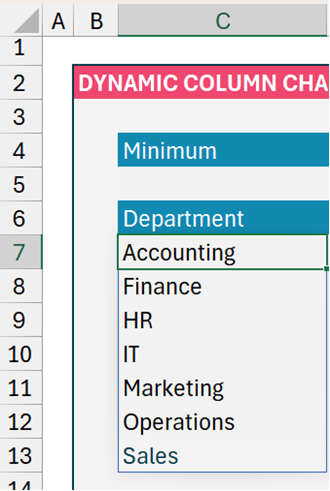
We’ll use the UNIQUE function to get the distinct list of departments from our Data table, in cell C7:
=UNIQUE(Data[Department])This will give us:
Step 02:
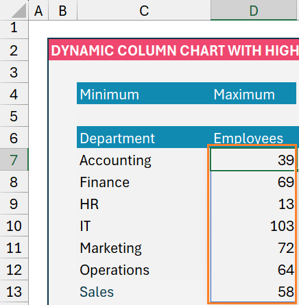
We’ll get the corresponding count of employees against each of these departments by using the COUNTIF function.
Since the objective is to create a dynamic chart, the data must also be dynamic. For this, we’ll include a # at the end of the cell reference, C7. Our formula in cell D7 will be:
=COUNTIF(Data[Department], C7#)This ensures that if more departments are added in the future, the formula is dynamic to include those data as well.
Step 03:
Before we get to addressing the minimum and maximum values, let us create a column chart:
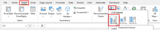
Click on any cell inside the data, go to Insert, and select the Clustered Column chart:
This will generate the default Column chart in Excel, in our example, we used a chart template that was pre-saved.
Stay tuned to Data to Decisions, for a dedicated blog post on how to create templates in Excel Charts soon.
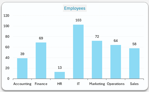
Now, the created chart would be:
Step 04:
We’ll make this chart dynamic to handle additional data to our raw data.
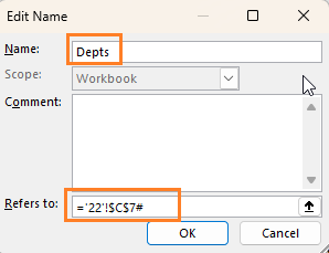
a. Firstly, click on cell C7 and create a named range that is dynamic (similar to step 2):
b. Similarly, assign a name to employee counts and make the range dynamic:

Step 05:
We have created the required Named Ranges, all that’s needed now is to point to our column chart to refer to these ranges.
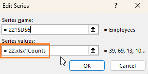
a. For this, right-click on the chart, select Data, go to the series, and include the named range we created:
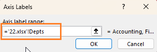
b. In the same way, edit the horizontal axis label name:
Step 06:
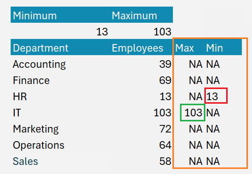
Now let us highlight the min/max values. Let us first identify the minimum and maximum from the count,
In cell C5 we use the MIN (returns the minimum value from a list) as shown:
=MIN(D7#)In cell D5 the MAX (returns the maximum value from a list) function:
=MAX(D7#)
Step 07:
Now, we need to create two series for Maximum and Minimum for chart creation.
If, the employee count (from cell D7) is equal to the max value (in cell D5), then we need the maximum value, else we’ll need an N/A error.
=IF(D7# = $D$5, $D$5, “NA”)In the same way, let us get the minimum series:
=IF(D7# = $C$5, $C$5, “NA”)We’ve got the Max/Min series:
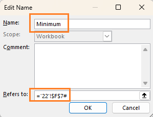
Step 08:
This will give us all the data required to highlight the Min and Max columns in our column chart. Similar to assigning names for the Department and Employees column, we’ll create names for the Maximum and Minimum columns:
For maximum:
For minimum:
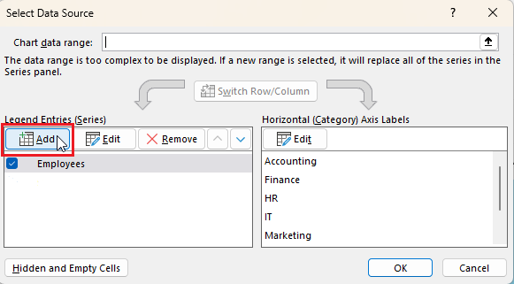
Step 09:
These new series has to be included in the chart:
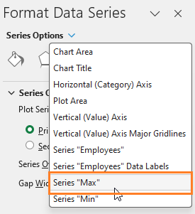
a. Right click and select data, add additional series:
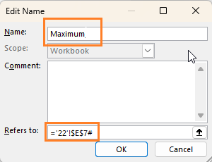
b. Create a new series named “Max” and the series value as the named range we created for the same, “Maximum”
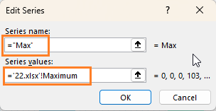
By default, the series value will show the cell reference as “ =’22.xlsx’!$E$7” change that to the named range we created for the series.
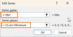
c. Create a new series named “Min” and the series value as the named range we created for the same, “Minumum”
Step 10:
After adding the series, the column chart will look like this:
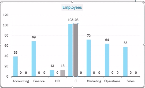
We will need to edit the chart to make it highlight the Max/Min columns only.
To achieve this, follow the simple steps given below:
a. Click on one of the series and go to “Format Series”, this will open up a new pane to the right:
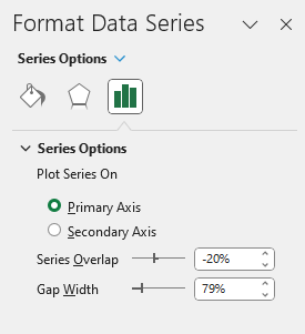
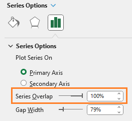
b. Since we need only one series plotted on this column chart, we will increase the Series overlap to 100%:
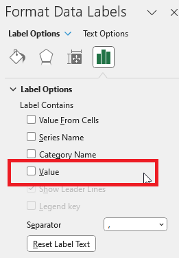
c. We can remove the multiple labels from appearing by right-clicking on the series, “Format Data Labels” by unchecking the “Value” as shown:
d. Similar to step b, go to “Max” series and increase the Series Overlap to 100%
e. Now the series is overlapped perfectly”

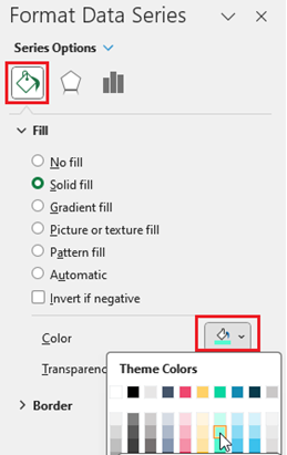
f. We need to change the color to the Min and Max, to do that, select the “Min’ series, go to “Fill” and change to a different color of choice:
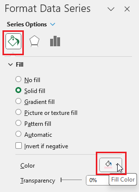
g. In the same way, change the color of the “Max” series:
Clear up any labels present as shown earlier to make the chart readable.
That is all, your dynamic column chart that highlights the Maximum and Minimum value columns is created!
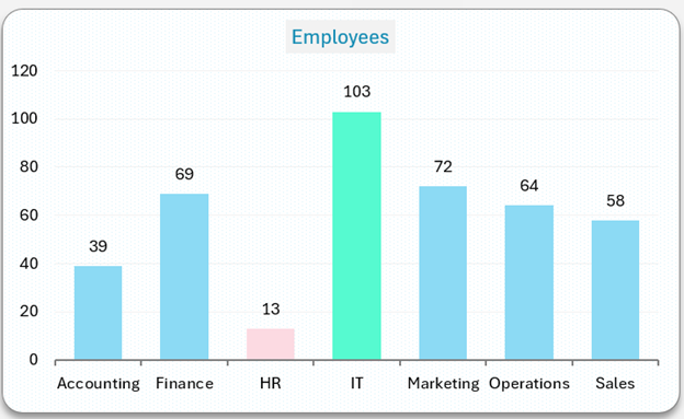
This dynamic nature of the chart will adapt to additions to the raw data. To test it, try changing the minimum and maximum values and see the chart highlight Max/Min automatically.
Ready to save time on your next presentation? Explore our Data Visualization Toolkit featuring multiple pre-designed charts, ready to use in Excel. Buy now, create charts instantly, and save time! Click here to visit the product page.
We have a dedicated YouTube video explaining the steps to create a column chart that highlights min/max columns, check it out:
If you have any feedback or suggestions, please post them in the comments below.


