This blog is about creating a column chart with a dynamic number of columns.
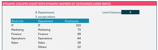
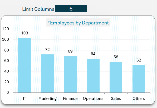
Consider the below chart, where the number of columns is limited to 5 based on input from the user.

Here, we can see that the column is limited to 6, the chart displays the top 5 departments, and the rest of the departments are combined and displayed as “Others”. This technique will make your visualization concise and simple especially when you have several columns with very little contribution to the total.
Please note: We have published a series of blogs on creating dynamic column charts, sort a dynamic column chart based on measure, and limit a dynamic column chart based on measure value. Please read them as we’ll use some of the techniques used in those blogs here.
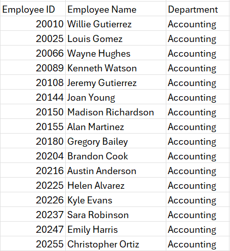
Consider a sample data where we have a list of employees’ ID, their Names, and Departments.
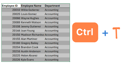
As a preparatory step, always convert your data into an Excel Table (we’ll call this Data), this increases formula readability and scalability when the data expands.
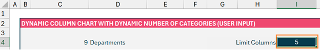
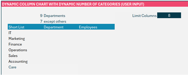
We’ll need a couple of numbers to understand the steps as we go along, so firstly, get a count of unique department names in the cell C4:
=COUNTA(UNIQUE(Data[Department]))The UNIQUE function gets a distinct list of departments, while COUNTA counts the number of non-empty cells.
Let us get the user input to limit the number of columns in cell I4:
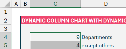
We also need the list of columns that are from the raw data except the Others in cell C5.
=IF(I4<C4, I4-1, C4)We have these two outputs in the cells as shown:
With this, let’s get started!
Step 01:
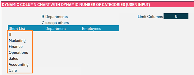
Find out the short list of departments using the LET function to return all the departments sorted by the count of employees in them in descending order.
=LET(
Departments, UNIQUE(Data[Department]),
Counts, COUNTIF(Data[Department], Departments),
SORTBY(Departments, Counts, -1)
)
Let us understand the formula above,
- First, we need a distinct list of departments in our “Data” table using UNIQUE, and let us call them Departments
- Next, we need the count of the number of employees where we use the COUNTIF function to count the departments in our “Data” table and we check this against the distinct list of departments, which we named in step a. We’ll name this as Counts.
- After defining the two components we needed, the result we need is arrived by using a SORTBY function to sort the Departments by Counts in Descending order.
Step 02:
But, the above formula does not take into account the column limit, let us look at how to incorporate that:
We will wrap the LET function with a CHOOSEROWS function and SEQUENCE function to get the rows where the column numbers are less than the chosen limit (in cell C5)
=CHOOSEROWS(LET(
Departments, UNIQUE(Data[Department]),
Counts, COUNTIF(Data[Department], Departments),
SORTBY(Departments, Counts, -1)),
SEQUENCE(C5))
CHOOSEROWS returns a number of rows from a given array while the SEQUENCE function returns a sequence of numbers.
Step 03:
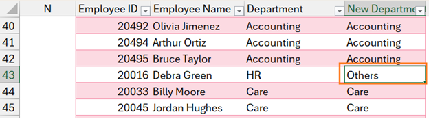
Now, we’ll go to the raw data and include an additional column, New Department, and do the following steps: (We have covered the detailed steps on this in dynamic column chart limited by measure value)
a. First, we’ll use a MATCH function to look up the department from the table and look up in the shortlist and we’ll look for an exact match.
=MATCH([@Department], $C$7#,0)This returns the position of the department in the corresponding short list, if there is no match this returns a #N/A error.
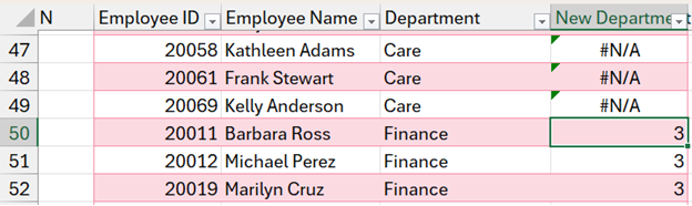
b. Now, we can wrap this formula within an ISERROR function which returns a Boolean whenever it encounters an error.
=ISERROR(MATCH([@Department], $C$7#,0))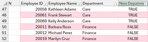
c. We use an IF function to name the departments that have a TRUE from the previous step as “Others” since these are NOT present in our shortlist.
=ISERROR(MATCH([@Department], $C$7#,0)), “Others”, [@Department])By this, the new Department column will look like this:
Step 04:
Now, we’ll focus on getting the list of departments for our column chart. We’ll tweak the LET function from our Short List but, instead of the Department, we’ll use the New Department from our Data table.
And use SORTBY to sort our Departments based on the Counts.
=LET(
Departments, UNIQUE(Data[New Department]),
Counts, COUNTIF(Data[New Department], Departments),
SORTBY(Departments, Counts, -1)
)
Step 05:
The count of Employees is a straightforward step, with COUNTIF as shown:
=COUNTIF(Data[New Department], D7#)Now the data we need for the chart is dynamic based on the limit of measure value is arrived:
Let us build our chart,
Since we’ve extensively covered this in our previous blogs, we recommend reading them to understand the detailed step-by-step process of creating a dynamic chart.
The overview of the steps are:
1. Select the data and create a clustered column chart
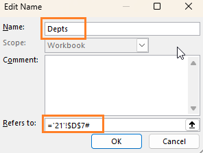
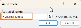
2. Define names for Department from D7 as Depts and make the range dynamic by using a #;
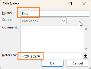
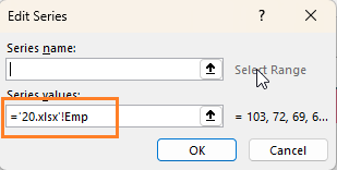
3. Similarly, for Employees from E7 as Emp and
4. Now, we just need to point our column chart to refer to these ranges. For that, right-click on the chart select Data, and click on the series to edit the range:
Similarly for the horizontal axis series,
Following the above steps will make the column chart dynamic and limit it to an arbitrary number of columns.
Ready to save time on your next presentation? Explore our Data Visualization Toolkit featuring multiple pre-designed charts, ready to use in Excel. Buy now, create charts instantly, and save time! Click here to visit the product page.
We have a dedicated YouTube video explaining the steps to create a column chart limited by columns
If you have any feedback or suggestions, please post them in the comments below.


