This post is all about creating a dynamic column chart in Excel from tabular data.
A dynamic chart adjusts automatically when you add or modify data, ensuring your visualizations remain up-to-date without manual intervention.
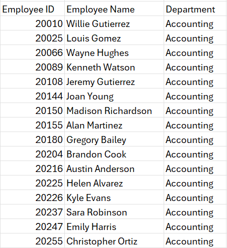
Consider a sample data with a list of employees’ ID, their Names, and Departments.
What do we aim to achieve?
We’ll look at how to transform this data into a dynamic column chart that will summarize the count of employees in each department.
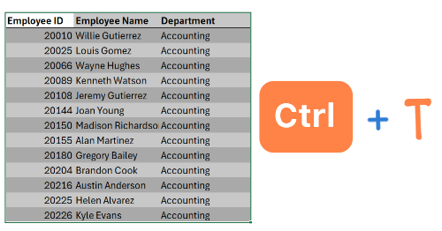
As a preparatory step, always convert your data into an Excel Table, this increases formula readability and scalability when the data expands.
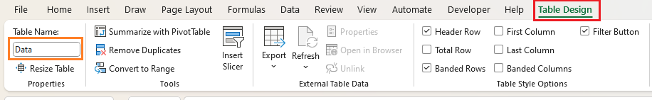
We’ll call our sample data as“Data”
To build a column chart, we need the list of departments on the X-Axis and the corresponding count on the Y-Axis.
Step 01:
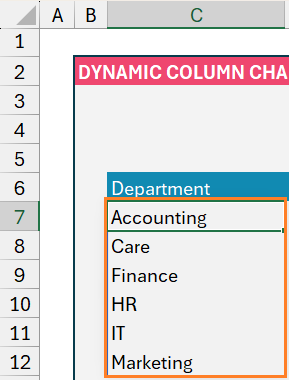
For X-Axis, we’ll use the UNIQUE function to get the distinct list of departments from our Data table:
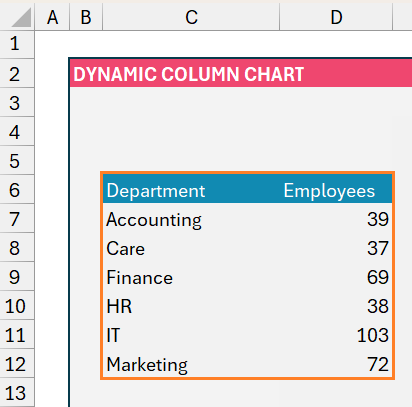
=UNIQUE(Data[Department])In cell C7 onwards, the list of departments will be populated:
Step 02:
We’ll get the corresponding count of employees against each of these departments by using the COUNTIF function.
The syntax for this is

In our example, the range will be the Department in our table “Data” and the criteria will be every department in this table, which is arrived through step 1 in cell C7 onwards. Which can be obtained by:
=COUNTIF(Data[Department],C7)Since the objective is to create a dynamic chart, the data here also needs to be dynamic. For this, we’ll include a # at the end of the cell reference, C7. Our formula in cell D7 will be:
=COUNTIF(Data[Department],C7#)This ensures that if more departments are added in the future, the formula is dynamic to include those data as well.
So, our data for creating the chart is:
Step 03:
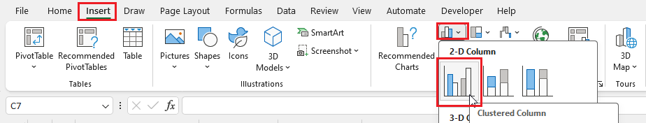
Let us use this data to create our column chart. Click on any cell inside the data, go to Insert, and select the Clustered Column chart:
Step 04:
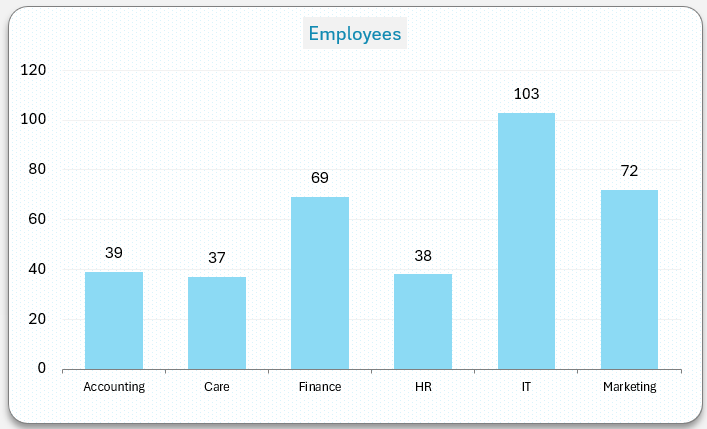
This will generate the default Column chart in Excel, in our example, we’ve created a template chart and will use the same (this is optional).
Stay tuned to the Data to Decisions series, we’ll create a dedicated article on how to create templates in Excel Charts soon.
Now, the created chart would be:
Step 05:
Let us look at how to modify this to ensure that the chart is dynamic and can handle additional data or modifications to the existing raw data from the table “Data”.
To do this, we need to include additional steps to point our data to the dynamic array of departments and counts. Let’s get into this:
Step i.
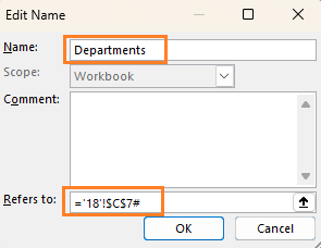
Click on cell C7, go to Formulas, Define Name, and assign a Name to this series of values as “Departments”. Similar to step 2, to refer to a dynamic array include a # to the cell reference as shown:
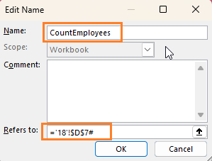
Similarly, click on D7 and create a Named Range for the count of employees and name it CountEmployees as shown below:
Step ii.
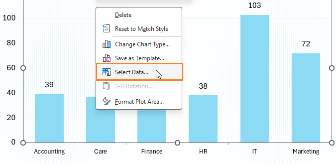
We have created the required Named Ranges, all that’s needed now is to point our column chart to refer to these ranges.
- For this, right-click on the chart and select Data:
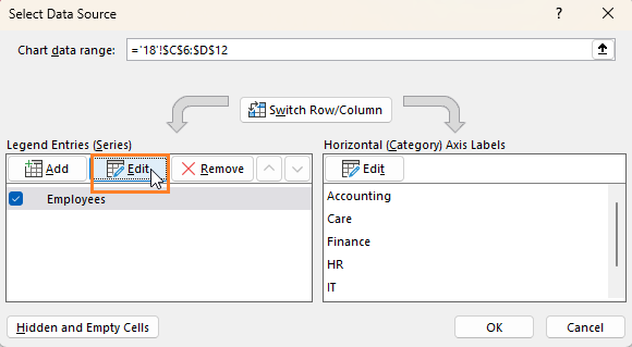
- Click on Employees series and edit:
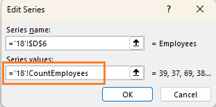
- Now, keep the sheet name as it is, (in my example it is 18) and change the ranges to the Named Range created i.e. CountEmployees:
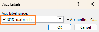
- Similar to the above steps, edit the X-axis:
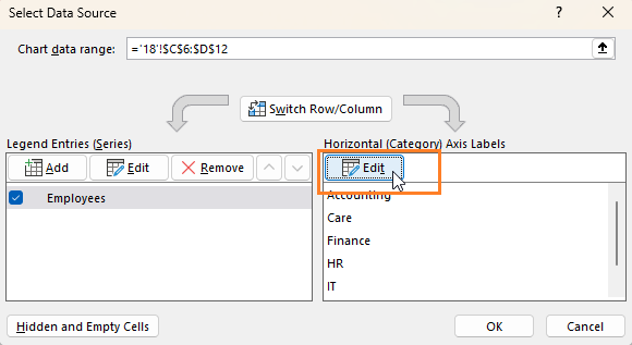
- Assign the Named Range, Departments to this:
Step iii.
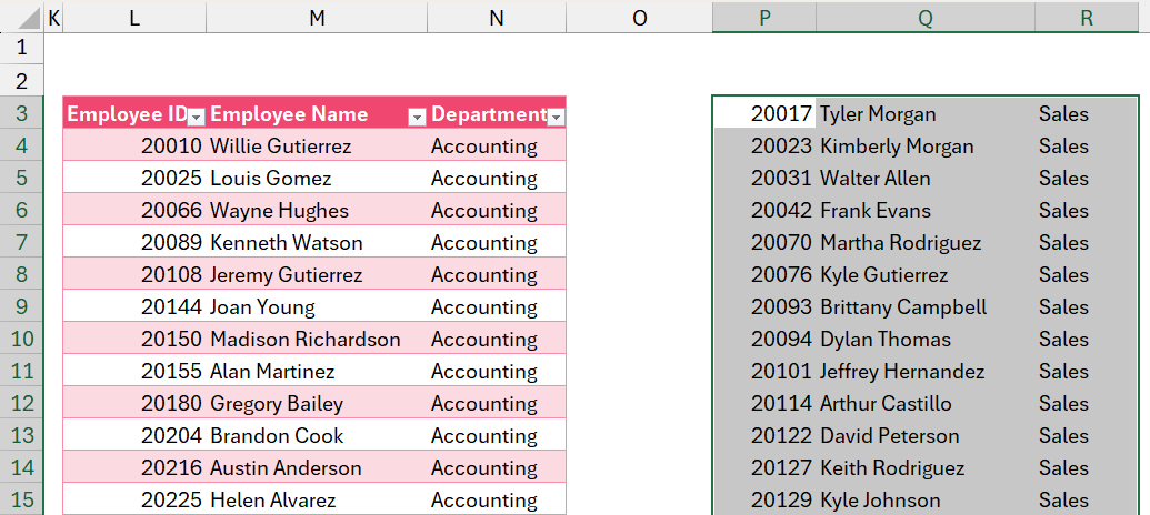
Now we have modified the chart to point to a dynamic range, let us test it by adding additional data to our “Data” table.
To do this, copy additional data for departments Sales, Operations, and Product and pasted it at the end of the existing data (do this by selecting the immediate empty cell next to the table and pasting only values)
Step iv:
We can see these new departments getting included in the chart:
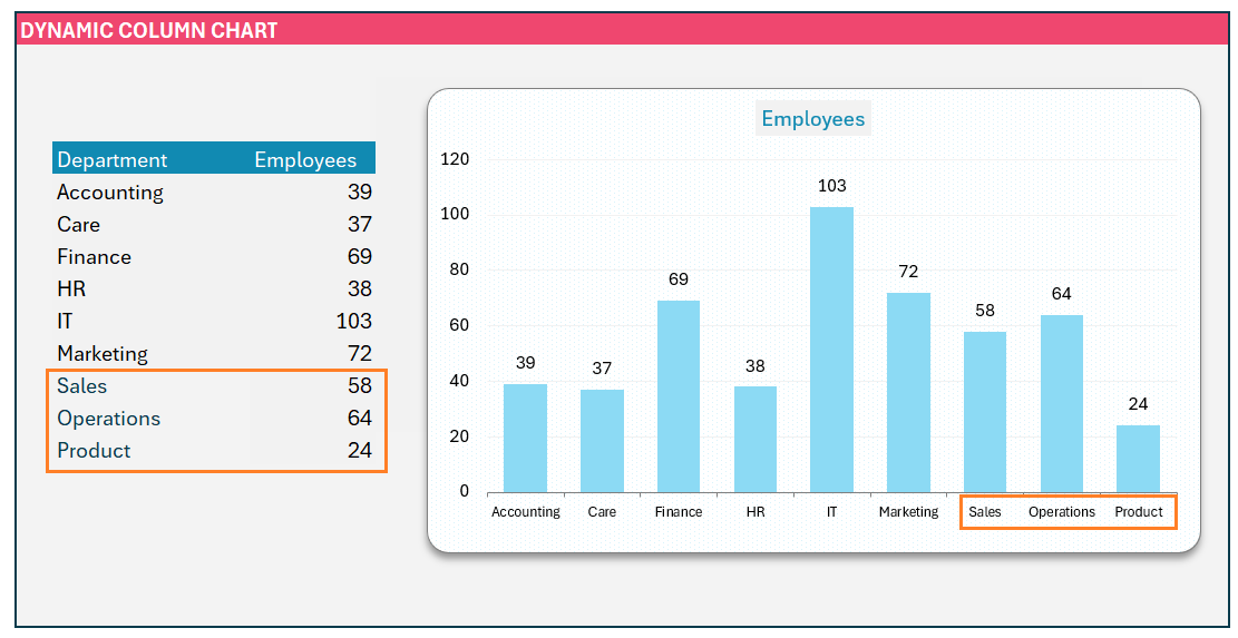
This dynamic nature of the chart accommodates any modifications to the existing data. To test it, try changing the department of select rows and try it for yourself to visually see the change in the chart.
Ready to save time on your next presentation? Explore our Data Visualization Toolkit featuring multiple pre-designed charts, ready to use in Excel. Buy now, create charts instantly, and save time! Click here to visit the product page.
Check our video on creating a dynamic column chart in Excel:
If you have any feedback or suggestions, please post them in the comments below.


