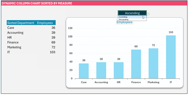
In this blog, we’ll look at how to create a dynamic column chart that can be sorted (ascending or descending) based on the measure value as shown here:
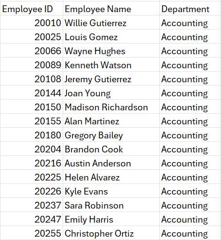
Consider a sample data with a list of employees’ ID, their Names, and Departments.
What do we aim to achieve?
The purpose of this type of column chart is to order the categories based on the measure. In this example, order the departments based on the count of employees in each department.
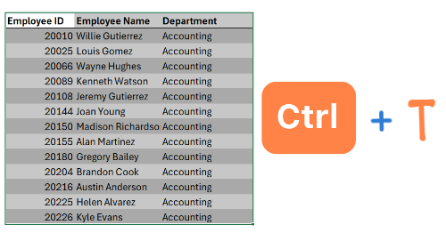
As a preparatory step, always convert your data into an Excel Table (we’ll call this Data), this increases formula readability and scalability when the data expands.
We need the list of departments on the X-axis and the corresponding count on the Y-axis.
This is explained in detail in our previous blog post on creating a dynamic column chart, we recommend giving it a read before we begin our steps to create a column chart sorted by measure.
Step 01:
For X-Axis, we’ll use the UNIQUE function to get the distinct list of departments from our Data table:
=UNIQUE(Data[Department])In cell C7 onwards, the list of departments will be populated:

Step 02:
We’ll get the corresponding count of employees against each of these departments by using the COUNTIF function.
Since the objective is to create a dynamic chart, the data here also needs to be dynamic. For this, we’ll include a # at the end of the cell reference, C7. Our formula in cell D7 will be:
=COUNTIF(Data[Department],C7#)This ensures that if more departments are added in the future, the formula is dynamic to include those data as well.
So, our data for creating the chart is:
Step 03:
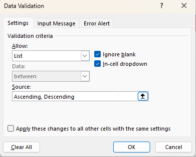
The objective of this blog is to be able to sort the column chart by measure, so in cell J4 create a simple drop-down with Ascending and Descending as values.
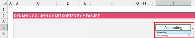
Note: To create a drop-down like this, go to Data, Data Validation and create a list of values:
Step 04:
Now, based on the user’s input for sort order in cell J4, how do we sort the departments?
Initially, we’ll include a formula as stated below in cell J5 for understanding:
=IF(J4="Descending", -1,1) Step 05:
In column F7, we’ll use the SORTBY function to sort the departments (from cell C7 onwards) based on the count of employees (from cell D7 onwards). We use the # symbol to dynamically reference these columns.
Our formula would be:
=SORTBY(C7#, D7#, J5) 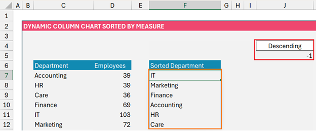
We have to now calculate the count based on this sorted order again as in step 2. But to minimize the number of columns and formulas used, let us use a more dynamic function like the LET function.
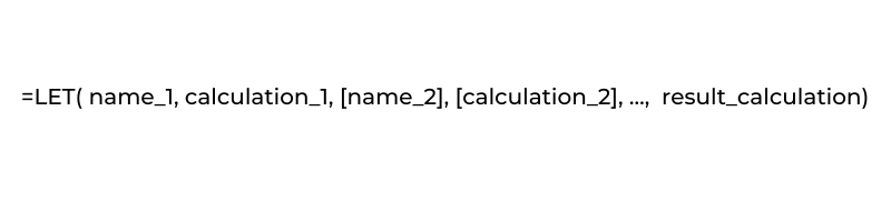
This function allows us to assign names to parts of your formula.
Our objective here is to sort the distinct department list by the count of employees and order it based on the user input. Let’s use the LET function for this in our next step.
Step 06:
In cell C7, let us use the LET function as given below:
=LET(Departments, UNIQUE(Data[Department]),
Counts, COUNTIF(Data[Department], Departments),
Order, IF(J4=”Descending”, -1, 1),
SORTBY(Departments, Counts, Order))
Let us understand the formula above,
- First, we need a distinct list of departments in our “Data” table using UNIQUE, and let us call them Departments
- Next, we need the count of the number of employees where we use the COUNTIF function to count the departments in our “Data” table and we check this against the distinct list of departments, which we named in step a. We’ll name this as Counts.
- Now, we need to order the above based on either ascending or descending (based on input in cell J4. Let’s name this Order.
- After defining the three components we needed, the result we need is a SORTBY of Departments (distinct departments), by Counts (count of employees) and the Orders (ascending or descending).
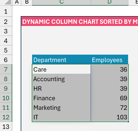
Using this formula the Sorted Department will be:
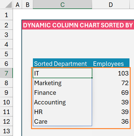
Please note that the Employee count will return count based on the corresponding department in column C, so we do not change anything in column D.
Step 07:
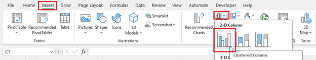
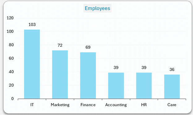
Now with this data, which is dynamic when a user selects a sort order, let us create a column chart:
The steps to creating a dynamic column chart are explained in detail in our blog on creating dynamic column charts, please check the same.
Step 08:
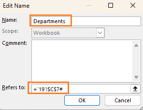
To make this dynamic, we’ll create Named Ranges:
Click on cell C7, go to Formulas, Define Name, and assign a Name to this series of values as “Departments”. Similar to step 2, to refer to a dynamic array include a # to the cell reference as shown:
Similarly, create a named range for the count of employees as “Counts”,

Step 09:
We have created the required Named Ranges, all that’s needed now is to point to our column chart to refer to these ranges.
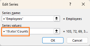
A. For this, right-click on the chart select Data, and click on the Employees series to edit the range to point it to the Named Range created “Counts”,
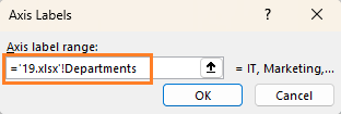
B. Similarly, edit the range for the horizontal axis:
Step 10.
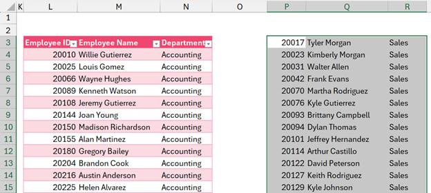
Now we have modified the chart to point to a dynamic range, let us test it by adding additional data to our “Data” table.
To do this, I’ve copied some additional data I have for departments Sales, Operations, and Product and pasted it at the end of my existing data (do this by selecting the immediate empty cell to the table and pasting only values)
We can see these new departments getting included in the chart and are sorted based on the sort order chosen by the user:

This dynamic nature of the chart will also include any modifications done to the existing data. To test it, try changing the department of select rows and try it for yourself to visually see the change in the chart.
Ready to save time on your next presentation? Explore our Data Visualization Toolkit featuring multiple pre-designed charts, ready to use in Excel. Buy now, create charts instantly, and save time! Click here to visit the product page.
We have dedicated YouTube video explaining the steps to create a column chart sorted by measure:
If you have any feedback or suggestions, please post them in the comments below.


