Employee Analysis – 2022
Learn how to analyze the Revenue Per Employee metric, its impact post-pandemic, and key factors to consider. Explore insights from top companies.
Learn how to analyze the Revenue Per Employee metric, its impact post-pandemic, and key factors to consider. Explore insights from top companies.

This article will cover the key components of an effective Recruitment Reporting setup such as Purpose of Recruiting Reporting, Meaningful Recruiting Metrics, Actionable Analyses to perform, Blueprint for a successful reporting platform, Sample Recruiting Reports and Dashboards, HR Reporting Tools
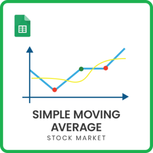
Download Simple Moving Average Google Sheets template to build the technical indicator for any stock. Customize the time period and interval of the stock history. Just type in Stock ticker symbol and view the simple moving average. Customize for any length of moving average.

Prepare for the year ahead with ease by creating a customized 2025 calendar using Google Sheets. Our collection offers 25 unique design templates for your

Download this free Excel template and create your own personalized calendars in Excel. This calendar template contains 25 designs that can be used to create calendars for any year.
Explore nine practical xlookup examples that demonstrate the incredible flexibility of XLOOKUP, showing you how to maximize its potential for solving real-world challenges.

Use this simple excel template to enter your predictions for the U.S Presidential elections for 2024, and let the template calculate the electoral votes, chances of each candidate winning and any scenarios for a tie result.
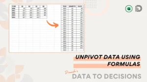
Unpivoting data is a common task in data transformation. In this article, we will learn how to use simple formulas to unpivot.

14 practical uses of the new GROUPBY function in Microsoft Excel
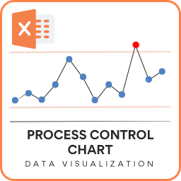
In this blog post, we will cover the following topics: About Statistical Process Control Charts A Control Chart or Statistical Process Control chart or SPC
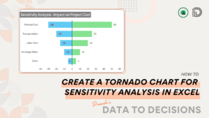
In this post, you’ll learn the simple steps required to create a tornado chart for sensitivity analysis in Microsoft Excel.
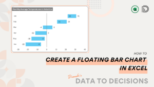
Learn how to create a floating bar chart in Excel to visually compare ranges in data effortlessly. A truly unique chart to your reports!