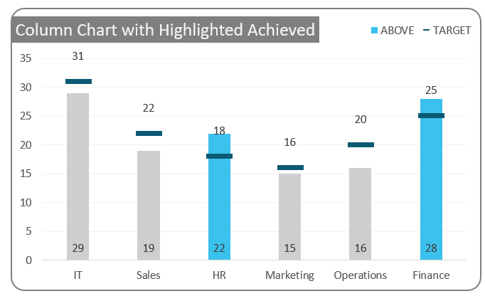
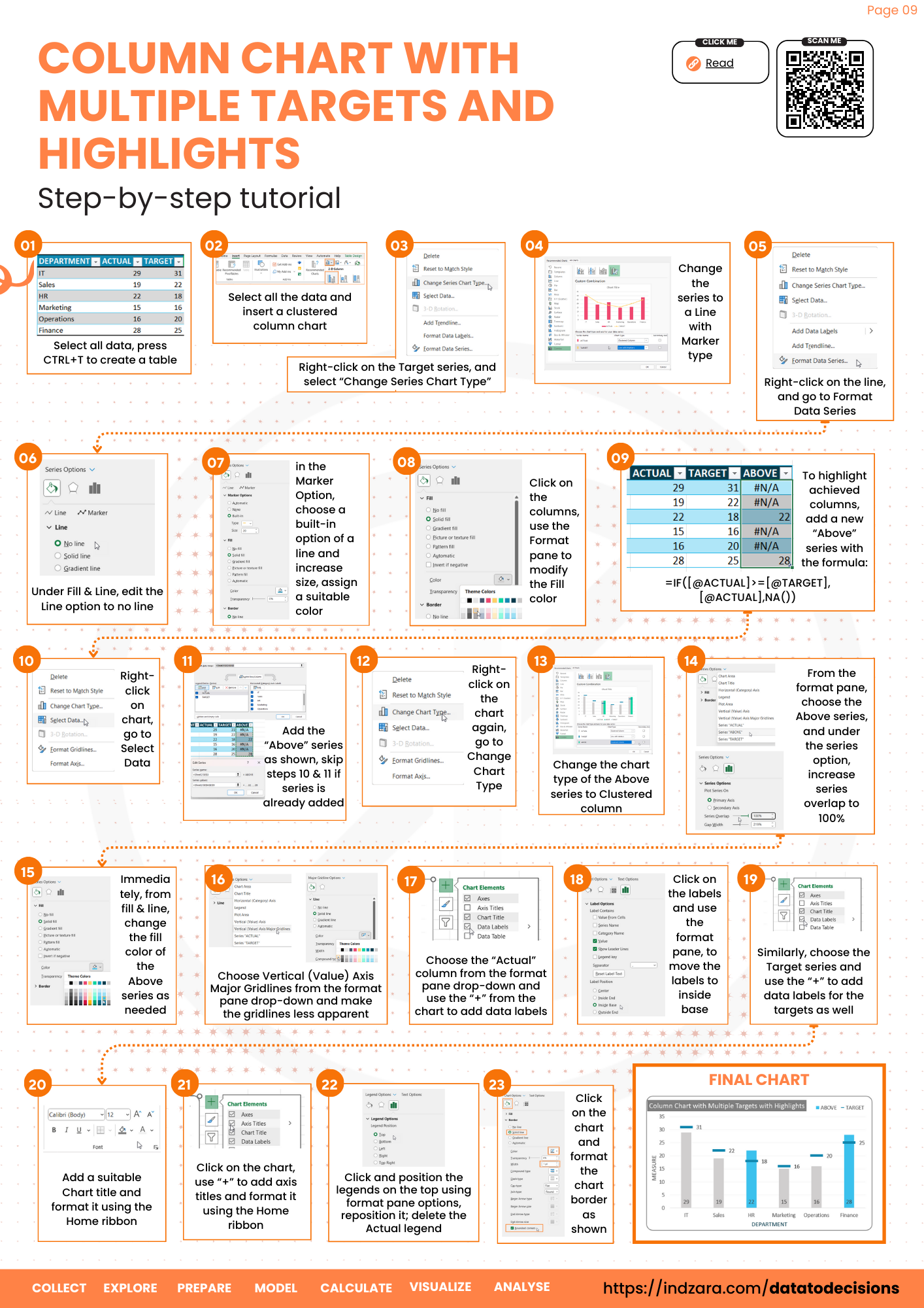
In one of our posts, we created a column chart with multiple targets. What if we need to highlight the columns that have achieved the set targets? This blog addresses that.
Consider a sample data of departments and a measure with their respective target values:
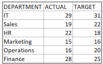
Our goal is to create a column chart with target lines for each of these values & to highlight only those columns where the target is achieved.
Let’s get started.
Ready to save time on your next presentation? Explore our Data Visualization Toolkit featuring multiple pre-designed charts, ready to use in Excel. Buy now, create charts instantly, and save time! Click here to visit the product page.
Step 01:
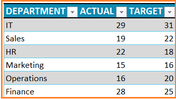
Let’s create a table for this data by selecting all the data and CTRL + T.
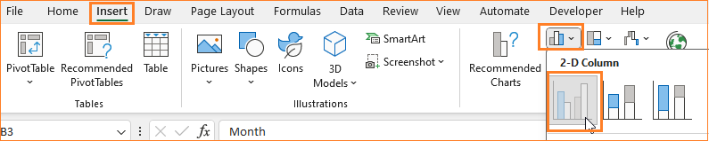
Step 02:
Select all the data and insert a clustered column chart.
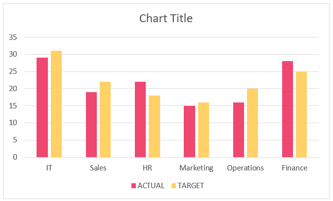
This creates a default column chart with two series:

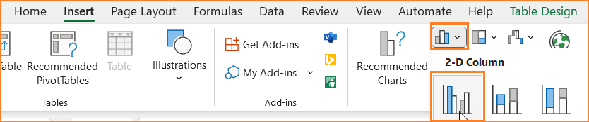
Step 03:
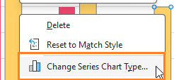
Right-click on the Target series, and select “Change Series Chart Type” to a Line with Markers as shown:
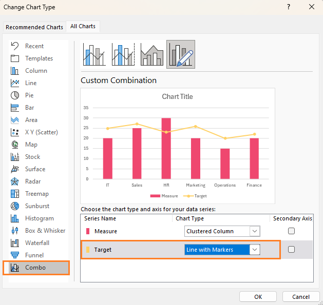
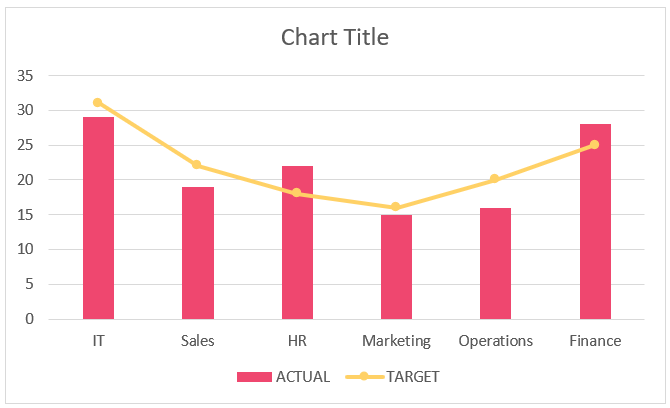
This creates a chart that
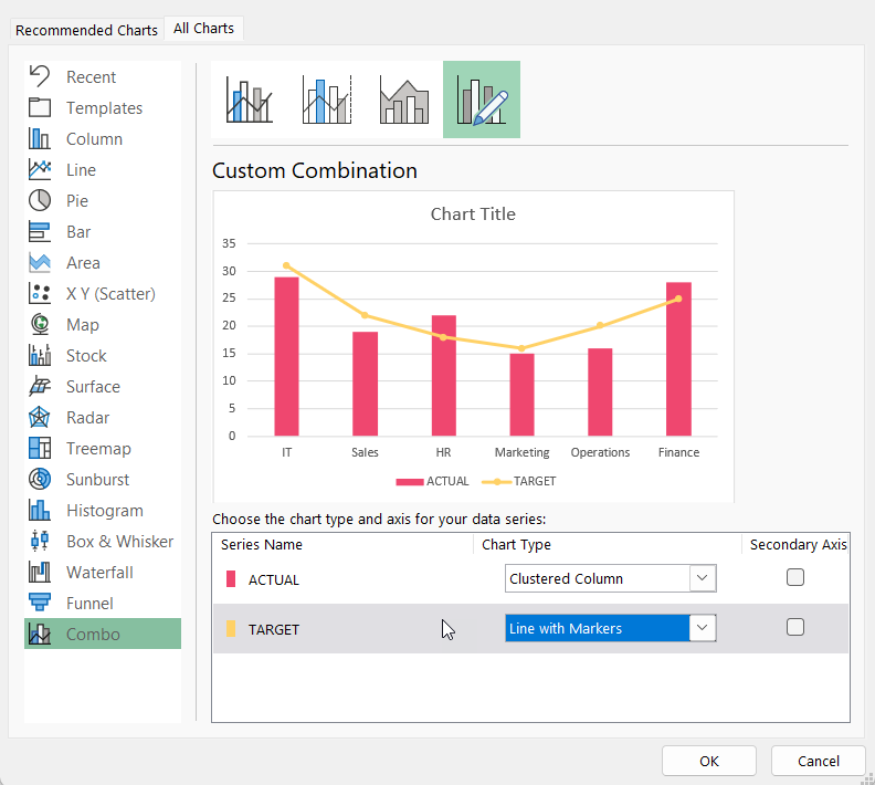
is a combination of columns and a line with markers:
Step 04:
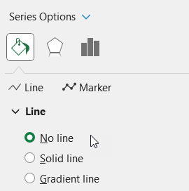
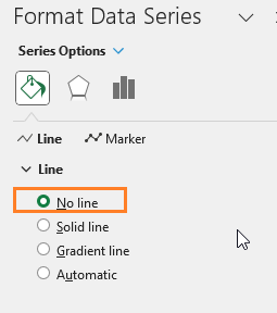
To modify the line to a bar, right-click on the line, go to Format Data series, and make the following modifications:
i. Under Fill & Line, edit the Line option to no line:
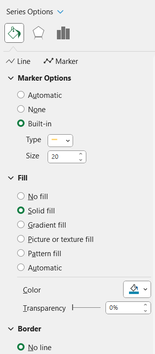
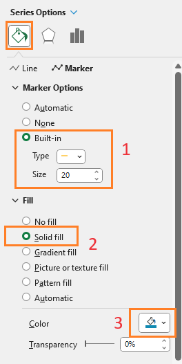
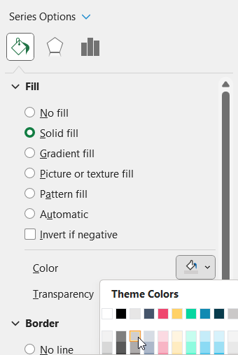
ii. Then in the Marker Option, choose a built-in option of a line and increase size accordingly, assign a color in the fill section as shown.
iii. Click on the columns, in the Format pane, and modify the Fill color according to your needs.
Step 05:
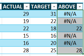
It’s time to bring in the highlights to this chart. For this, add a new “Above” series, which has the formula as shown below:
=IF([@ACTUAL]>=[@TARGET],[@ACTUAL],NA())The above column contains only values that have reached the targets or more.
With this, the data will be:
Step 06:
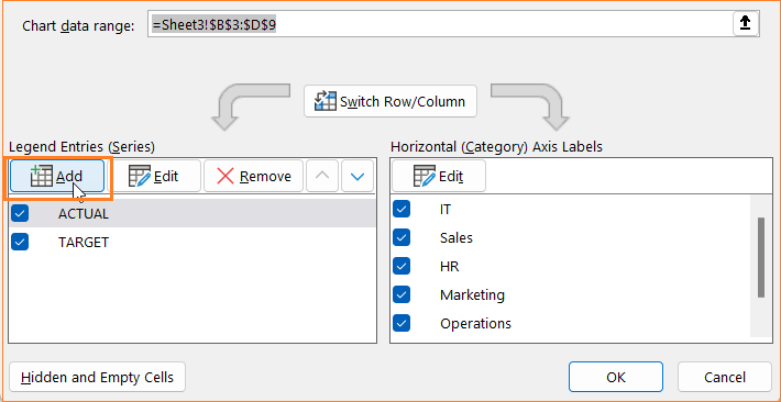
Now, we’ll add this new series to our chart. For this, follow the steps below:
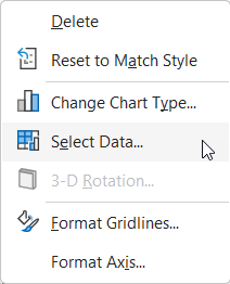
i. Right-click on the chart, go to Select Data
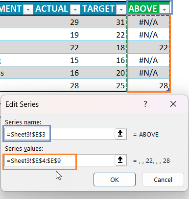
ii. Add the “Above” series as shown:
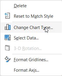
iii. Right-click on the chart again, go to Change Chart Type
iv. Change the chart type of the Above series to a Clustered column
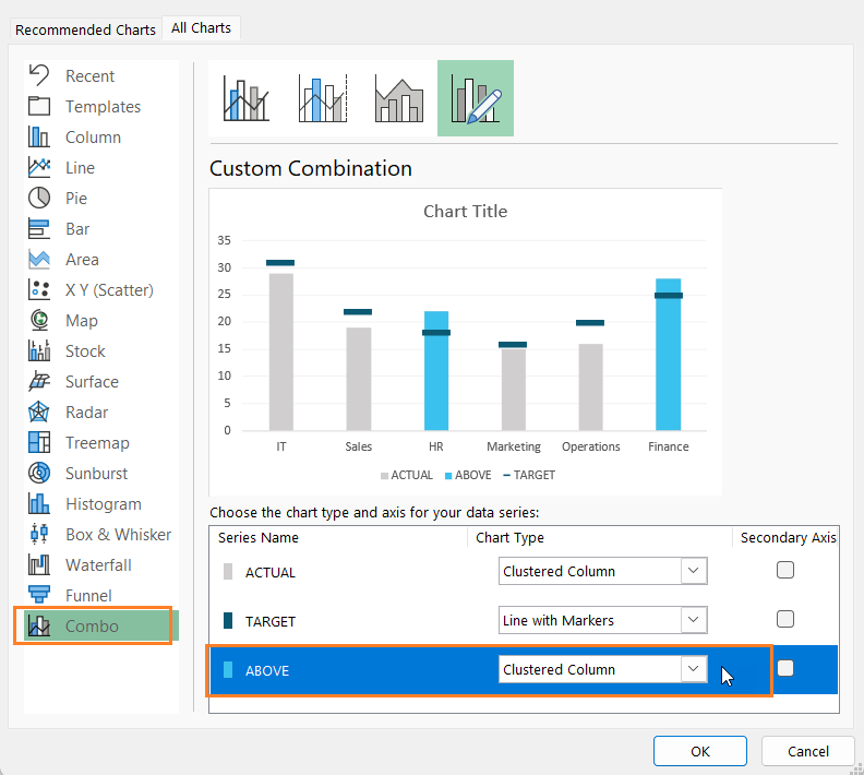
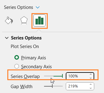
v. From the format pane, choose the Above series, and under the series option, increase series overlap to 100%
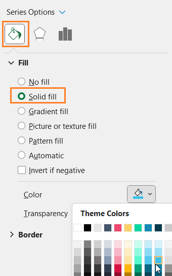
vi. From fill & line, change the fill color as needed
With this, the chart looks something like this:
Step 07:
Now, it is time for some final formatting
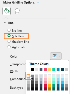
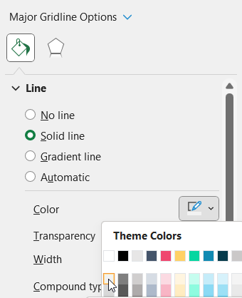
i. Modify the gridline color to make it less apparent by
(1) Choose Vertical (Value) Axis Major Gridlines from the format pane drop-down

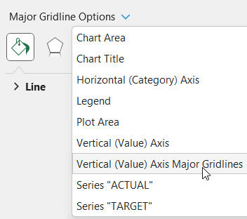
(2) format gridlines and change the color:
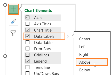
ii. Add Data labels to the Actual columns (1) choose the “Actual” column from the drop-down, a “+” icon appears to the top right of the chart:
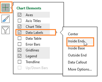
iii. Similarly, click on the lines and use the “+” to add data labels for the targets as well
iv. Add a suitable Chart title and format it using the Home ribbon
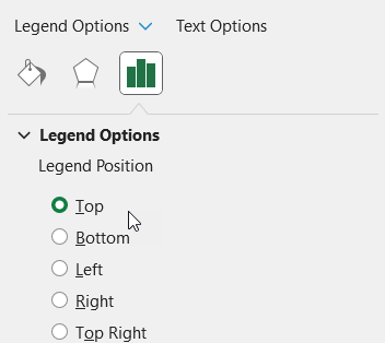
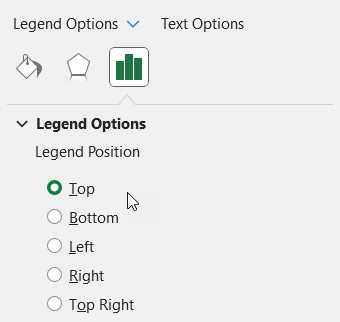
v. Click and position the legends on the top; delete the Actual legend
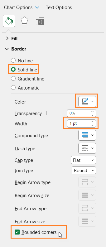
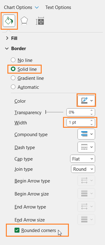
vi. Click on the chart and format the chart border as shown
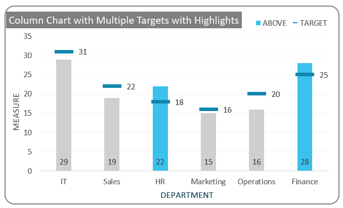
With this, the column chart with highlighted above the target columns is ready!
Check our 1-page, downloadable illustrative guide explaining all the steps for a quick reference.
If you have any feedback or suggestions, please post them in the comments below.


