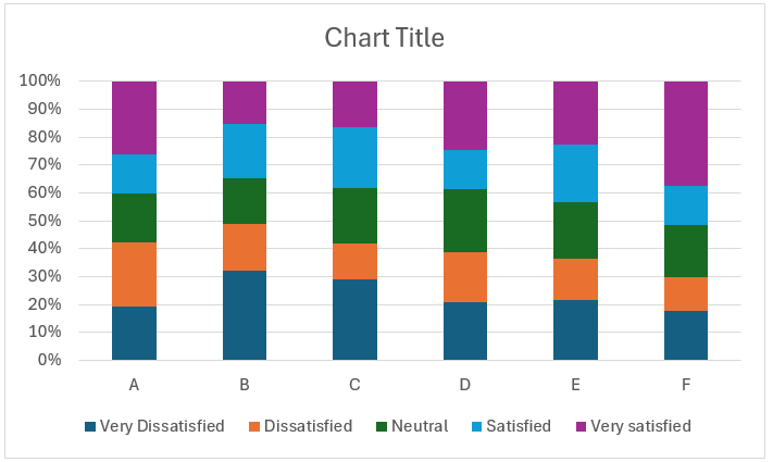
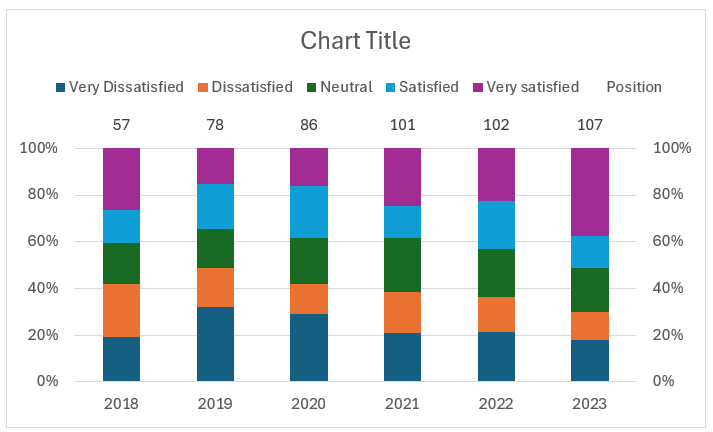
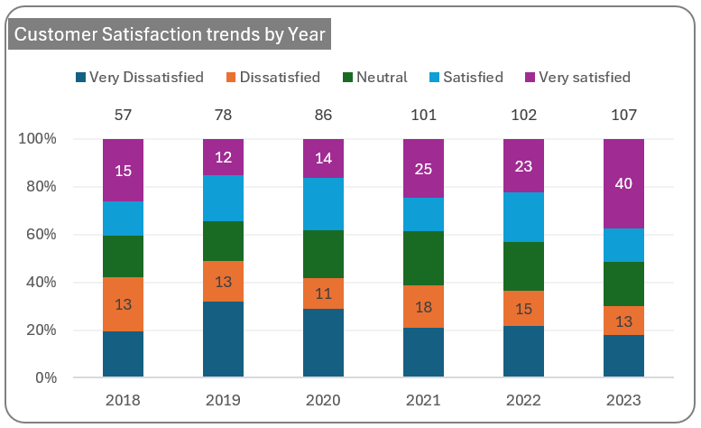
This post helps create a simple 100% stacked column chart which also displays the totals. A sample chart is shown below which we’ll create.
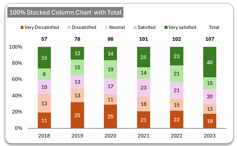
To understand when or in which scenarios to use a 100% stacked column chart instead of a stacked column chart, let us look at the data used to create the above chart.
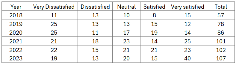
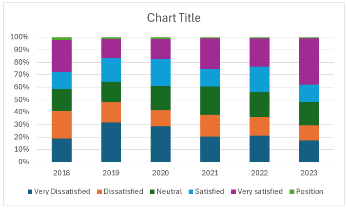
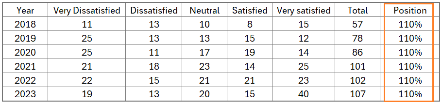
The sample data is of customer feedback for a period of 6 years while the responses varied from Very Dissatisfied to Very Satisfied.
Let us look at the Dissatisfied responses count for the years 2018 and 2023: they are the same, 13. If this data is plotted on a stacked column chart the height of the Dissatisfied series for 2018 and 2023 will remain the same. Using this for any analysis won’t be ideal.
Let us understand why.
In 2018, the count 13 is from a total of 57 respondents whereas in 2023 the count 13 is from a higher total respondents of 107.
That is in relation to the total number of responses, 2023 has fewer dissatisfied customers relative to 2018. Hence, converting these into percentages gives an accurate representation as depicted in the 100% stacked column chart shown below. (Notice the Dissatisfied portion of each the year 2018 is longer than that of 2023.)
The height of every category in a 100% stacked column is always the same and each component is differentiated by the size relative to that. Whereas, in a stacked column chart, the height of each column is different.
Ready to save time on your next presentation? Explore our Data Visualization Toolkit featuring multiple pre-designed charts, ready to use in Excel. Buy now, create charts instantly, and save time! Click here to visit the product page.
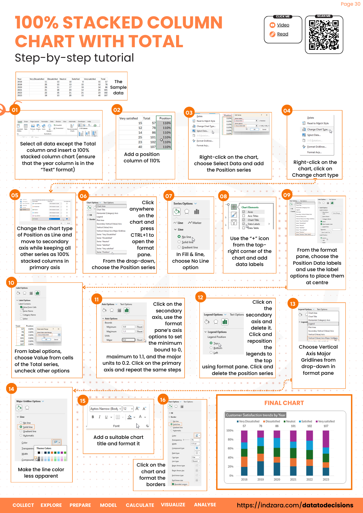
In Excel, creating this chart and displaying the total can be done within minutes. Let’s see how.
We have a dedicated video on our YouTube channel explaining these steps in details:
The following are the steps we’d follow in creating this chart:
- Insert a 100% Stacked Column Chart
- Add “Position” Series to the chart
- Modify the chart type
- Format the chart – Add position labels
- Apply Axis formatting
- Change the label values
- Apply standard formatting to the Chart
Step 01: Insert a 100% Stacked Column Chart
Select the whole data without the total values and insert a 100% stacked column chart. Excel inserts a chart, that looks like this:
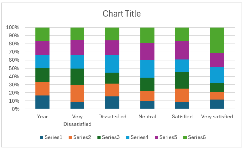
Notice that Excel has created a chart that has considered the column “Year” as a series as well. There’s a simple Excel trick to change this.
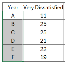
Convert the values in the Year column to text as shown below:
Now, insert a 100% stacked column chart with this data, except the total values. With this, Excel creates a chart correctly as shown here:
Now, convert the text values (A, B, etc) in the Year column to the years (2018, 2019, etc), at the end of step 01, this is our chart:
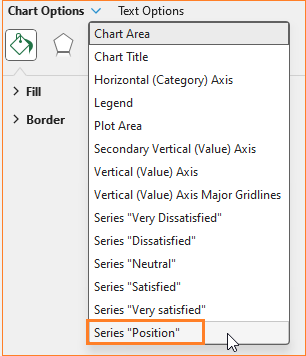
Step 02: Add “Position” Series to the chart
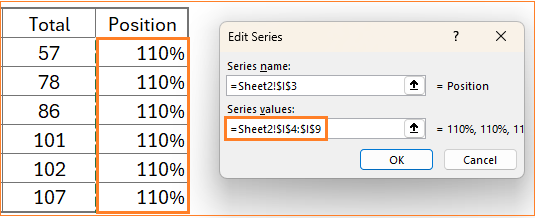
We aim to display the totals on top of each column, to do this we need to add a position series, as shown which is a higher value than the 100% of the chart:
To include this series, right-click on the data, go to Select data
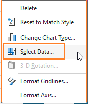
which opens a pop-up to add a new series:
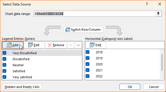
Add the Position series as shown:
With this, our chart looks like the below, with no much visible change:

Step 03: Modify the chart type
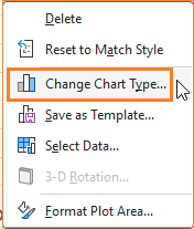
To modify the position chart type, right-click anywhere inside the chart and choose Change chart type:
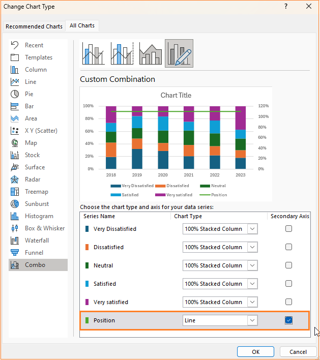
In the dialog box that appears, change the chart type of the Position series to a Line and move it to the secondary axis while ensuring that the other series remains a 100% stacked column chart in the primary axis.
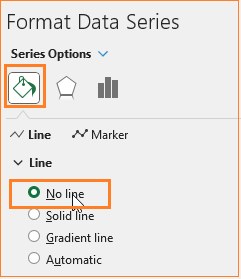
Step 04: Format the chart – Add position labels
i. Now, click anywhere in the chart and press CTRL + 1 to open the format pane. From this, choose the Position series as shown here:
ii. From the Fill & Line, we’ll remove the line.
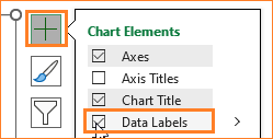
iii. Click on the “+” symbol on top of the chart and include data labels.
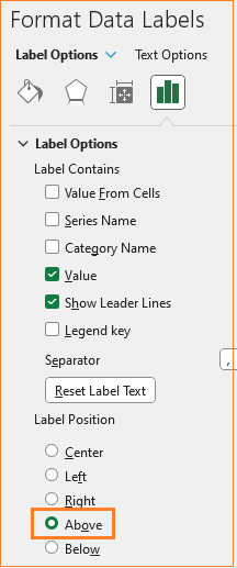
iv. Click on the labels and position them on top using the format pane.
At this point, our chart is:
Step 05: Apply Axis formatting
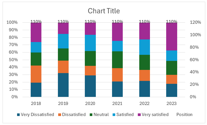
i. Click on the secondary axis and in the axis options, set the minimum bounds to 0.0 and maximum bounds to 1.1. Modify the major units to 0.2 as shown in the figure below:
Note: If the values you need to change (in the bounds or units) are present by default in the axis options, change them to some other value that is not default and then change again.
ii. Repeat the same steps for the primary axis as well.
iii. Delete the secondary axis.
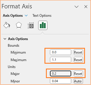
With the modified axis, our chart looks like this:
Step 06: Change the label values
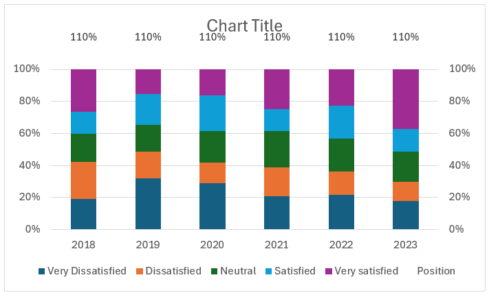
Click on the total labels and re-position them to center using the formatting pane as shown:
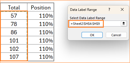
We do not want the position value to be displayed but rather the total value on top of each column. To do this, click on the labels and in the format pane, in the label options uncheck all other and choose Value from cells as shown:
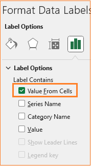
This opens up a pop-up from where you can choose the total range:
By the end of this step, our chart should look like this:
Step 07: Apply standard formatting to the Chart
Let us apply some standard chart formatting to this:
i. Now, click on the legend and move them to the top of the series:
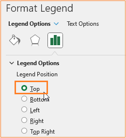
Click on the “Position” label alone and press the delete button as this adds no meaning to our chart.
ii. Add a suitable title, say “Customer Satisfaction trends by Year” and format the same as well.
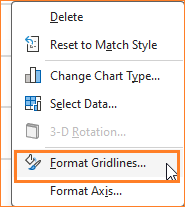
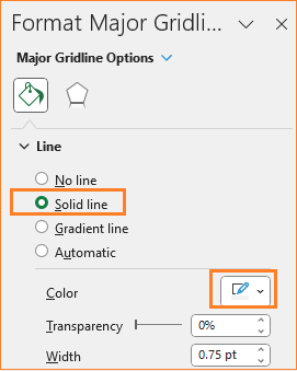
iii. Now the gridlines, ensure to have them but not so evidently overpowering chart by modifying the line color.
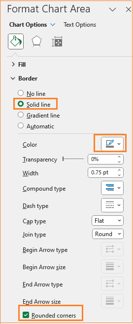
iv. As a final step of formatting, change the chart border by clicking on the chart and modifying the following in the format pane:
v. Click on any series in the columns and insert data labels from the “+” icon, here note that the values are absolute values and not percentages of these series of data.
With this our 100% stacked column chart with totals is ready!
Note: To create a chart that displays the percentage values of total, modify the data to show the percentage values (actual value/total) for each series and use that data to create the chart.
Check our 1-page, downloadable illustrative guide explaining all the steps for a quick reference.
Check our blog post on creating a stacked column chart displaying totals in Excel.
If you have any feedback or suggestions, please post them in the comments below.


