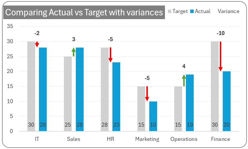
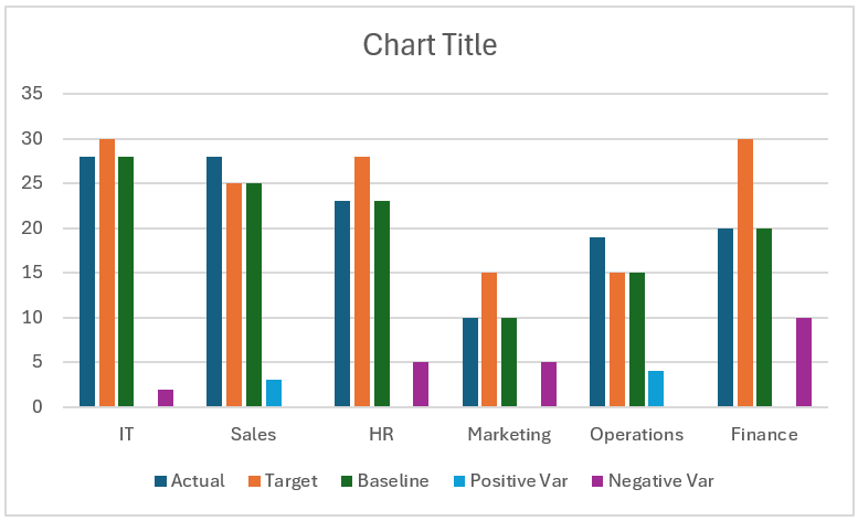
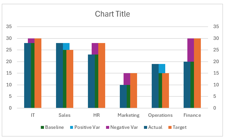
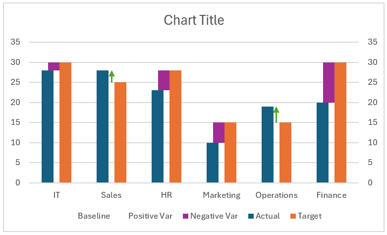
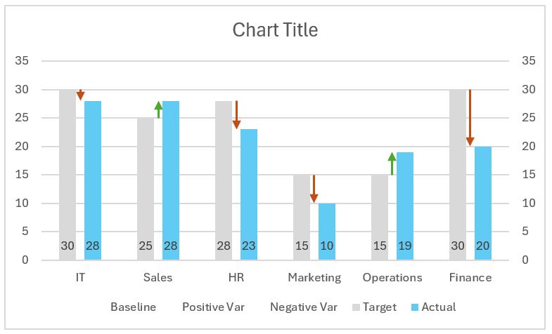
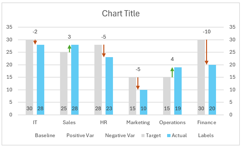
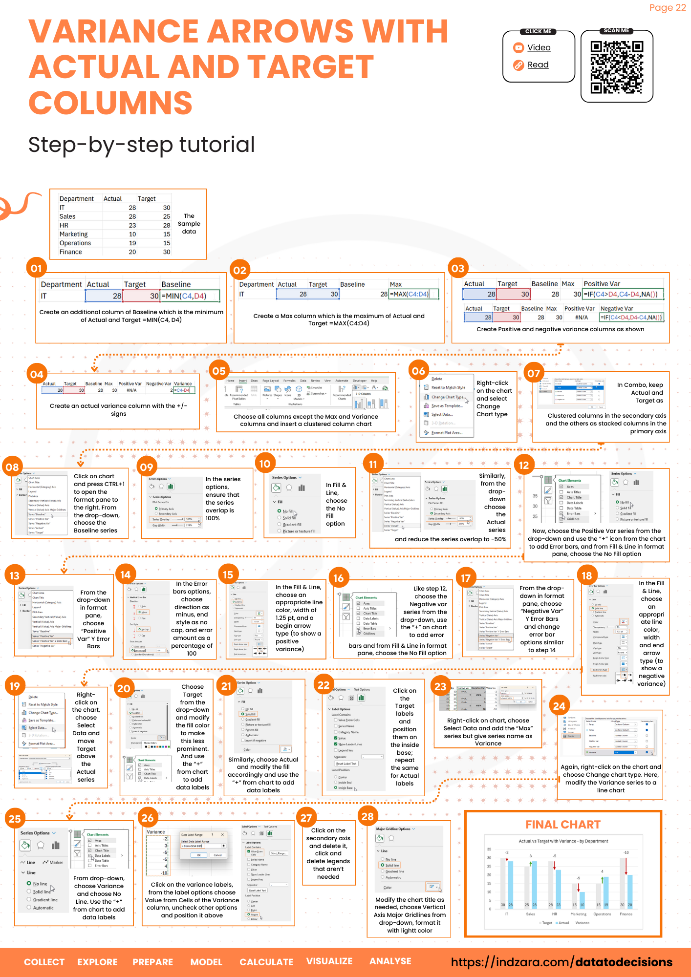
Creating an Actual vs Target chart in Excel is a common task for visually comparing performance metrics. Adding variances with arrow indicators can enhance the chart’s ability to convey whether actual figures are above or below targets quickly. The below chart is an example of displaying actual versus target and variances displayed with arrows.
This article is about building this amazing chart in Excel in a few easy steps. Let’s get started!
Ready to save time on your next presentation? Explore our Data Visualization Toolkit featuring multiple pre-designed charts, ready to use in Excel. Buy now, create charts instantly, and save time! Click here to visit the product page.
Do check our dedicated video on YouTube explaining these steps in detail.
The following are the steps we’d follow in creating this chart:
- Prepare sample data
- Insert clustered column chart & modify series types
- Format baseline and actual series overlaps
- Format baseline and positive var series
- Format positive variance arrows
- Format negative variance arrows
- Format the chart for visual clarity
- Add variance labels
- Remove secondary axis and format the chart
Step 01: Prepare sample data
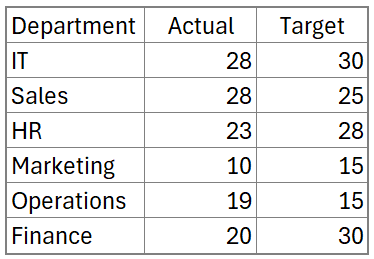
Let us consider sample data of actuals and the targets of a metric across departments.
To build our chart, we need to add more columns to aid to that.
Note: our actual values start from cell C4 and the target from cell D4
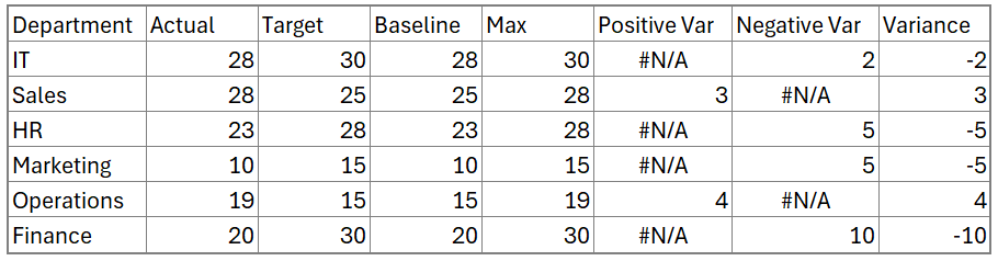
i. Firstly, we need a baseline since our chart will have a stacked approach of data over data.
=MIN(C4:D4)ii. The Max column which is the maximum of the target and the actual.
=MAX(C4:D4)iii. Positive variance: Variance when the actual value is greater than the target value
=IF(C4>D4,C4-D4,NA())iv. Negative variance: Variance when the actual value is less than the target value.
=IF(C4<D4,D4-C4,NA())v. Absolute Variance: The above two variances give only the value of difference but not with the sign.
=C4-D4With this, our sample data to build the chart is:
Step 02: Insert clustered column chart & modify series types
To create the chart, select the Department, Actual, Target, Baseline, Positive Var, and Negative Var columns (including the headers) and insert a clustered column chart.
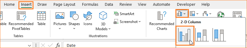
Excel inserts a default clustered column chart with our data (please note that the colors of columns may vary based on the theme of your Excel).
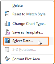
Now, right-click inside the chart and click on Change the chart type.
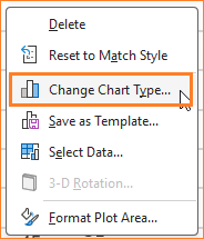
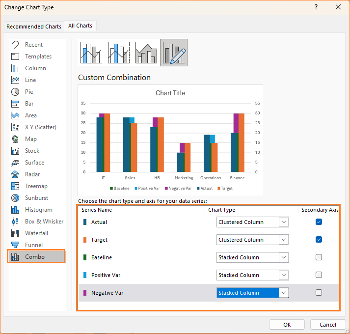
This opens a dialog box where we make the following changes:
- The Actual and the Target series are to be moved to the secondary axis
- For the Baseline, Positive, and Negative Var series – change the chart type to “Stacked Column”
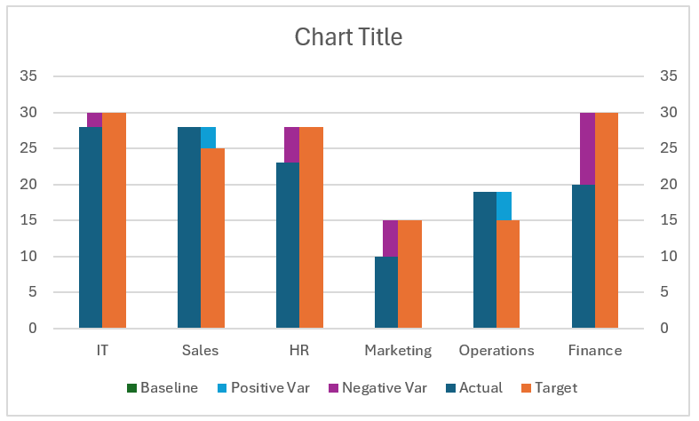
With this change, the chart looks something like this:
Step 03: Format baseline and actual series overlaps
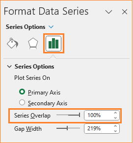
To select a specific series and make formatting changes in that, click on the chart and press CTRL + 1 to open the format pane that appears to the right.
i. Choose the Baseline series from the drop-down menu.
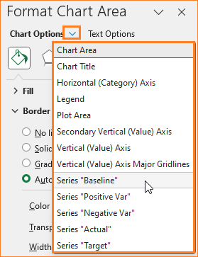
In this, ensure that the series overlap is 100%
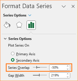
ii. Similarly, choose the Actual series and reduce the overlap to -50%
At this point, the chart looks like this:
Step 04: Format baseline and positive var series
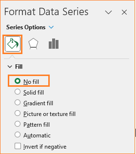
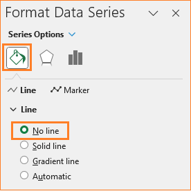
i. Now, choose the baseline series again, and in the Fill & Line option, remove the fill color.

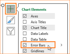
ii. Select the Positive Var series, on the chart a “+” symbol appears at the top right. From here choose to include error bars as shown:

After this, in the format pane, remove the fill color for this series:
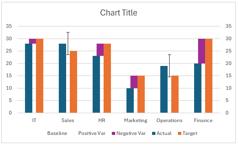
After this step, our chart looks like this:
Let’s now format the error bars to get the desired chart.
Step 05: Format positive variance arrows
Lets now look at how to make variances to be displayed with arrows
i. Click on the error bar or choose the same from the drop-down in the format pane.
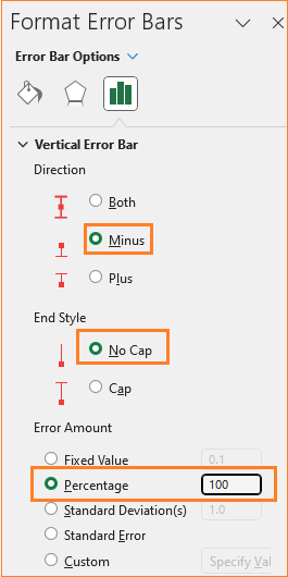
Here, change the direction of the errors to “Minus”, the End style to “No Cap”, and the error amount as a percentage of 100%
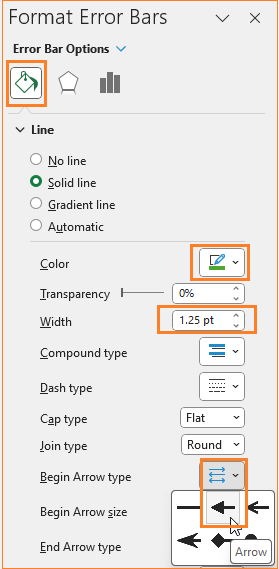
ii. After this, in the Fill & Line options, choose a color to indicate positive variance (here, we have chosen green), adjust the width, and begin arrow type to an arrow symbol.
With this, our chart is taking shape (as shown below). Now, we’ll repeat this process for the negative variance as well.
Step 06: Format negative variance arrows
i. Select the negative var series, and remove the fill color in the Fill & Line section.
ii. Then, click on the “+” to include Error bars.
iii. Here, change the direction of the errors to “Minus”, the End style to “No Cap”, and the error amount as a percentage of 100%
iv. Click on the error bars, in the Fill &Line modify the line color to denote a negative variance i.e with red color, adjust the width and include a end arrow type as shown:
At this stage, our chart where the variances are displayed with arrows is:
We are nearing our desired chart. Let’s apply some Excel formatting to get a visually appealing chart in the next few steps.
Step 07: Format the chart for visual clarity
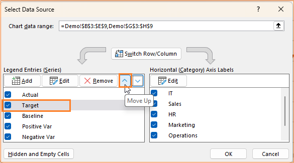
i. Let’s move the target series to the left, for better chart readability (you can skip this if your desired structure needs the actual to the left).
For this, click inside the chart, go to Select Data and this opens a pop-up where move the target up.
ii. Click on the target columns, in the format pane change the color of the columns to be less prominent:
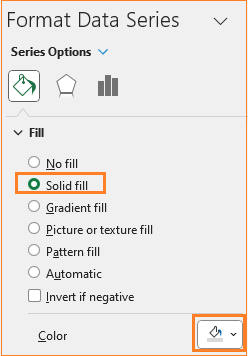
Similarly, choose the Actual series and modify the color accordingly.
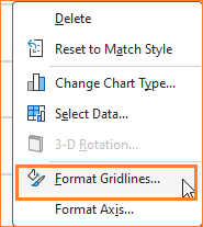
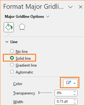
iii. Now the gridlines, ensure to have them but not so evidently overpowering chart by modifying the line color.
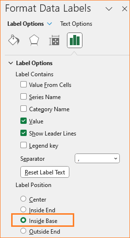
iv. Now, we’ll add the data labels to the Actual and the target series. Click on the Actual series (you can choose this from the drop-down in the format pane as well) and in the “+” from the chart, insert the data labels.
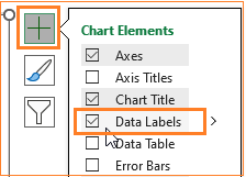
Position this at the inside base as shown below:
Repeat the same steps for the Target series as well.
By the end of this step, our chart looks something like this:
Step 08: Add variance labels
What’s missing in the chart from the previous step is the labels for the variance. Let’s add them now.
Right-click inside the chart and Select Data. This opens up a dialog box, from where we’ll add the variance series (from our sample data).
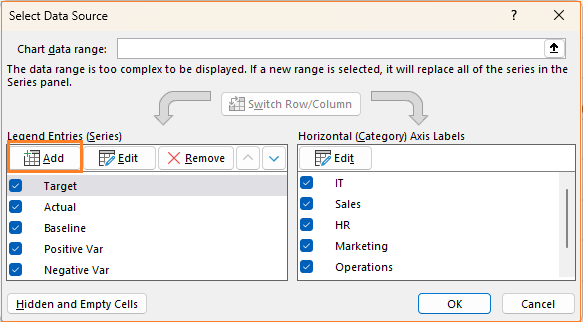
We’ll include a new series called Labels and add the Max column here, this is because the labels need to be positioned on the top near the arrows.
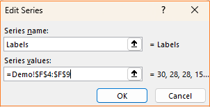
With this, Excel adds this new series to the chart. Let’s change the chart type (as seen in step 02) to a Line chart as shown:
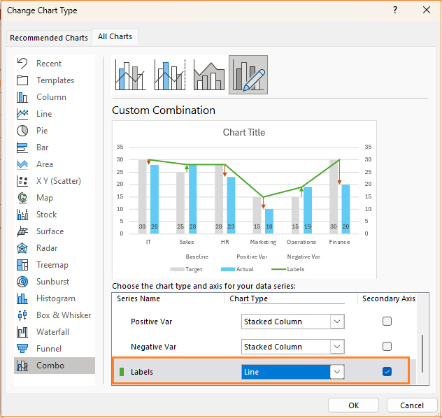
We only need the labels, so click on the line and remove the Line in the Fill & Line option:
We’ll only include the data labels for this series:
This adds the Max series values as labels, but we need the variances to be displayed. Here, Excel’s amazing formatting options come in handy!
Click on the labels, and in the format pane, choose the Value from Cells option while unchecking others:
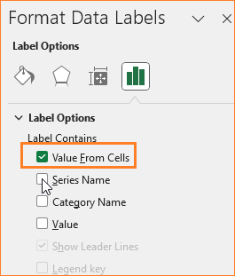
This opens a pop-up where you can choose the Variance values instead of the Max values to be displayed as data labels. Click on the labels and position them above form the format pane.
At this stage, our chart is almost ready!
Step 09: Remove secondary axis and format the chart
As final formatting,
i. Remove the secondary axis by clicking on the same and deleting it.
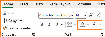
ii. Give a suitable title to the chart, say “Actual vs Target with Variance – by Department” and format the same in the Home ribbon.
iii. Move the legend to the top and delete the legends that do not add much value to the chart (select the legend and press delete)
iv. As a final step of formatting, change the chart border by clicking on the chart and modifying the following in the format pane:
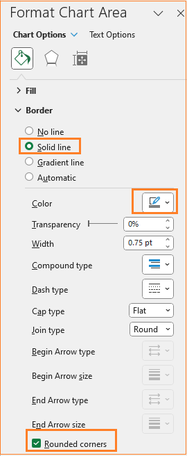
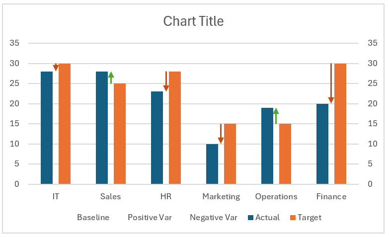
With this the actual v. target chart with the variances displayed with arrows is ready!
Check our 1-page, downloadable illustrative guide explaining all the steps for a quick reference.
Check a different variation of this chart using only column charts in one of our blog posts here.
If you have any feedback or suggestions, please post them in the comments below.


