A filled map visualization differs from a gradient map in the number of colors that can be inducted into the visual. While gradient maps are a great visual representation, in some cases we might need more than 2-3 colors to make a meaningful analysis. This is where a filled map with categories is useful.
For example, what if the colors in the map have to be representative of a range of numeric values?
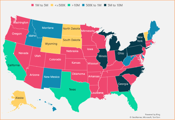
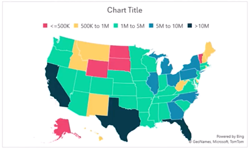
Consider a sample data of U.S. states and the civilian labor force data. How can we represent this on a map visual where the colors are based on the range of the labor force data grouped as categories? A map that looks like this:
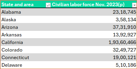
The sample data is as shown:
This blog is all you need to create a filled map visualization. Let’s get started!
All the steps for creating a filled map with categories are explained in detail in the YouTube video:
Step 01:
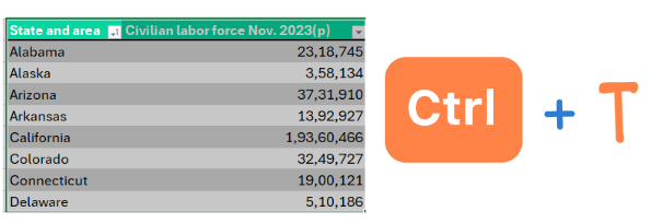
If you’ve been following our blog posts in Data to Decisions, one thing we always encourage you to do before beginning to work with data is to convert them into tables. This ensures better formula readability and scalability when the data expands. Select the data and do CTRL + T for the same.
Let’s name this as Data.
Step 02:
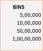
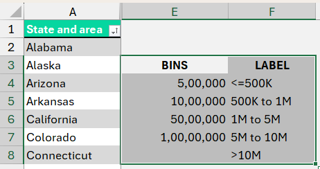
Begin with creating the categories (also called bins) of our numeric data. Say, five categories as shown below (from cell E4):
Assign a label to these bins that we’ll use in our visualization as shown here.
Step 03:
Let’s connect these bins with our data. Create a “LABEL” column which will assign a label for each of the states based on the bin hierarchy.
With XMATCH function, which looks-up and returns a position of a value in a given range/table data.

Here, the match type can take the following values:
0 – Exact match (default)
-1 – Exact or next smallest value
1 – Exact or next largest value
2 – Wildcard match
Similarly, the search type can take:
1 – Search from beginning (default)
-1 – Search from last
2 – Binary ascending search
-2 – Binary descending search
Let us look at how this function works in our example:
=XMATCH([@[Civilian labor force Nov. 2023(p)]],$E$4:$E$8,1,1)We look up for the labor force value in the bins for an exact or the next smallest value (1) and do this look up from the start (1).
Note: $ symbol is used to lock the cell references stating that these values are in a fixed location.
This returns the position of the bins as shown:
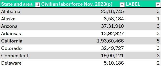
We need the corresponding label value and not the position, for this we’ll use the INDEX function which returns the value from the position.
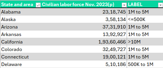
=INDEX($F$4:$F$8,XMATCH([@[Civilian labor force Nov. 2023(p)]],$E$4:$E$8,1,1))This gives us the labels for each state:
Step 04:
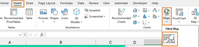
With the above data, we’ll create our filled map visual. Click anywhere outside the data and (1) Go to Insert, (2) Maps, (3) Create a Filled Map visual:
Right-click on the empty map to Select Data, assign a series name (our column name) and the values (the labels created in the previous step) as shown:
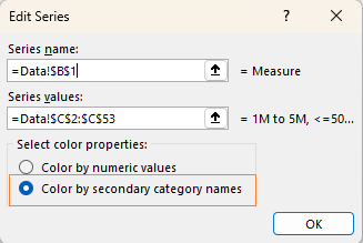
A key point to note is to choose the “Color by secondary category names” to get a filled map visual as shown above. (Color by numeric values gives a gradient fill)
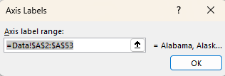
Select the horizontal axis labels to be the State names:
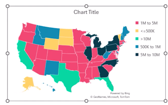
This creates a filled map visual that looks like this:
Adjust the position of the legends to make more space for the actual visual. Add a title, per your need.
Step 05:
A quick look at the map generated tells us that the sequence of the categories is not in any particular order (either ascending or descending). Let’s look at a quick way to resolve this.
The reason our legend has the given order (as shown in the previous image) is based on the order in which the label column contains these values. If we can change the order of the labels, the map’s legends get updated.
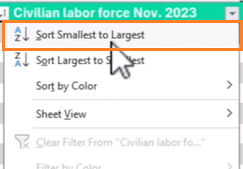
To do this, sort the LABEL column from the smallest to largest value as shown:
With this, we have a visually clear filled map visualization:
There’s an important point to consider here. This method of manual sorting needs to be done whenever there is a change in our source table.
Step 06:
From here on, apply changes to the color of categories per your requirement.
You can also assign labels and much more with the multiple chart formatting options available in Excel. Our filled map with categories is ready!

Click here to read about how to create a filled map with gradient colors here.
If you have any feedback or suggestions, please post them in the comments below.


