Adding a map visualization for geographical data is a great addition to your reports and dashboards. This post walks you through the steps required to create a filled map visual in Excel.
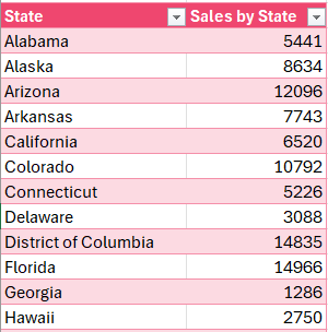
Consider sample data on sales figures of a company by state for a given period as shown:
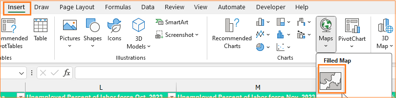
Step 01: Insert chart
Click anywhere in the Excel sheet and (1) go to Insert (2) Filled Maps as shown:
Step 02: Time to create our filled map visual
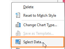
Now, we’ll include data by clicking inside the map and selecting data.
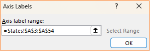
Now Edit series, the values will be our sales column and the Horizontal axis will be the State names:
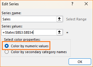
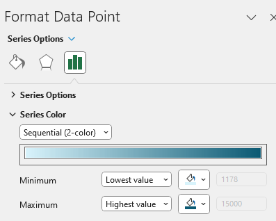
Important point to note: Since we need a gradient fill map, please choose the color by numeric values.
Step 03: Format the chart visual
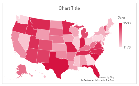
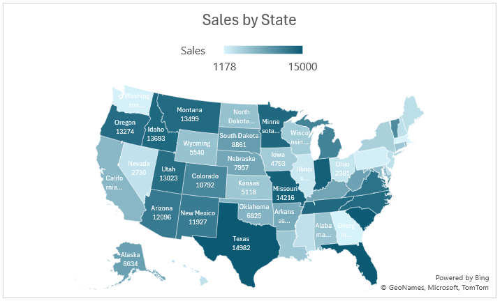
With this, our filled map visualization is ready.
We’ll make some formatting on the chart created now:
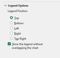
i. We’ll edit the Chart title, move the legend to the top,
ii. Modify the series color to suit your theme for the report:
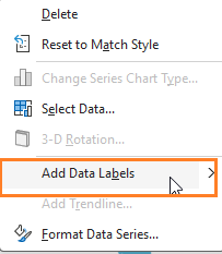
iii. Now, we’ll include Data Labels by right-clicking on the chart:
We’ll also include the Category names in the map (the state names) for that, right-click on format labels, and in the Format pane do the following:

There are several ways you can format a chart in Excel, these are a few basic formatting options to include to make the map visually appealing.
Read our blog on creating a filled map based on categories here.
If you have any feedback or suggestions, please post them in the comments below.


