Statistical Process Control Charts in Excel
In this blog post, we will cover the following topics:
- When to use Statistical Process Control Charts?
- What is the concept behind Control Charts?
- How Control chart identifies anomalies? 8 Rules
- How to create a Control Chart? Free Template download.
About Statistical Process Control Charts
A Control Chart or Statistical Process Control chart or SPC Chart is an effective business process monitoring tool to measure whether your process is within control.
Control charts can be used to monitor a wide variety of processes. A process can be measured with one or more metrics. Let’s take a few examples to illustrate the concept.
- Ecommerce: In an ecommerce business, here are a few different metrics.
- Order Fulfillment process’s efficiency can be measured as the average time taken to fulfil an order – i.e. from the time of placement of an order by customer to the time when the order is shipped.
- Ordering process can be measured by tracking number of Failed orders
- Effectiveness of upsell and cross-sell marketing can be measured by tracking Average Order Value
- Quality of the products can be measured by tracking Product Return Rate
- Manufacturing process – Measurement here could be the length / width / height / depth / weight of the product manufactured.
- Financial processes – An example could be Number of failed billing attempts to customer
- Information Technology (IT) – Number of bugs raised during development, and Number of project deadlines missed
The above are just a few varied sets of metrics to illustrate that the control charts can be applied to a variety of business contexts. If there is a metric you can measure to reflect a certain aspect of the business process, a control chart can be useful.
Concept behind Control Charts
Let’s take a simple metric to illustrate the concept behind control charts.
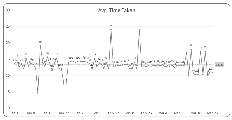
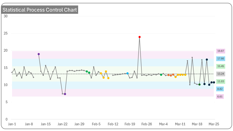
In the above chart, we show the average time taken to fulfill an order every day. The dotted line represents the overall average across all the days.
In a perfect process, the process is steady and does not vary at all. However, in reality, most processes are not perfect. For example, each order does not take the exact same amount of time to fulfill.
There are two broad types of variation.
Normal variations
This is the natural or normal variation in a process. Depending on how many items and which items are in the order, there could be slight variation in each order. In the manufacturing example, each unit manufactured may have a slight variance in dimensions. In this case, small variations within a certain tolerance limit will not impact the ultimate product quality and usage by customer. Such small variations are normal and acceptable.
Special variations
Sometimes, there can be special variations or anomalies or unexpected behaviors in process. For example, if you receive more orders during a single-day sale (like Amazon Prime day), the average time taken to fulfill orders may get impacted if you don’t have extra staff to handle extra orders.
In the manufacturing example, if one of the machines used broke down, that can result in the incorrect dimensions of product being produced.
Such special variations can be detected using the control charts. Upon researching, root causes can be assigned to such events. Once you identify the root cause, we will work on a fix. In the order fulfillment example, we may accept the fact the order fulfillment is an anomaly on that one day of special sale and it is not expected to happen the next day when the sale is over. We don’t try to change anything since we can clearly attribute why the measurement anomaly happened and there is no process issue for normal days.
In the manufacturing example, once we find the root cause, which was the broken machine, we can work on fixing the machine and once it is fixed, the process is expected to be back in control.
Once the root causes are identified and resolved, we can remove the data point from our control chart data as it does not represent the normal process.
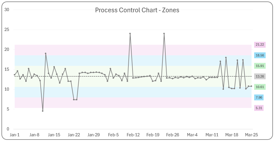
The simple line chart above does not differentiate between a normal variation vs anomaly. This is where a control chart comes in handy. A control chart is a tool that helps in identifying which data points are special variations (anomalies) vs which ones are normal variations.
Let’s move on to understand how the control chart can detect anomalies.
How does a control chart identify anomalies?
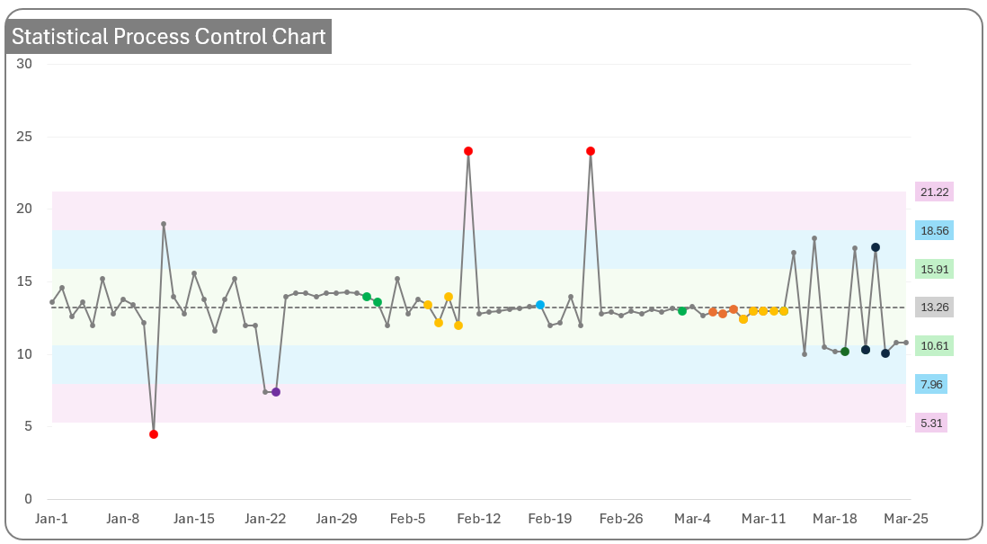
Before we discuss the rules to identify anomalies, we need to set up the foundation by clarifying the different zones on our chart. This is where the ‘statistical’ part of statistical process control chart comes in.
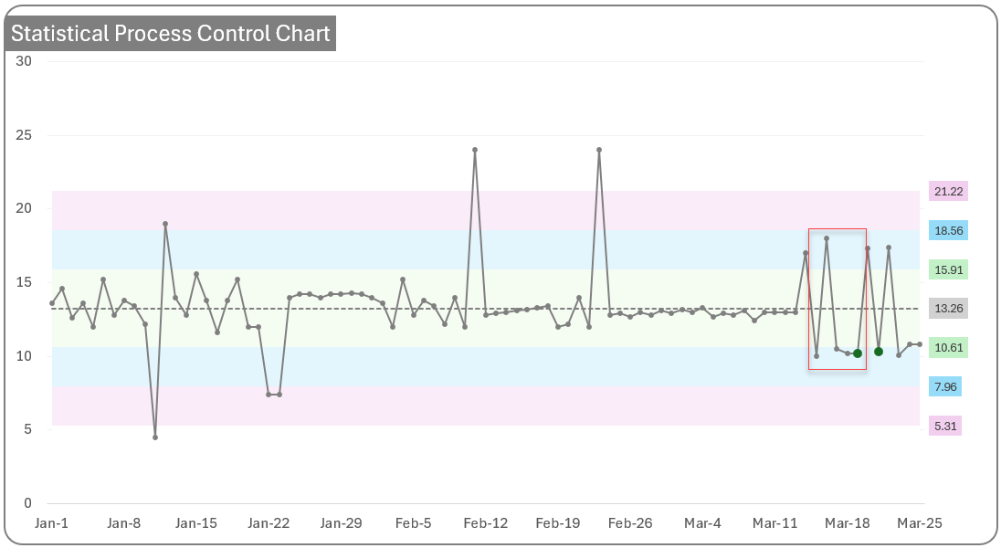
3 Zones
In the above chart, I have added 3 zones (3 different colors) along with the Centre line (dotted) which represents the overall average of all observations.
- Green Zone is the 1 Sigma Zone – this represents the area between [Overall Mean – 1 Std Deviation] to [Overall Mean + 1 Std Deviation]
- Blue Zone is the 2 Sigma Zone – this represents the area outside the 1 Sigma zone but within the 2 Sigma limits.
- Red Zone is the 3 Sigma Zone – this represents the area outside the 2 Sigma Zone, but within the 3 Sigma Limits.
With this understanding, we can discuss the rules to identify the anomalies.
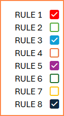
8 Nelson Rules
Nelson’s 8 rules are commonly used in the field of statical process control to identify anomalies. Nelson rules – Wikipedia
We can apply these 8 rules to our data to identify which of the 8 rules, if any, are violated by our process. If the rules are violated, the process needs to be investigated, to address the root cause(s). Depending on the nature of your process and the criticality, you can choose one, few or all the rules. You can also customize the rules according to your business context.
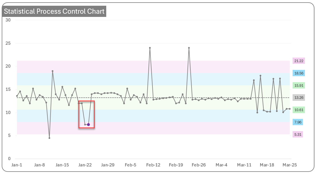
Rule 1: 1 point is more than 3 standard deviations from the mean
The violation of this rule means that the process is grossly out of control
Rule 2: 9 (or more) points in a row are on the same side of the mean.
Not enough normal variation. Prolonged bias.
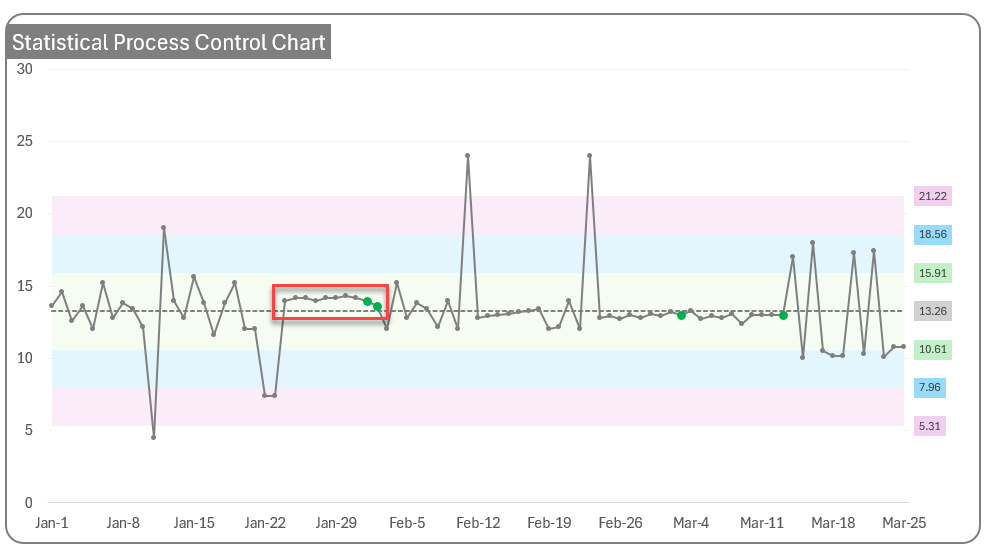
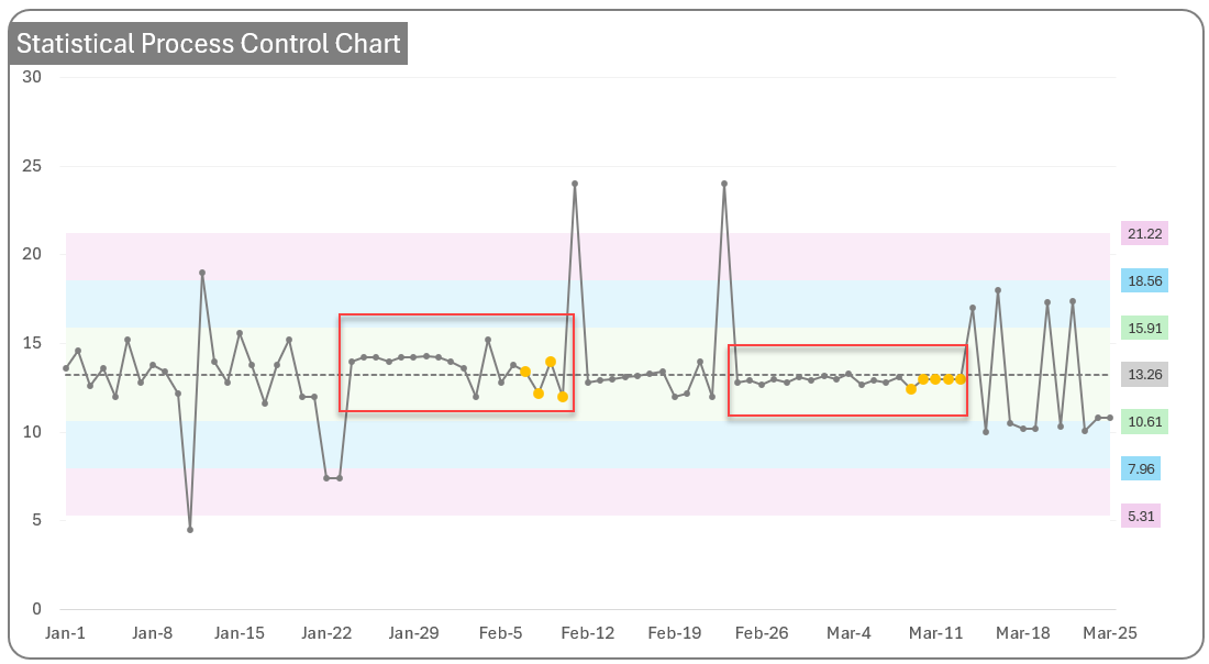
Rule 3: 6 (or more) points in a row are continually increasing (or decreasing).
Process appears to be shifting. A trend is forming.
Rule 4: 14 (or more) points in a row alternate in direction, increasing then decreasing
Too much oscillation
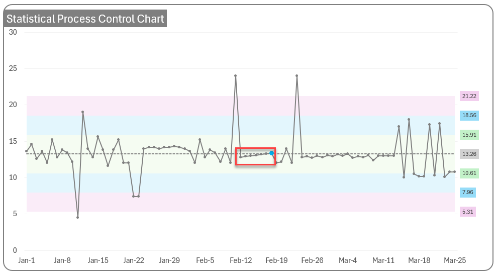
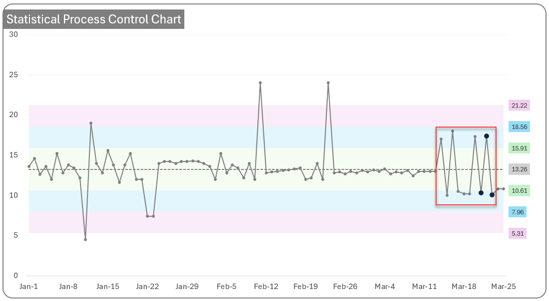
Rule 5: 2 (or three) out of 3 points in a row are more than 2 std. deviations from the mean in the same direction
Medium out of control. Not as severe as Rule 1 but requires attention.
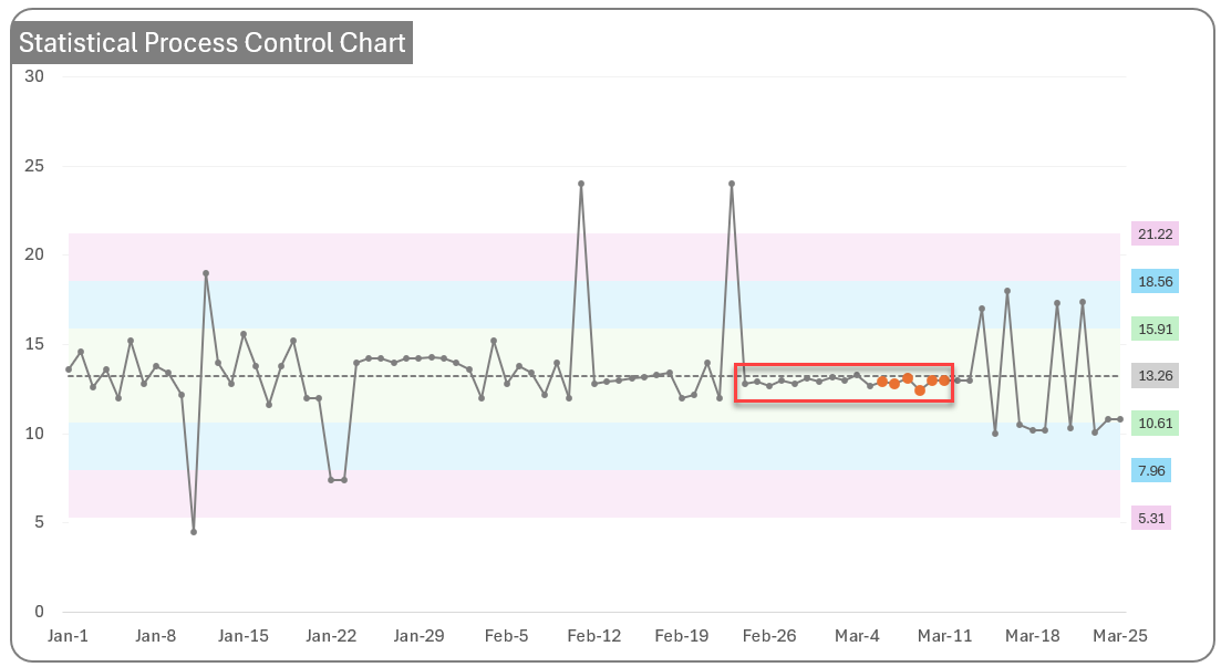
Rule 6: 4 (or five) out of 5 points in a row are more than 1 standard deviation from the mean in the same direction.
Slightly out of control. Less severe than Rule 5.
Rule 7: 15 points in a row are all within 1 standard deviation of the mean on either side of the mean.
Not enough normal variation.
Rule 8: 8 points in a row exist, but none within 1 std. deviation of the mean, and the points are in both directions from the mean.
This pattern is unusual..
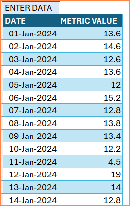
Control Chart Template Download
In our control chart template, you can enter the input data of your processes in just two columns. 1. Date and 2. Metric value
You can choose which rules you want to apply to the chart
The template will then create the control chart using your data automatically.
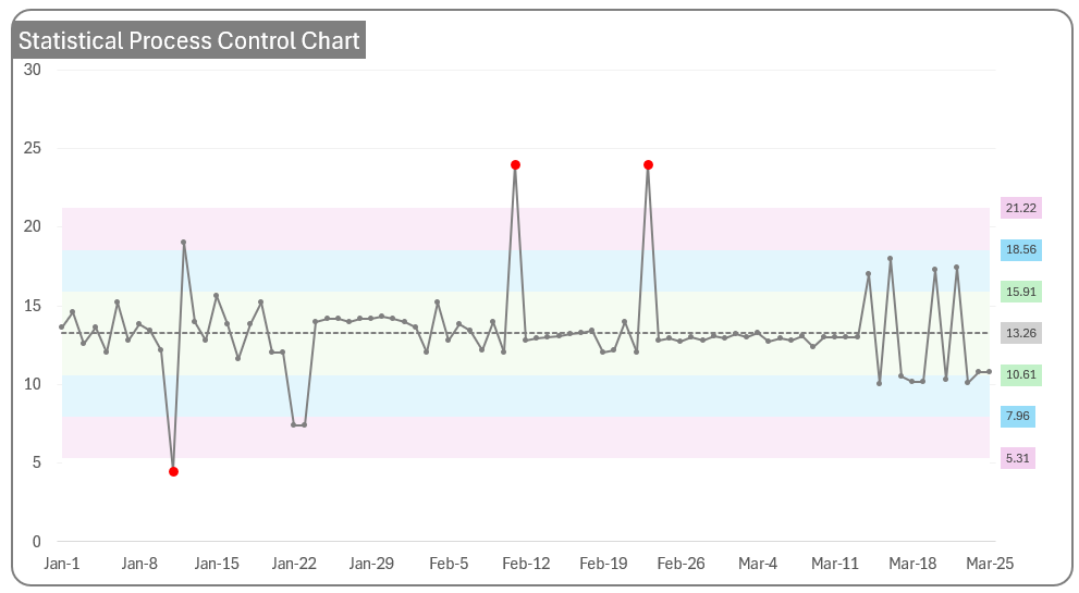
You can label specific data points as outliers and the template will then exclude them from display and calculations.
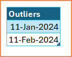
The Chart will appear as below, without the outlier points.
How to use it daily?
Every day, a new data point becomes available from your business. Once that is fed to this template, the template can help identify if the latest point is an anomaly or not.
The input table can be connected to a database in your company, so that you don’t have to manually enter.
Leave a Reply