You can use this template to build candlestick chart of price history of any stock.
In this article, I will go over the following.
1) Candlestick chart template and its features
2) Introduction to the Candlestick
Download
Video Demo
How to create a Candlestick chart in Excel?
A very common thing you see in the charts of stock market related sites is the Candlestick chart.
Using our free template, you can see those charts in Excel itself for any stock you are interested in. The template allows
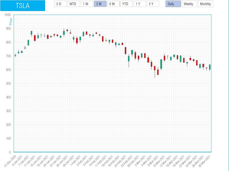
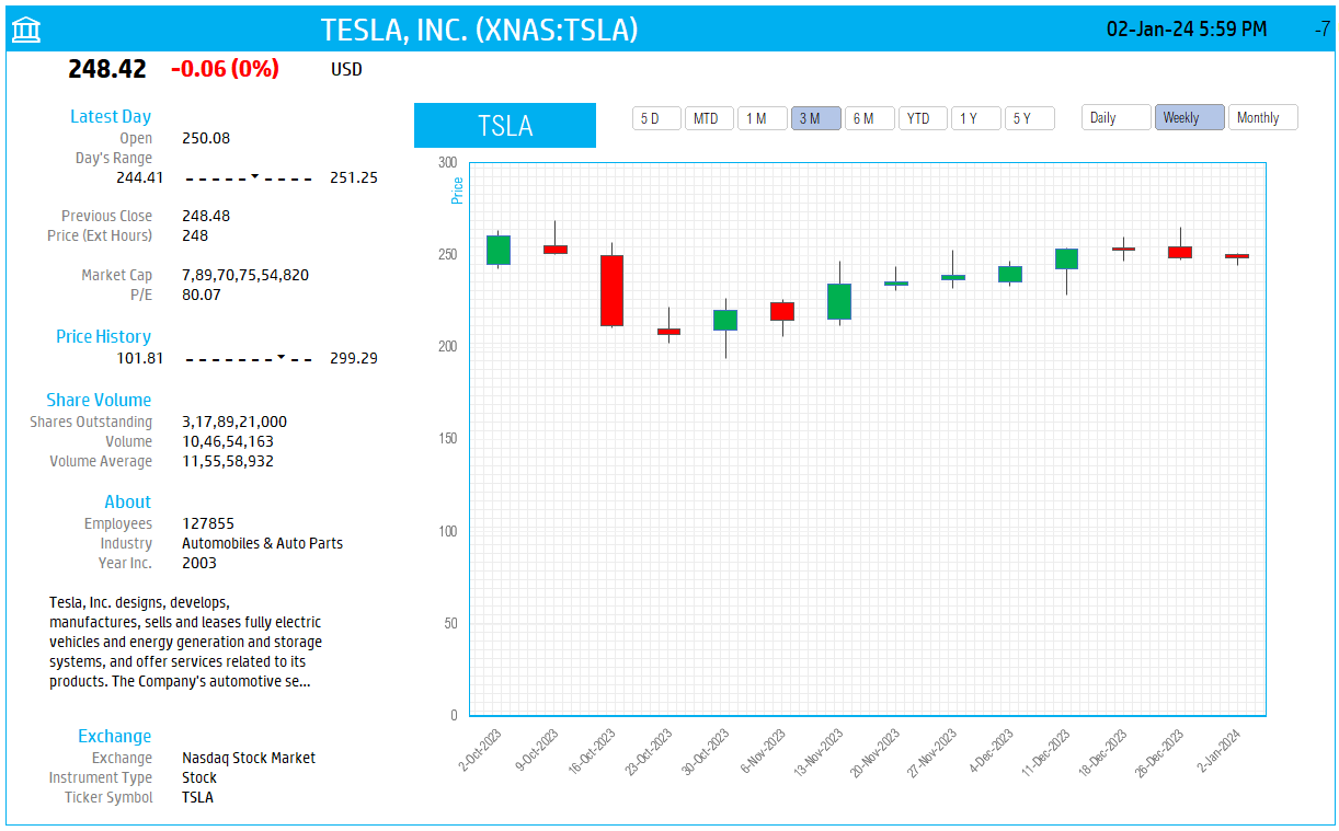
- Entering a stock ticker symbol to pull in up to 5 years of price history
- Allows controlling the period displayed on the chart (5 days, Month To date, 3 Months, 6 Months, etc.)
- Allows controlling the interval of price data – Daily, Weekly or Monthly
- In addition, the price is displayed not as one price line – instead it is represented in this shape which is called as candlestick chart.
What is a CandleStick chart?
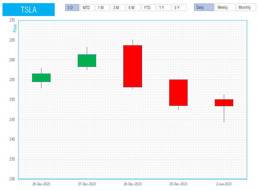
In order to explain how to interpret a candlestick chart, let’s choose a shorter date range. Let’s use a 5 day price trend.
Now, the chart should look like this. By default the data labels do not appear.
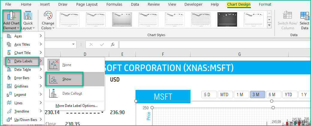
Enable the data labels using the steps shown below.
Tip: Showing the data labels for a lot of data points will be very cluttered and not useful. (Use the same steps and choose None for data labels, in order to remove data labels).
There are four series of values plotted on the chart. They represent the Open, High, Low and Close values of the stock for the day or the period.
You can right click on each and choose Format Data Labels.
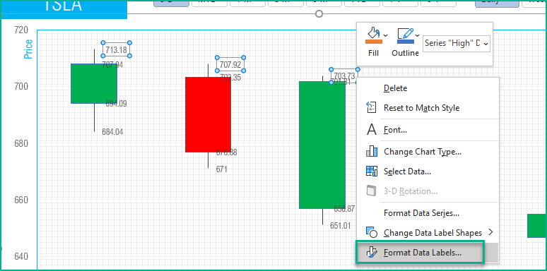

Optionally you can change the separator and the label position as needed.

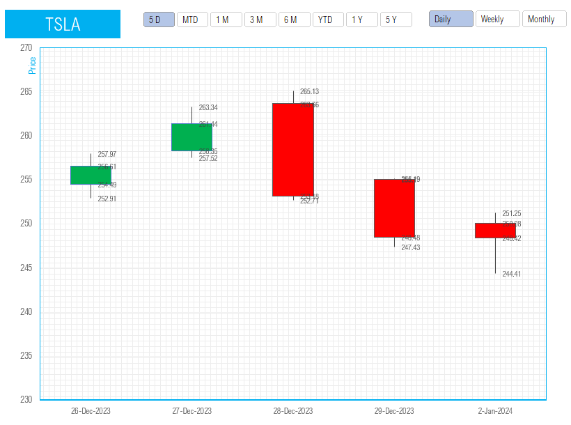
After implementing the data labels for all the four series, the chart should look like below.
- A candle is colored red when the closing price is less than Open price. For example, on 16th March, Open price is 703.35 and the Closing price is 676.88.
- A candle is colored green when the closing price is more than the Open price. For example, on 17th March, the Open price is 656.87 and the Closing price is 701.81.
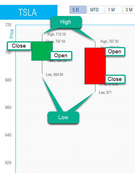
The candlestick also represents two more data points about each day/period. They are called the wicks or shadows. They represent the High and Low of the day.
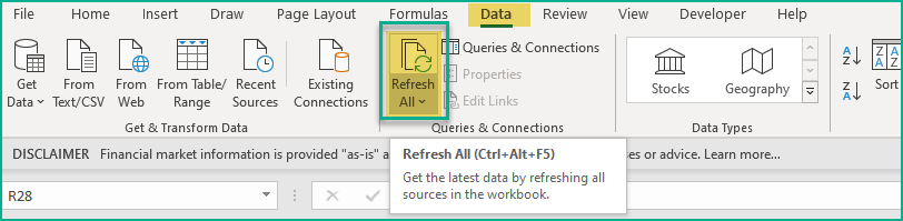
How to refresh?
To refresh the price and other information, just use the regular Excel refresh in the Data ribbon.
Resources
The foundation of this is the StockHistory function.
Please read more on StockHistory function and how we use to extract the price history of a stock or currency.
Here is the link to the article from Microsoft which shows which exchanges are available and the delay in data refresh for each.
Requirements
Microsoft has introduced a new feature in Excel called Data types. One of the data types is ‘Stocks’. That’s what we will be using for these templates. This feature is available in Microsoft 365 Subscription Plans for PC and Web
For all the templates in this ‘Excel for Stock Market’ series, please visit indzara.com/stock-market-templates
-
 SMA Strategy Backtester Google Sheets Template$25
 -
SMA Strategy Backtester Excel Template$25
-
RSI Strategy Backtester Google Sheets Template$25
-
RSI Strategy Backtester Excel Template$25
-
MACD Strategy Backtester Google Sheets Template$25
-
MACD Strategy Backtester Excel Template$25
-
 Simple Moving Average Stock Screener Google Sheet Template$25
 -
Stock Screener Excel Template$97
-
Simple Moving Average Stock Screener Excel Template$25
Feedback
Please share your experience. I expect this to be different with different exchanges and countries. Is it working for you? Is it working differently? I would love to hear from you.