Download this free Excel template to identify the best and worst-performing products easily. Automated reports with a lot of customization options. Compare sales data to attain clarity.
Category: Data Visualization
Excel templates designed for presenting data visually in an easy to understand form. You will find templates on creating geographic heat maps using your own data.
Social Media Dashboard – Free Excel Template to report social media metrics
Download this free Excel template to consolidate metrics across multiple Social networks and present it in a single-page dashboard.
2016 Olympics Dashboard – Explore Rio Olympics data in Excel
Download this free Excel template to access and explore the results of the Rio Olympics. This dashboard template has an Olympic view, country view, and sports view. Accounts for unusual scenarios.
How to edit colors by data range in U.S. State Heat Map Excel Template?
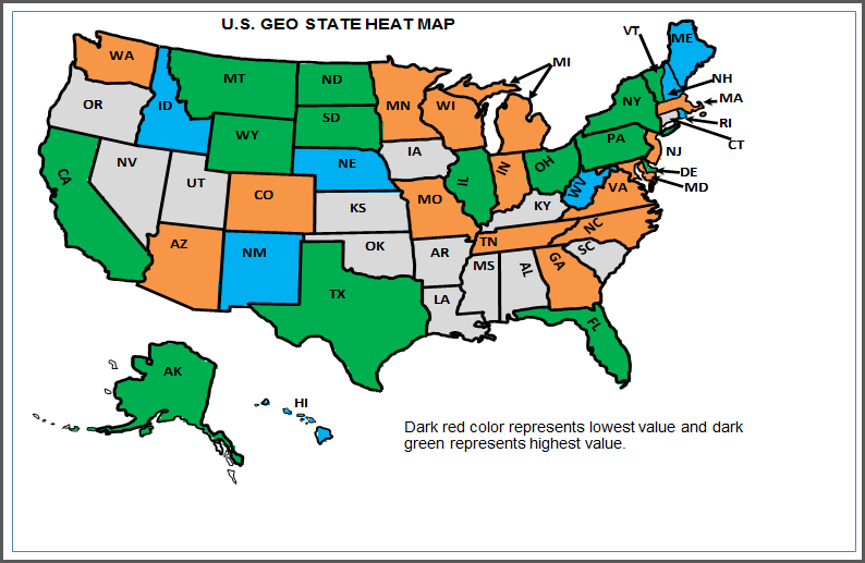
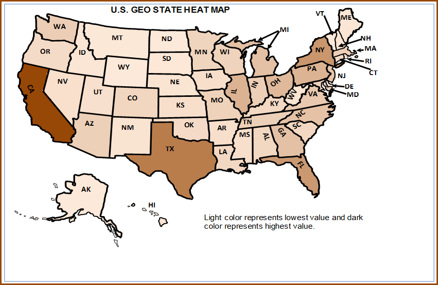
In the previous article, we learnt how to change the gradient colors used in the U.S. Geographic State Heat Map Excel Template. In this article, we will edit the colors used in the ‘Colors by Data Range’ option in the same template. Please visit product page to understand the features of the U.S. Geographic State […]
How to change Gradient colors in U.S. State Heat Map Excel Template?
In this article, we will learn how to change the gradient colors used in the U.S. Geographic State Heat Map Excel Template. Using the template, you can create a geographic heat map at the state level for 50 states of U.S using your own data. Please visit the product page to understand the features of […]
Product Rating Report (5 Star Ratings) – Free Excel Template
Download this free Excel template to create a report on product rating (5 Star Ratings) data. By entering the product’s rating data in a simple table, the report is automatically generated for the product comparison.
Activity Pattern Heat Maps – Free Excel Template
Download this free Excel Template to visualize activity patterns. By understanding the patterns this template uses you can make important decisions. This template uses simple formulas and conditional formatting.
Cricket World Cup 2015 – Free Excel Dashboard
Download this free Excel template to calculate all the stats based on raw match data and present it in a dashboard. There are three views available. Cup view, Team view & Match view. Change data to view corresponding metrics changes.
Changing the Colour Gradient in the Heat map
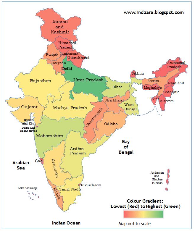
I have received requests around how to change the colour gradient for the Geographic Heat Map (India) Excel template. In this quick tutorial, I will explain how to do it. Step 1: Download and open the Geographic Heat Map (India) Excel Template. The map looks like the image below. Step 2: Open Conditional Formatting menu […]
Geographic heat map – India (Excel template)
Download this free Excel template to generate geographic heat maps for India. The template has a hidden worksheet and conditional formatting is used to create the printable ready to use heat map. Use this template to showcase position of one state.


