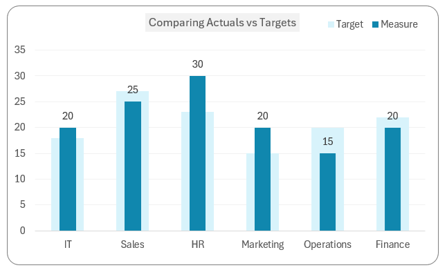
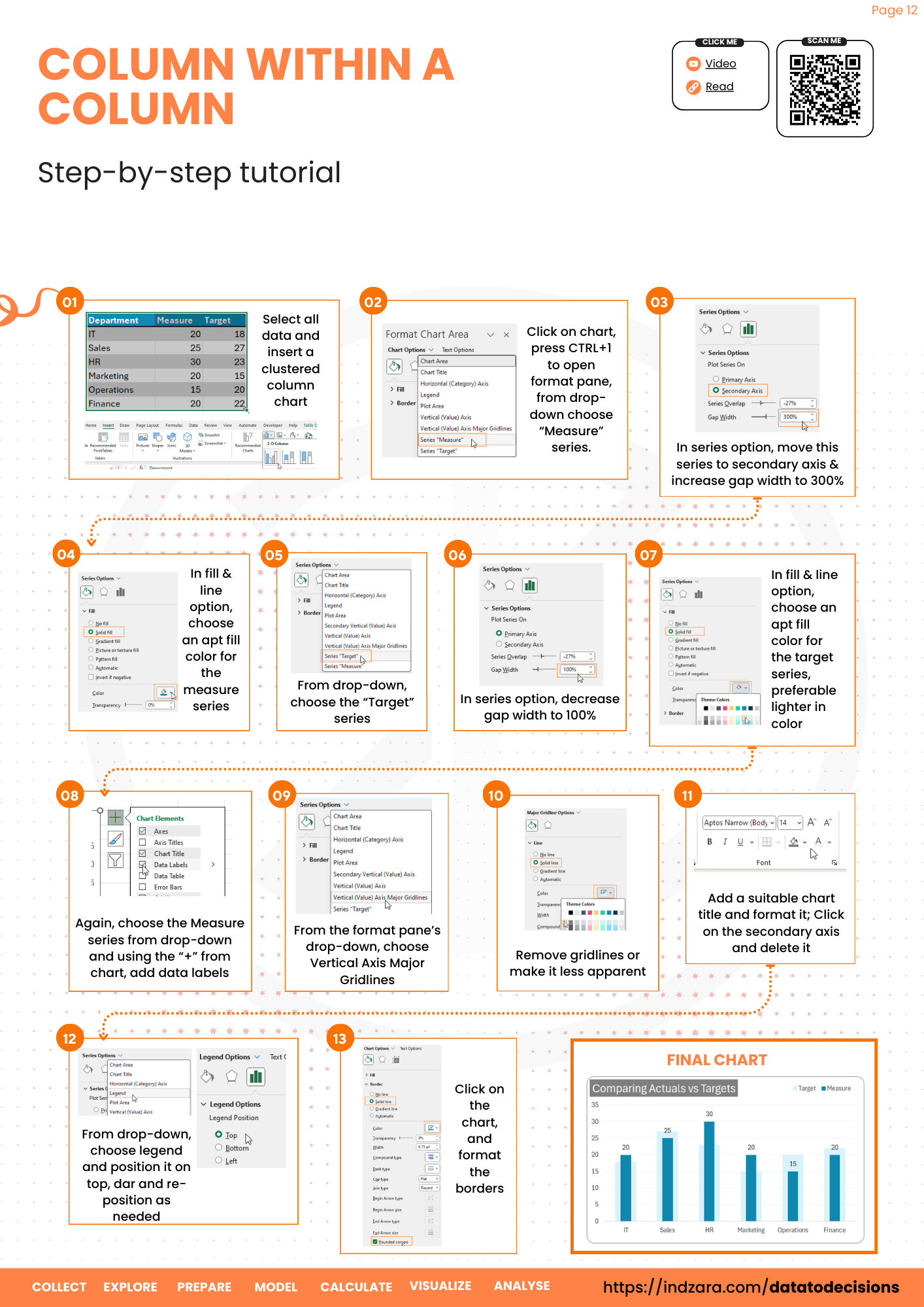
Let’s create a column chart within a column chart as shown below where the target is the background of the actual measure:
Let’s get started!
Ready to save time on your next presentation? Explore our Data Visualization Toolkit featuring multiple pre-designed charts, ready to use in Excel. Buy now, create charts instantly, and save time! Click here to visit the product page.
Check our previous article to display a target line in a column chart, or multiple target lines in a column chart.
The following are the steps we’d follow in creating this chart:
- Convert the data to a table
- Insert a clustered column chart
- Adjust the series options
- Format the chart
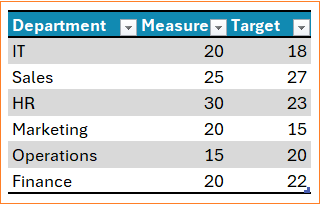
Step 01: Convert the data to a table
Consider a sample data as shown which is converted to a table (CTRL +T)
Step 02: Create a clustered column chart
Select the entire data and (1) insert (2) a 2D column chart.
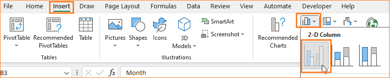
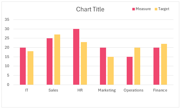
This creates a chart like below:
Step 03: Adjust the series options
Our goal is to overlap these columns and adjust the column widths. For this,
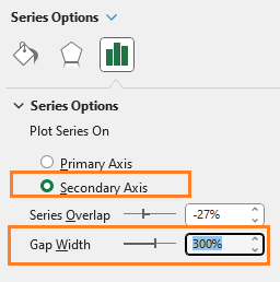
i. Right-click on Measure (2) Format data series and move it to secondary axis (3) adjust the gap width to 300%
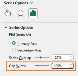
ii. Similarly, for the Target series, adjust the gap width to a 100%
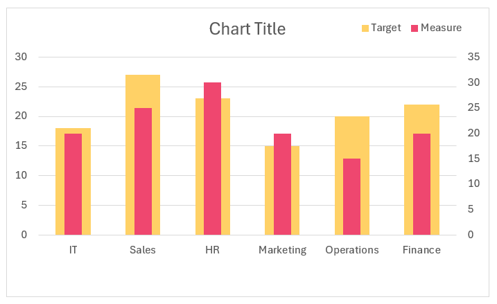
This adjusts the charts accordingly:
Step 04: Format the chart
Let’s format the colors of the columns for a better visual appearance:
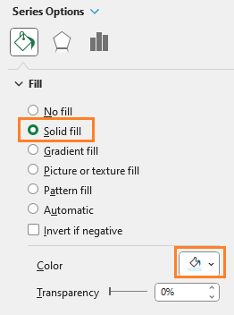
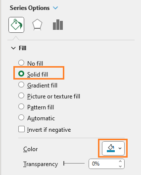
i. Right-click on the target series, go to Format Data Series, and fill with a lighter color:
ii. Similarly, fill the measure column with a darker color fill:
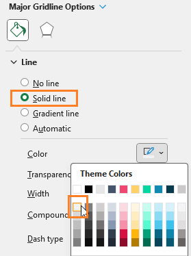
iii. Format the gridlines to be lighter, add title and add borders:
With this, the chart looks something like this:
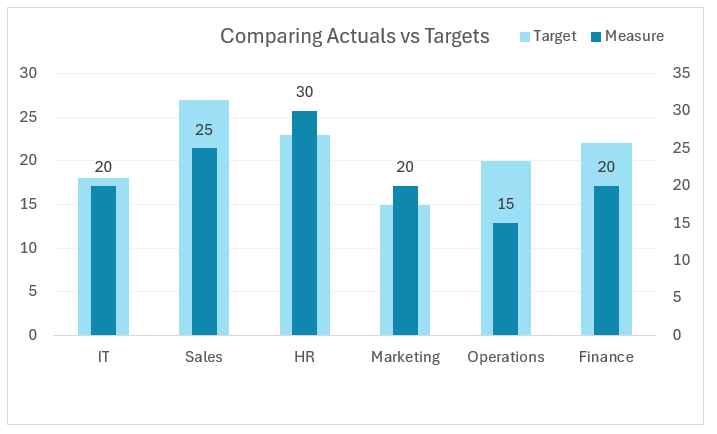
One issue to notice here is that, for the IT department the measure is 20 and the target is 18 but the chart displays the measure to be less than the target. This is caused due to the presence of a secondary axis.
Address it by (1) right-clicking on the secondary axis and (2) deleting it:
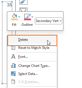
That’s it! Our desired chart is ready!
Our YouTube video explains these steps in detail:
Check our 1-page, downloadable illustrative guide explaining all the steps for a quick reference.
If you have any feedback or suggestions, please post them in the comments below.


