Home » Data to Decision » Page 5
Category: Data to Decision
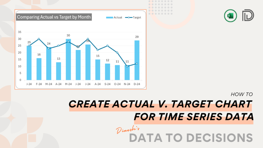
With this blog, learn to create an actual vs. target chart in Excel. Our post simplifies the steps needed to
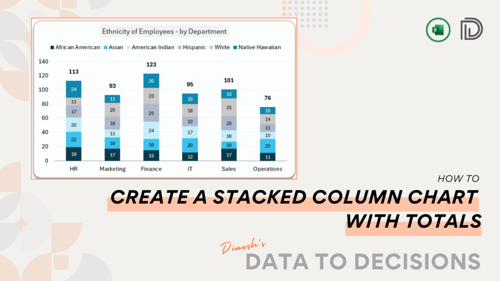
Streamline your data presentation with this post on creating a Stacked Column Chart that showcases data with aggregate totals.
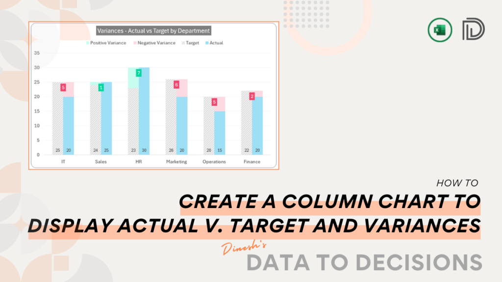
Elevate your Excel dashboards with our blog post on constructing a Column Chart that neatly displays the actuals, targets, and
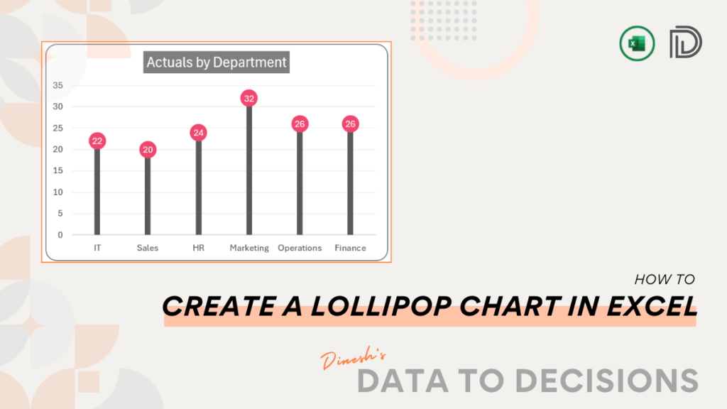
Unleash the power of Excel with our quick guide on creating Lollipop Charts, the visually engaging way to depict actual
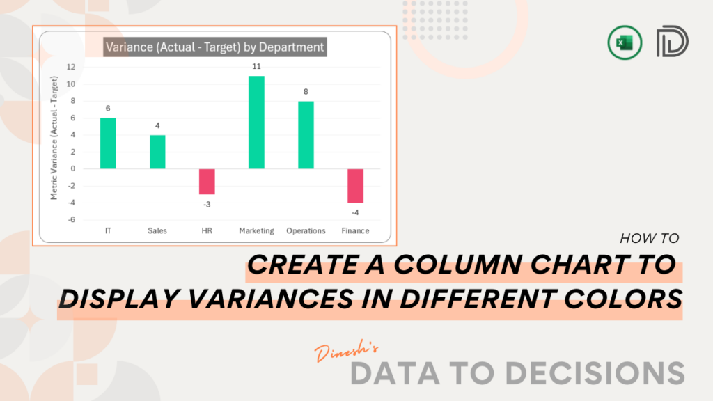
Master the art of visualizing with our blog on creating a Column Chart to display Variances in Excel, with simple
Tracking progress made easy! With this post, learn the simplest method to create a progress tracker in column charts in
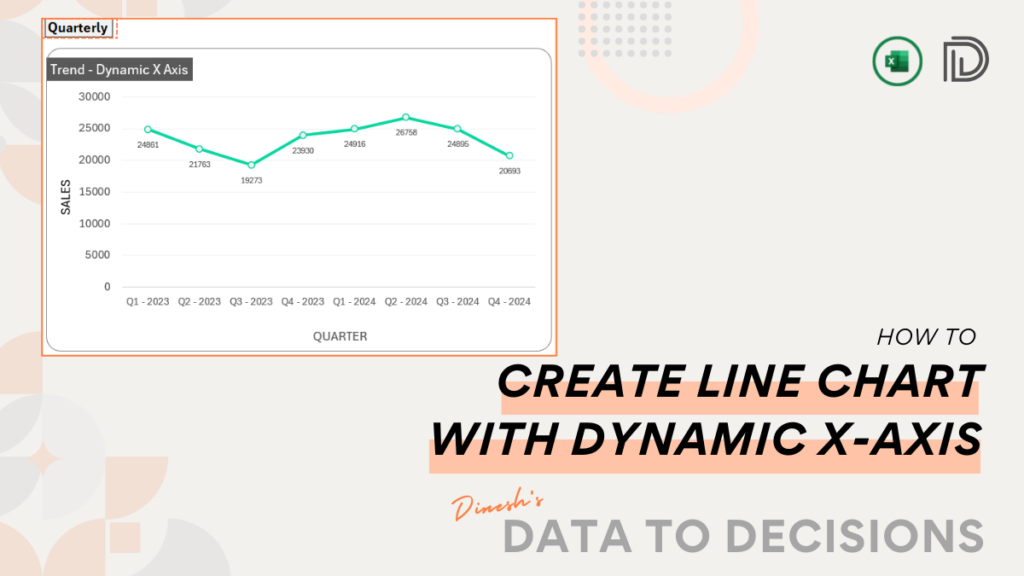
This post gives you the quickest method to create an interactive line chart where the X-axis can be controlled dynamically.
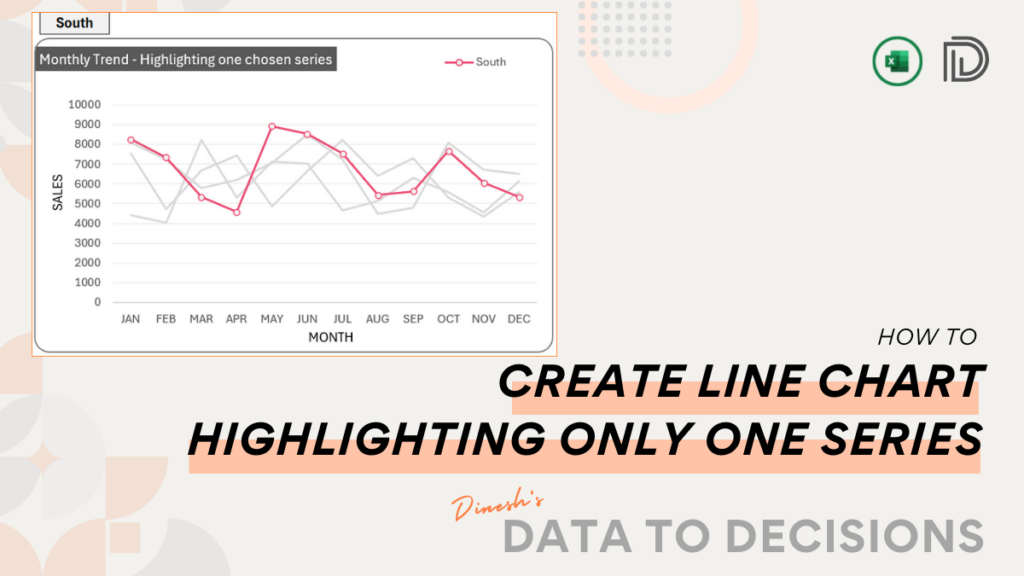
Custom line charts in Excel: Learn the simplest way to create a multiple series line chart that highlights only one
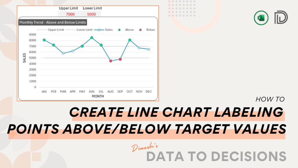
This blog post is your guide to create simple, visually engaging line charts that can highlight markers above or below
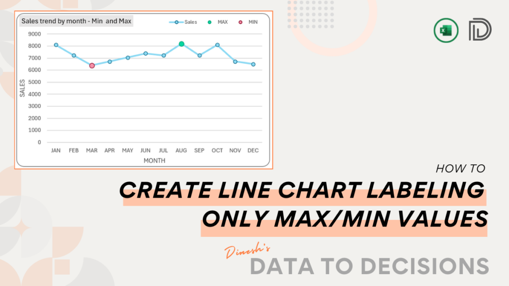
Elevate your dashboards and presentations with a line chart with highlighted minimum and maximum points in Excel, within minutes!

