Skip to content
Shop
Support
Login
HR
Recruitment & Onboarding
Recruitment Tracker Dashboard (Excel)
Recruitment Tracker Dashboard (Google Sheet)
Recruitment Dashboard (Power BI)
Free Recruitment Tracker (Excel)
Free Recruitment Tracker (Google Sheet)
Free Recruitment Tracker (Power BI)
New Employee Checklist (Excel)
New Employee Checklist (Google Sheet)
Onboarding Dashboard (Excel)
Onboarding Dashboard (Google Sheet)
Onboarding Tracker (Power BI)
Skills & Training
Skills Dashboard (Excel)
Skills Dashboard (Google Sheet)
Compliance Training Dashboard (Excel)
Compliance Training Dashboard (Google Sheet)
Learning & Development Dashboard (Excel)
Learning & Development Dashboard (Google Sheet)
Training Dashboard (Power BI)
Leave Trackers
Free Leave Tracker (Excel)
Free Leave Tracker (Google Sheet)
Free Leave Tracker (Power BI)
Leave Manager (Excel)
Leave Manager (Google Sheet)
Leave Dashboard (Power BI)
Employee Vacation Planner (Excel)
Team Vacation Planner (Excel)
Team Vacation Planner (Google Sheet)
PTO Balance for Salaried (Excel)
PTO Balance for Hourly (Excel)
PTO Manager for Salaried (Excel)
PTO Manager for Salaried (Google Sheet)
PTO Balance for Salaried (Google Sheet)
PTO Balance for Hourly (Google Sheet)
PTO Manager for Hourly (Excel)
Timesheets
Timesheets Manager (Excel)
Timesheets Manager (Google Sheets)
Employee Timesheet (Excel)
Employee Timesheet (Google Sheet)
Compensation
Salary Structure Calculator (Excel)
Salary Structure Calculator (Google Sheet)
Employee Annual Bonus Planner (Excel)
Employee Annual Bonus Planner (Google Sheet)
Employee Annual Bonus Planner (Power BI)
Employee Performance
9 Box Grid (Excel)
9 Box Grid (Google Sheet)
Performance Dashboard (Excel)
Performance Dashboard (Google Sheet)
Performance Dashboard (Power BI)
KPI Trackers
HR KPI Scorecard (Excel)
HR Admin Dashboard (Google Sheet)
HR Admin Dashboard (Excel)
HR Admin Dashboard (Power BI)
Employee Net Promoter Score (Google Sheets)
Retention
HR Retention Dashboard (Excel)
HR Retention Dashboard (Google Sheet)
Flight Risk Management (Excel)
Flight Risk Management (Google Sheet)
Toolkits
HR Templates Toolkit (Excel)
HR Sheets Superpower (Google Sheet)
Power HR (Power BI)
Small Business
Invoices
Asset Rental Invoice (Excel)
Property Rental Receipts (Excel)
Packing Slip (Excel)
Sales Quotation (Excel)
Invoice Manager Pro (Excel)
Invoice Manager (Google Sheet)
Invoice Manager (Excel)
Invoice Tracker (Excel)
Sales Invoice (Excel)
Invoice Tracker (Google Sheet)
Accounting
Small Business Finance Manager (Excel)
Small Business Finance Manager (Google Sheet)
Free Income Statement (Excel)
Software Renewal Tracker (Excel)
Business Management
Manufacturing Business Manager (Excel)
Manufacturing Business Manager (Google Sheet)
Retail Business Manager Pro (Excel)
Retail Business Manager (Excel)
Retail Business Manager (Google Sheet)
Retail Business Manager Pro (Google Sheets)
Rental Business Manager (Excel)
Rental Business Manager (Google Sheet)
Digital Catalog (Excel)
Product Catalog (Excel)
CRM
Sales Pipeline Manager (Excel)
Sales Pipeline Manager (Google Sheet)
Sales Pipeline Manager (Power BI)
Sales Pipeline Tracker (Excel)
Sales Pipeline Tracker (Google Sheet)
Inventory management
Retail Inventory Tracker (Excel)
Retail Inventory Tracker (Google Sheet)
FIFO Inventory Tracker (Excel)
Inventory and Sales Manager (Excel)
Inventory and Sales Manager (Google Sheet)
Manufacturing Inventory Tracker (Excel)
Manufacturing Inventory Tracker (Google Sheet))
Rental Inventory Tracker (Excel)
Rental Inventory Tracker (Google Sheet)
Stock Market
Stock Charts
Stock Lookup (Excel)
Stock Lookup (Google Sheets)
Candlestick Chart (Excel)
Stock Price Analysis Chart (Excel)
Stock Price Analysis Chart (Google Sheets)
Compare 2 Stocks (Excel)
Forex Rate Chart (Excel)
Cryptocurrency Trends (Google Sheets)
Screeners
Free U.S. Stock Market Screener (Excel)
Premium Stock Screener (Excel)
Simple Moving Average Screener (Excel)
Simple Moving Average Screener (Google Sheet)
Market Analysis
U.S. Stock Market Analysis (Excel)
Indian Stock Market Analysis (Excel)
U.S. Stock Market Tracker (Excel)
Indian Stock Market Tracker (Excel)
India Stock Market Tracker (Google Sheet)
London Stock Market Tracker (Excel)
Forex Rate Tracker (Excel)
Portfolio and Watchlists
Stock Portfolio Tracker (Excel)
Stock Portfolio Tracker (Google Sheet)
Stock Watchlist (Excel)
Stock Watchlist (Google Sheets)
Technical Analysis
25 Technical Indicators Pro (Excel)
Simple Moving Average (Excel)
Simple Moving Average (Google Sheets)
Weighted Moving Average (Excel)
Exponential Moving Average (Excel)
Exponential Moving Average Crossover (Excel)
Moving Average Envelope (Excel)
Bollinger Bands (Excel)
Donchian Channels (Excel)
Momentum & Rate of Change (Excel)
Awesome Oscillator (Excel)
MACD (Excel)
MACD (Google Sheet)
RSI Relative Strength Index (Excel)
ATR Average True Range (Excel)
Williams %R (Excel)
Stochastic (Excel)
OBV On Balance Volume (Excel)
Keltner Channels (Excel)
RSI Relative Strength Index (Google Sheet)
Backtester
MACD Strategy Backtester Excel Template
MACD Strategy Backtester Google Sheets Template
RSI Strategy Backtester Excel Template
RSI Strategy Backtester Google Sheets Template
SMA Strategy Backtester Excel Template
SMA Strategy Backtester Google Sheets Template
Data Visualization
Charts
Activity Pattern Heat Maps (Excel)
Bar Chart (Excel)
Column Chart (Excel)
Motion Bubble Chart (Excel)
Timeline Chart (Excel)
Process Control Chart (Excel)
Combination Generators
Combinations Generator Toolkit
Geo Heat Maps
Australia Heat Map (Excel)
Canada Heat Map (Excel)
India Heat Map (Excel)
Kerala State Heat Map (Excel)
Tamil Nadu State Heat Map (Excel)
United States Heat Map (Excel)
World Heat Map (Excel)
Dashboards
2014 Indian Election Dashboard (Excel)
2016 Olympics Dashboard (Excel)
2016 U.S. Presidential Election Dashboard (Excel)
Fitness & Weight Loss Tracker Excel Template
Product Rating Report (Excel)
Social Media Dashboard (Excel)
World Cup Cricket Dashboard (Excel)
Toolkits
Data Visualization Toolkit
Project Management
Toolkits
Project Management Toolkit (Excel)
Capacity Planners
Resource Capacity Planner (Excel)
Resource Capacity Planner Lite (Excel)
Resource Capacity Planner (Google Sheet)
Resource Planning Calendar (Excel)
Capacity Calculator (Excel)
Gantt Chart Makers
Gantt Chart (Excel)
Gantt Chart (Google Sheet)
Project Planners
Project Pipeline Tracker (Excel)
Project Manager (Excel)
Project Planner Advanced (Excel)
Project Planner Basic (Excel)
Earned Value Management (Excel)
Task Trackers
Task Manager Basic (Excel)
Task Manager Advanced (Excel)
Kanban Board Task Tracker (Excel)
Kanban Board Task Tracker (Google Sheet)
Eisenhower Matrix (Excel)
Eisenhower Matrix (Google Sheet)
Other
Calendars
2025/2024 Premium Excel Calendar
2025/2024 Premium Google Sheets Calendar
2025 Free Excel Calendar
2025 Free Google Sheet Calendar
2023 Free Excel Calendar
2024 Free Excel Calendar
2023 Free Google Sheet Calendar (Any Year)
2024 Free Google Sheets Calendar
School
Free Attendance Tracker (Excel)
Free Attendance Tracker (Google Sheet)
Premium Attendance Report (Excel)
Premium Attendance Report (Google Sheet)
Free Student Report Card (Excel)
Personal Finance
Bills Tracker (Excel)
Budget Tracker (Excel)
Group Shared Expense Calculator (Excel)
Loan EMI Mortgage Calculator (Exce)
Tutorials
Home
»
Data to Decision
»
Visualization
»
Page 4
Category: Visualization
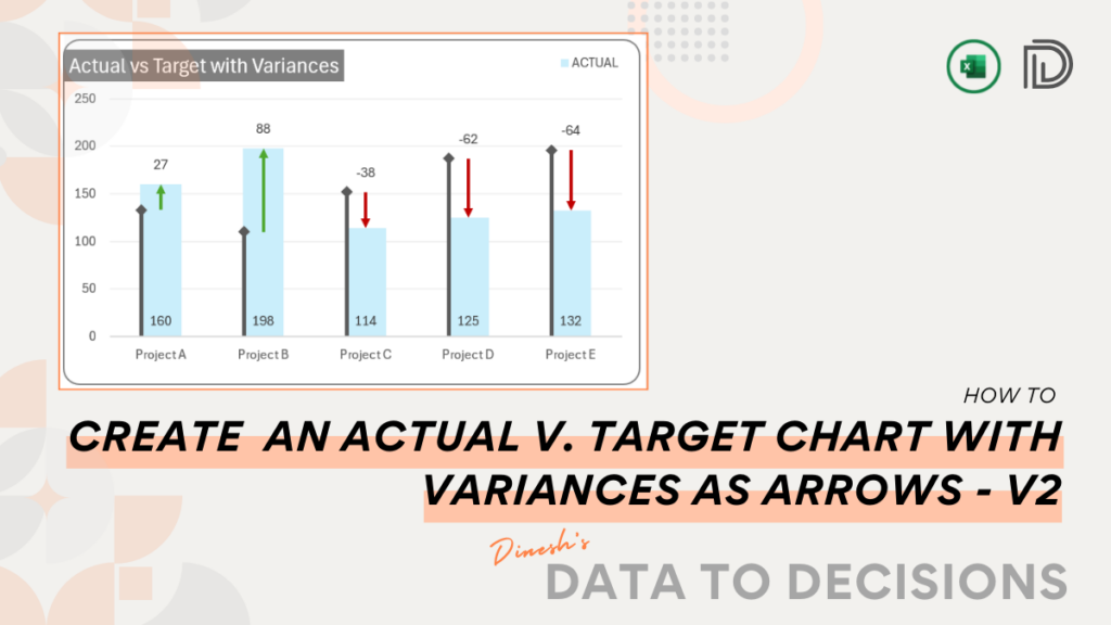
How to Create a Chart with Variance Arrows with Actual Columns and Vertical Target Line?
Become proficient in data storytelling by following this post to design an Actual vs. Target chart in Excel. This tutorial
read more
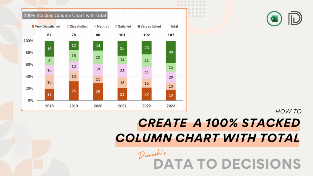
How to Create a 100% Stacked Column Chart with Totals in Excel?
Craft a 100% stacked column chart in Microsoft Excel, showcasing not just the proportional contributions of each data series but
read more
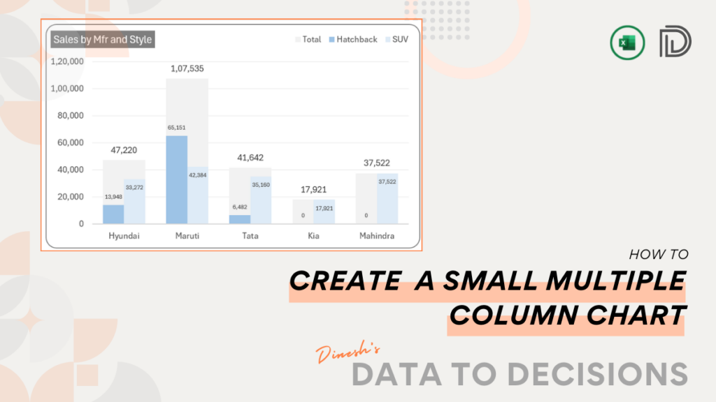
How to Create a Column Chart with Multiple Series and Small Multiple?
Learn to create a small multiple column chart that displays the data comparison and analysis and enhance your visual reporting.
read more
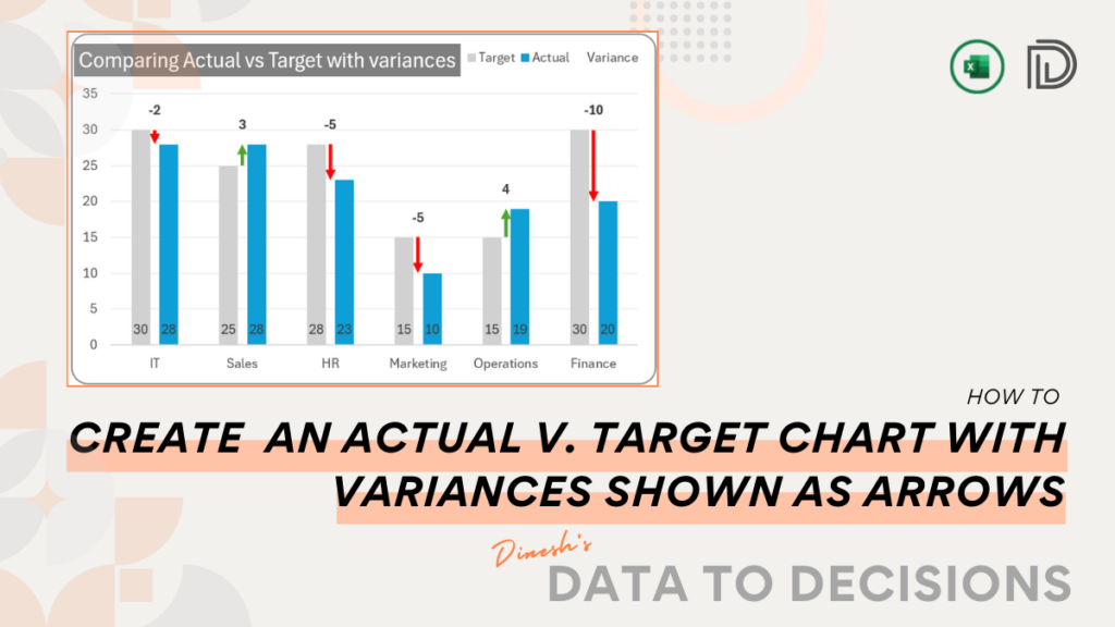
How to Create a Chart with Variance Arrows with Actual and Target Columns?
Learn the simplest method to create a dynamic Actual vs Target and variances displayed with arrows chart in Excel. Perfect
read more
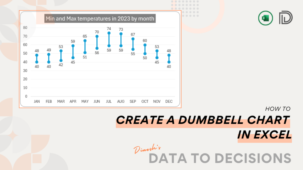
How to Create a Vertical Dumbbell Chart in Excel?
Learn the quickest method to create a dumbbell chart in Excel, a great addition to your regular dashboards and reports!
read more
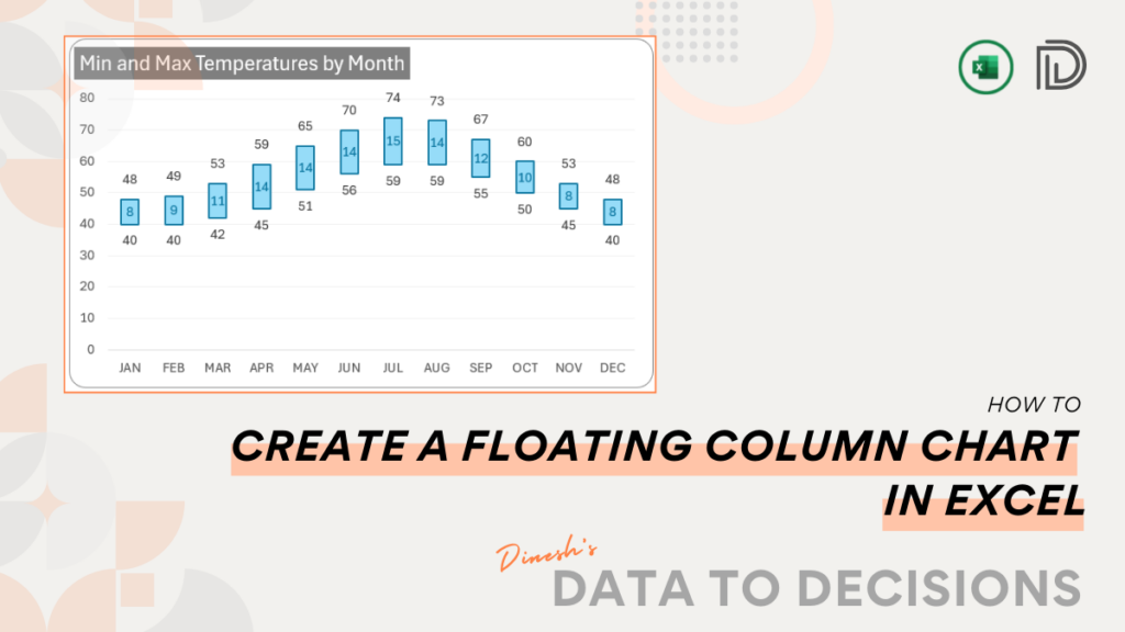
How to Create a Floating Column Chart in Excel?
Elevate your data visualization with a step-by-step guide to creating a Floating Column Chart in Excel- a great addition to
read more
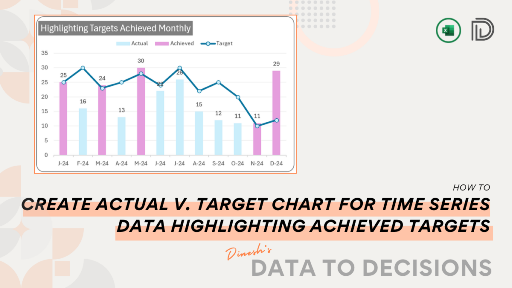
How to Create a Column Chart with Line for Time Series and Highlight in Excel?
Elevate your charts with our insightful post on creating one that not only compares actual vs. target but also highlights
read more
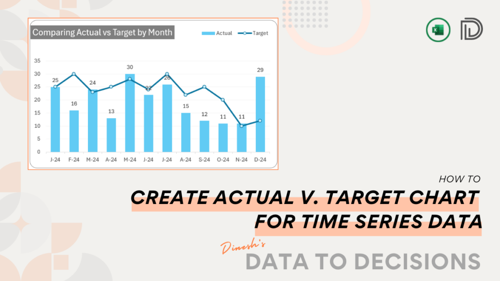
How to Create Column Chart with Line for Time Series Data in Excel?
With this blog, learn to create an actual vs. target chart in Excel. Our post simplifies the steps needed to
read more
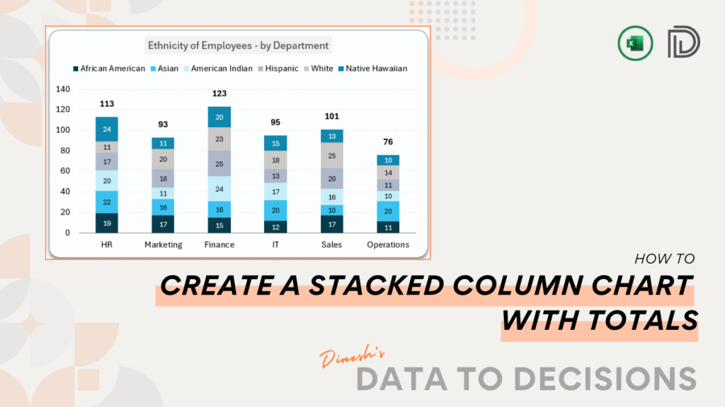
How to Create a Stacked Column Chart with Total in Microsoft Excel?
Streamline your data presentation with this post on creating a Stacked Column Chart that showcases data with aggregate totals.
read more
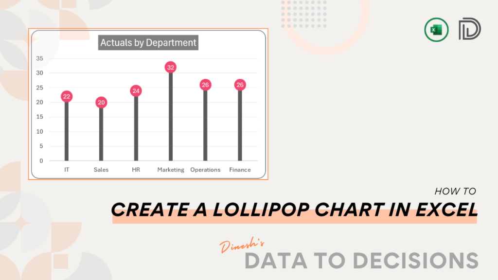
How to Create a Vertical Lollipop Chart in Microsoft Excel?
Unleash the power of Excel with our quick guide on creating Lollipop Charts, the visually engaging way to depict actual
read more
Previous
Next
✕