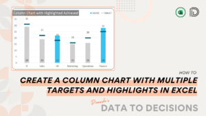
Create a Column Chart with Multiple Targets and Highlights in Excel
Uncover the steps to build a column chart with multiple targets in Excel, highlighting the achieved columns for an enhanced dashboard!
Uncover the steps to build a column chart with multiple targets in Excel, highlighting the achieved columns for an enhanced dashboard!
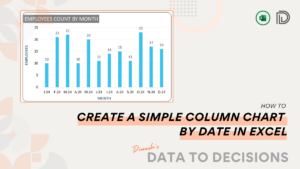
Create a visually appealing column chart in Excel for your time series data. This is great for comparing your data across time periods
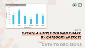
Turn your raw data into a compelling visual with a simple column chart in Microsoft Excel, apt for comparisons by category.
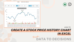
Learn to create a stock price history chart in Excel, a perfect tool for tracking market trends – ready in minutes!
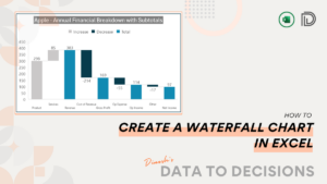
Learn to create detailed Waterfall Charts in Excel with this blog post. We cover three variations to suit any data story you want to present!
Follow this post to create a progress tracker using stacked column charts within minutes in Microsoft Excel!
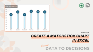
This post will walk you through the steps to turn numbers into engaging, clear visuals by creating a Matchstick chart in Excel.
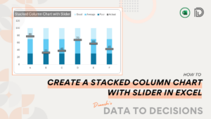
Elevate your data visualization skills by learning to create a Stacked Column Chart with a Slider in Excel through this post.
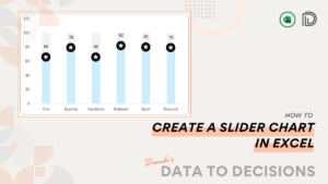
Learn how to create a Slider Chart in Excel – Enhance your presentations with this simple chart and turn raw data into compelling visuals
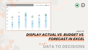
Acquire the crucial techniques to accurately contrast Actual, Budget, and Forecast data through a straightforward chart designed in Microsoft Excel.
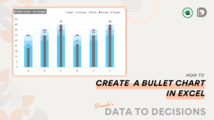
Elevate your data visualization expertise with advanced bullet chart techniques in Excel, designed for a sophisticated comparison of actual performance against set targets, offering deeper insights into your metrics.
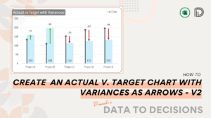
Become proficient in data storytelling by following this post to design an Actual vs. Target chart in Excel. This tutorial includes instructions for adding variance arrows, enabling rapid and insightful analysis.